How to Add Custom Block Supports in theme.json for Enhanced Editor Controls
The block supports system is one of the least-documented corners of block theme development, but it controls a huge amount of what editors can and cannot do. When you configure blocks in theme.json, you’re not just setting default styles. You’re deciding which controls appear in the editor sidebar, which properties cascade from global styles, and which behaviors blocks inherit from the theme.
Getting block supports right means your editors have exactly the controls they need and nothing they don’t. It also means theme users can extend your styles predictably without fighting against hidden constraints. This connects directly to the broader topic of using style variations in block themes to offer multiple design presets, which relies on block supports being configured correctly for each variation.
This guide covers the full block supports system: what it is, how theme.json interacts with it, how to enable and disable supports per block, and how to extend core blocks with additional controls without touching block.json directly.
What Block Supports Actually Are
Every block in WordPress registers a set of capabilities in its block.json file. These are called supports. A support tells the editor what kinds of controls to show for that block. The color support, for example, tells the editor to show text color and background color pickers. The spacing support enables margin and padding controls.
{
  "name": "core/paragraph",
  "supports": {
    "anchor": true,
    "className": true,
    "color": {
      "gradients": true,
      "link": true
    },
    "spacing": {
      "margin": true,
      "padding": true
    },
    "typography": {
      "fontSize": true,
      "lineHeight": true
    }
  }
}
These are the defaults registered by the block itself. But theme.json can override them on a per-block basis. This is a key distinction: theme.json doesn’t change what a block is capable of, but it does control what the editor exposes to users in your theme context.
The theme.json Blocks Section
The blocks section in theme.json lets you target any core block by its namespace and set default styles, variations, and support settings. The structure mirrors the global settings section but scoped to a specific block.
{
  "version": 3,
  "settings": {},
  "blocks": {
    "core/paragraph": {
      "color": {
        "background": true,
        "text": true
      },
      "spacing": {
        "padding": true
      }
    },
    "core/heading": {
      "color": {
        "background": false,
        "text": true
      }
    }
  }
}
The settings you define inside blocks narrow down what the editor shows. Setting a feature to false hides that control in the sidebar for that block in your theme. Setting it to true ensures it’s available even if a parent theme disabled it.
Global vs Per-Block Settings
Settings at the top-level settings key in theme.json apply globally to all blocks. Settings inside blocks.core/paragraph apply only to that block and take precedence over the global settings. This lets you enable padding globally but turn off padding for headings specifically.
{
  "version": 3,
  "settings": {
    "spacing": {
      "padding": true,
      "margin": true
    }
  },
  "blocks": {
    "core/heading": {
      "spacing": {
        "padding": false,
        "margin": false
      }
    }
  }
}
With this configuration, paragraphs, groups, and other blocks get padding and margin controls. Headings do not. The per-block setting wins.
Enabling Color Supports Per Block
Color is the most commonly controlled support in theme.json. The color object has several sub-properties, each controlling a different color picker in the editor.
| Property | What it controls |
|---|---|
background | Background color picker |
text | Text color picker |
link | Link color picker |
gradients | Gradient backgrounds |
duotone | Duotone image filters |
A common pattern: allow text color on paragraphs but disable background color to prevent editors from breaking your layout with random background fills.
{
  "blocks": {
    "core/paragraph": {
      "color": {
        "background": false,
        "text": true,
        "link": true,
        "gradients": false
      }
    },
    "core/group": {
      "color": {
        "background": true,
        "text": true,
        "gradients": true
      }
    }
  }
}
Spacing Controls: Padding, Margin, and Gap
The spacing support has three main controls: padding, margin, and blockGap. All three can be enabled globally or per block.
{
  "settings": {
    "spacing": {
      "padding": true,
      "margin": true,
      "blockGap": true,
      "units": [ "px", "em", "rem", "%" ]
    }
  },
  "blocks": {
    "core/columns": {
      "spacing": { "blockGap": true, "padding": true, "margin": false }
    },
    "core/column": {
      "spacing": { "padding": true, "margin": false, "blockGap": false }
    }
  }
}
Custom Spacing Presets
Instead of giving editors a free-form spacing input, you can define a preset list. The editor shows a visual scale rather than a number input. This keeps spacing consistent across the site.
{
  "settings": {
    "spacing": {
      "spacingSizes": [
        { "name": "XS",  "slug": "xs",  "size": "0.5rem" },
        { "name": "S",   "slug": "sm",  "size": "0.75rem" },
        { "name": "M",   "slug": "md",  "size": "1.5rem" },
        { "name": "L",   "slug": "lg",  "size": "2.5rem" },
        { "name": "XL",  "slug": "xl",  "size": "4rem" }
      ]
    }
  }
}
Border Controls in theme.json
Border support was expanded in WordPress 6.1. The border support controls which border-related controls appear in the editor. Before 6.1, only border-radius was available. Now you can control each side independently.
{
  "settings": {
    "border": { "color": true, "radius": true, "style": true, "width": true }
  },
  "blocks": {
    "core/image": {
      "border": { "color": true, "radius": true, "style": false, "width": true }
    },
    "core/button": {
      "border": { "color": true, "radius": true, "style": true, "width": true }
    }
  }
}
Block Supports vs Custom Block Attributes
Block supports are built-in capabilities the block API understands. When you enable color.background, the editor adds a color picker, saves the value automatically, and outputs the CSS class or inline style. You don’t write any JavaScript or PHP to make it work.
Custom attributes require a JavaScript edit function to show the control and PHP or JavaScript to output the saved value on the frontend. Use custom attributes when you need something the supports system doesn’t cover.
| Feature | Block Supports | Custom Attributes |
|---|---|---|
| Setup effort | Low (theme.json only) | High (JS + PHP) |
| Editor UI | Automatic | Manual |
| CSS output | Automatic | Manual |
| Theme.json control | Yes | No |
| Global styles | Yes | No |
Extending Core Blocks with Additional Controls
Sometimes you want to add a control to a core block without forking it. The key hook is blocks.registerBlockType in JavaScript and register_block_type_args in PHP. This technique complements the approach covered in creating block variations to extend core blocks without code duplication.
Adding a Custom Attribute via JavaScript Filter
import { addFilter } from '@wordpress/hooks';

function addHighlightAttribute( settings, name ) {
    if ( name !== 'core/paragraph' ) {
        return settings;
    }

    return {
        ...settings,
        attributes: {
            ...settings.attributes,
            isHighlighted: {
                type: 'boolean',
                default: false,
            },
        },
    };
}

addFilter(
    'blocks.registerBlockType',
    'my-theme/add-highlight-attribute',
    addHighlightAttribute
);
Adding a Sidebar Control via editor.BlockEdit
import { addFilter } from '@wordpress/hooks';
import { createHigherOrderComponent } from '@wordpress/compose';
import { InspectorControls } from '@wordpress/block-editor';
import { PanelBody, ToggleControl } from '@wordpress/components';

const withHighlightControl = createHigherOrderComponent( ( BlockEdit ) => {
    return ( props ) => {
        if ( props.name !== 'core/paragraph' ) {
            return <BlockEdit { ...props } />;
        }

        const { attributes, setAttributes } = props;

        return (
            <>
                <BlockEdit { ...props } />
                <InspectorControls>
                    <PanelBody title="Highlight" initialOpen={ false }>
                        <ToggleControl
                            label="Mark as highlighted"
                            checked={ !! attributes.isHighlighted }
                            onChange={ ( value ) =>
                                setAttributes( { isHighlighted: value } )
                            }
                        />
                    </PanelBody>
                </InspectorControls>
            </>
        );
    };
}, 'withHighlightControl' );

addFilter(
    'editor.BlockEdit',
    'my-theme/with-highlight-control',
    withHighlightControl
);
Applying the Attribute to Frontend Output
import { addFilter } from '@wordpress/hooks';

function applyHighlightClass( extraProps, blockType, attributes ) {
    if ( blockType.name !== 'core/paragraph' ) {
        return extraProps;
    }

    if ( attributes.isHighlighted ) {
        extraProps.className =
            ( extraProps.className || '' ) + ' is-highlighted';
    }

    return extraProps;
}

addFilter(
    'blocks.getSaveContent.extraProps',
    'my-theme/apply-highlight-class',
    applyHighlightClass
);
Disabling Specific Supports to Protect Design Consistency
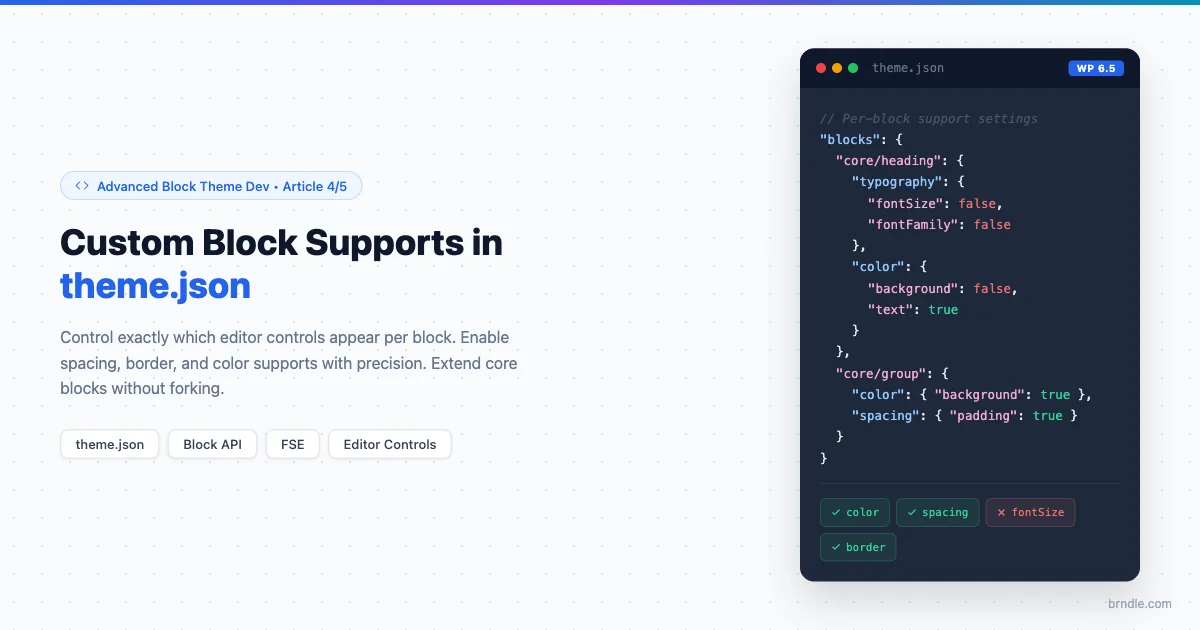
One of the most practical uses of the blocks section in theme.json is locking down controls that would break your design. If your heading styles are carefully crafted, disable typography controls for headings entirely.
{
  "blocks": {
    "core/heading": {
      "typography": {
        "fontSize": false,
        "lineHeight": false,
        "fontFamily": false,
        "fontWeight": false
      },
      "color": { "background": false }
    }
  }
}
This is one of the most commonly needed configurations on client sites where editorial consistency matters more than full flexibility. An editor who changes heading font sizes will break your typographic rhythm. Removing the control is simpler than writing a style guide and hoping everyone follows it.
Typography Supports: Controlling Font Controls Per Block
Typography is where editorial control matters most. The typography support object in theme.json has sub-properties for every font-related control in the editor sidebar.
| Property | Editor control | Default state |
|---|---|---|
fontSize | Font size picker | Enabled if font sizes defined |
lineHeight | Line height input | Disabled by default |
fontFamily | Font family selector | Enabled if font families defined |
fontStyle | Italic toggle | Disabled by default |
fontWeight | Font weight selector | Disabled by default |
letterSpacing | Letter spacing input | Disabled by default |
textTransform | Uppercase / lowercase toggle | Disabled by default |
textDecoration | Underline, strikethrough | Disabled by default |
For a design-system theme, expose fontSize on paragraphs so editors can pick from your type scale, and lock heading font size and font family so the type hierarchy stays intact. Letter spacing on body text almost always produces inconsistent results in editorial workflows, so leave it disabled.
{
  "blocks": {
    "core/paragraph": {
      "typography": {
        "fontSize": true,
        "lineHeight": true,
        "fontFamily": false,
        "fontWeight": false,
        "letterSpacing": false
      }
    }
  }
}
Block Supports and the WordPress Style Engine
When a block support is enabled and an editor sets a value, WordPress runs it through the style engine, which decides whether to output an inline style on the block element or add a generated CSS class. For color, WordPress generates a class like has-primary-color mapped to your palette. For spacing, it outputs style="padding: 2rem" directly on the element.
Custom CSS properties defined in your theme’s palette and spacing scale feed directly into this system. A color set as var(--wp--preset--color--primary) in your palette gives any block using that color a scoped CSS variable that updates globally when you change the palette entry. This means you can update one color in theme.json and the change propagates to every block that references it, without touching individual post content.
The style engine also controls how block-level styles interact with global styles. If you define a default background color for core/group in the styles.blocks section of theme.json, the style engine generates a scoped CSS rule that applies only to group blocks. The editor’s global styles UI respects these defaults, letting editors override them on individual blocks without touching the theme files.
Understanding this flow matters because it explains why removing a support doesn’t remove the previously saved value. If an editor set a font size on a paragraph and you later disabled the fontSize support for paragraphs, that paragraph’s inline style or class still exists in the post content. Disabling the support only hides the control; it doesn’t clear saved values. A content migration pass is required if you need to reset previously set values across existing posts.
The appearanceTools Shorthand
WordPress 6.0 added appearanceTools as a convenience shorthand in theme.json. Setting it to true at the global level enables border, color link, margin, padding, blockGap, letter spacing, and text decoration in one go.
{
  "settings": {
    "appearanceTools": true
  }
}
The shorthand does not replace explicit settings. If you set appearanceTools: true but then set spacing.padding: false in the blocks section for a specific block, that block loses padding controls. Per-block settings still override the shorthand. The shorthand is useful for getting all appearance controls on quickly during development and then dialing back what you don’t want block by block.
Custom Block Supports via PHP
For a custom block or to modify a core block, you can register or adjust supports via PHP using the register_block_type_args filter. This runs at block registration time and lets you add supports that aren’t in the original block.json without forking the block.
add_filter( 'register_block_type_args', function( $args, $block_type ) {
    if ( $block_type !== 'core/group' ) {
        return $args;
    }

    $args['supports']['sticky'] = true;

    return $args;
}, 10, 2 );
This approach is useful when a theme or plugin needs to add a support that the Gutenberg team hasn’t shipped yet, or when you need a non-standard support that only makes sense in your specific context. The added support still needs corresponding JavaScript and PHP to actually do something when the editor uses it.
Supports for Custom Blocks You Register
When you register your own block, declare supports in block.json rather than relying on theme.json overrides. Theme.json overrides are meant for adjusting core blocks, not for defining the baseline of your own custom block. Your block.json is the source of truth for what your block can do.
{
  "name": "my-theme/callout",
  "title": "Callout",
  "supports": {
    "color": {
      "background": true,
      "text": true,
      "gradients": false
    },
    "spacing": {
      "padding": true,
      "margin": false,
      "blockGap": false
    },
    "border": {
      "color": true,
      "radius": true,
      "style": true,
      "width": true
    },
    "typography": {
      "fontSize": false,
      "fontFamily": false
    }
  }
}
Notice that typography controls are disabled here. A callout block has its own defined type style. Allowing font size changes on it would break the design. Border and spacing are enabled because they make the block more versatile for layout purposes without affecting the typographic system.
Using theme.json to Restrict Supports on Third-Party Blocks
Third-party plugin blocks can be targeted in the same way as core blocks. If a plugin registers a block called my-plugin/card, you can override its supports from your theme’s theme.json.
{
  "blocks": {
    "my-plugin/card": {
      "color": {
        "background": false
      },
      "typography": {
        "fontFamily": false
      }
    }
  }
}
This is useful when a plugin’s block has too many exposed controls for your editorial workflow. You can tighten it down to match your design system without modifying the plugin itself. Just be aware that plugin updates can change the block’s registered supports, which might conflict with your theme.json overrides in unexpected ways. Test after plugin updates.
Debugging Block Supports
When a control isn’t showing up in the editor sidebar, work through these checks in order:
- Open the browser console on the editor page. Look for JavaScript errors related to block registration.
- Run
wp.blocks.getBlockType('core/paragraph').supportsin the browser console to see the active supports object for that block. This reflects all merged settings from block.json and theme.json. - Check that your theme.json is valid JSON. A syntax error anywhere in the file silently prevents all settings from loading.
- Look for a parent theme or must-use plugin that might be setting supports via
register_block_type_args. These run at block registration and can override theme.json. - Hard-refresh the editor after changing theme.json. The editor caches block type data and font loading in the browser. A cached version will still show the old support configuration.
- Use
WP_DEBUGand check the debug log for PHP errors in theme.json parsing.
Real-World Configuration: A Controlled Editorial Theme
Here is a complete, production-ready blocks section for a theme where design consistency takes priority over editorial freedom. This is a good starting point for agency or client work where you need predictable output across a large content team.
{
  "version": 3,
  "settings": {
    "appearanceTools": true,
    "color": {
      "defaultPalette": false,
      "defaultGradients": false
    },
    "typography": {
      "defaultFontSizes": false
    },
    "spacing": { "units": [ "px", "rem" ] }
  },
  "blocks": {
    "core/paragraph": {
      "color": { "background": false, "gradients": false },
      "typography": { "fontFamily": false, "fontWeight": false }
    },
    "core/heading": {
      "color": { "background": false, "gradients": false },
      "typography": { "fontSize": false, "lineHeight": false, "fontFamily": false }
    },
    "core/image": {
      "border": { "radius": true, "color": true, "width": true, "style": false }
    },
    "core/button": {
      "color": { "background": true, "text": true, "gradients": false },
      "border": { "radius": true, "color": true, "width": true, "style": true }
    },
    "core/group": {
      "color": { "background": true, "text": true, "gradients": true },
      "spacing": { "padding": true, "margin": true, "blockGap": true }
    },
    "core/columns": {
      "spacing": { "blockGap": true, "padding": true, "margin": false }
    }
  }
}
The logic behind each choice: paragraphs keep text color for emphasis but lose background color and gradients because those belong on layout blocks like group. Headings lose all typography controls because the type scale is defined in theme.json and should not be overridden per block. Images get border radius and width but not border style, which keeps the UI simple. Buttons get full border control because they have the most varied design requirements. Groups get full color and spacing because they are layout primitives. Columns lose margin because the gap control is sufficient for column spacing.
Testing Your Block Support Configuration
After setting up your blocks section, open a new draft post and test each block systematically. For each block in your configuration, confirm that the controls you enabled appear in the sidebar and the controls you disabled do not. Check both the basic and advanced inspector panels, since some controls appear in different locations depending on WordPress version.
Create a test page with one of each block type and save it. Then check the rendered HTML source to confirm the style engine is outputting what you expect. Text color controls should produce a has-{slug}-color class. Padding should produce an inline style. If you see neither, the support is likely being overridden elsewhere. Document what passes so future theme updates can be verified against the same list.
Version Compatibility Notes
Block support properties have been added across multiple WordPress releases. The border.color, border.style, and border.width controls landed in WordPress 6.1. The typography.letterSpacing and typography.textTransform properties arrived in WordPress 5.8. Before relying on a support property, check the minimum WordPress version your theme targets. Document this requirement in your theme’s readme so theme shop customers and site builders know what version they need. After WordPress updates, verify your blocks configuration still behaves as expected, since new core releases occasionally change how support properties are interpreted or introduce new sub-properties worth considering.
Where This Fits in the Series
This is article four in the Advanced Block Theme Development series. Earlier articles covered theme.json global styles, typography systems, and color palette architecture. The next and final article covers block patterns and template parts: how to build reusable patterns that respect your block support configuration and ship with your theme.
Check out the earlier articles in the series: building custom blocks with the WordPress Block API and creating custom block styles for the WordPress design system. If you’re working on a block theme that needs a tight editorial experience, get in touch via the services page.