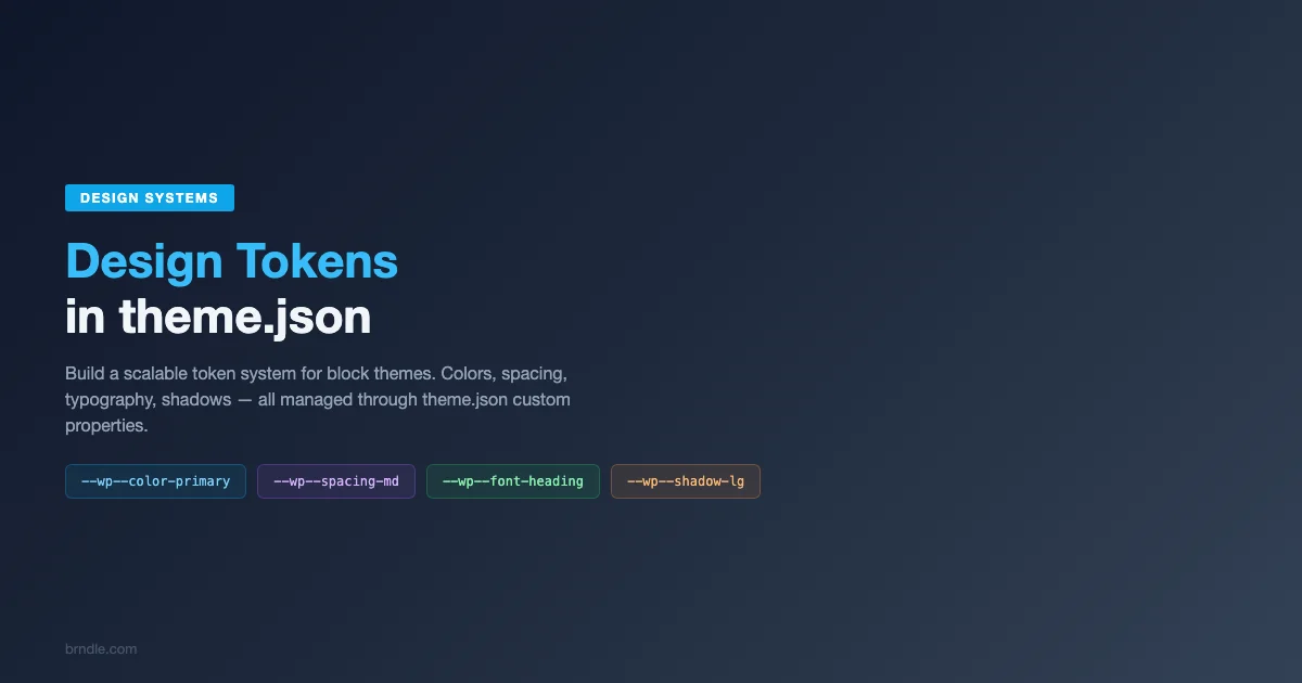
How to Build a Design Token System in theme.json for Maintainable Block Themes
What Design Tokens Are and Why They Matter for WordPress Themes
Design tokens are the smallest units of a design system. They are named values that represent visual properties like colors, font sizes, spacing increments, border radii, and shadows. Instead of scattering raw hex codes, pixel values, and font stacks throughout your theme’s code, you define them once as tokens and reference those tokens everywhere else. When a brand color changes, you update one token and the change propagates automatically across every block, pattern, and template that uses it.
The concept of design tokens originated in large-scale design systems at companies like Salesforce and Google, where hundreds of designers and developers needed a shared vocabulary for visual properties. The W3C Design Tokens Community Group has been working on a formal specification for design tokens, aiming to standardize how they are defined, stored, and exchanged between design tools and code platforms.
WordPress adopted this concept through the theme.json configuration file, which serves as the central authority for a block theme’s visual properties. Every preset you define in theme.json (colors, font sizes, spacing scales, gradients, shadows) functions as a design token. The block editor reads these tokens and makes them available through its visual controls, while the front-end rendering system generates CSS custom properties from them.
Building a deliberate token system in your theme.json transforms theme development from ad-hoc styling into systematic design. This guide covers how to plan, implement, and maintain a comprehensive design token system that scales from simple personal themes to complex commercial products.
How theme.json Maps to Design Tokens
The WordPress.org theme.json reference documents the full structure of the configuration file. For the purpose of design tokens, the settings section is where tokens are defined, and the styles section is where they are applied globally.
When you define a color preset in theme.json, WordPress generates a CSS custom property following the pattern --wp--preset--color--{slug}. The same pattern applies to other token categories: --wp--preset--font-size--{slug}, --wp--preset--spacing--{slug}, --wp--preset--font-family--{slug}, and so on.
Here is a simplified example showing how token definitions in theme.json translate to CSS custom properties:
// In theme.json
{
  "settings": {
    "color": {
      "palette": [
        { "slug": "primary", "color": "#2563eb", "name": "Primary" },
        { "slug": "secondary", "color": "#7c3aed", "name": "Secondary" }
      ]
    },
    "typography": {
      "fontSizes": [
        { "slug": "small", "size": "0.875rem", "name": "Small" },
        { "slug": "medium", "size": "1rem", "name": "Medium" },
        { "slug": "large", "size": "1.25rem", "name": "Large" }
      ]
    }
  }
}

// Generated CSS custom properties
--wp--preset--color--primary: #2563eb;
--wp--preset--color--secondary: #7c3aed;
--wp--preset--font-size--small: 0.875rem;
--wp--preset--font-size--medium: 1rem;
--wp--preset--font-size--large: 1.25rem;
These CSS custom properties are available in the block editor and on the front end, which means any custom CSS you write can reference them directly. This creates a single source of truth where changing a value in theme.json automatically updates every usage throughout the theme.
Planning Your Token System Before Writing Code
A well-planned token system requires upfront design thinking before you write any theme.json code. Rushing into token definitions without a plan leads to inconsistent naming, redundant tokens, and a system that is harder to maintain than the ad-hoc approach it was supposed to replace.
Audit Your Visual Properties
Start by auditing the visual properties your theme uses. Go through your existing designs, mockups, or reference themes and catalog every distinct color, font size, spacing value, shadow, border radius, and gradient. Group similar values and identify redundancies. Most themes use far fewer unique values than it initially appears once duplicates and near-duplicates are consolidated.
A typical theme audit might reveal patterns like this: 15-20 distinct colors (including neutral grays), 6-8 font size steps, 8-12 spacing increments, 2-3 font families, 3-5 shadow depths, and 2-4 border radius values. These numbers provide a reasonable scope for your token system.
Define Token Categories
Organize your tokens into categories that align with theme.json’s structure. The primary categories in WordPress theme.json are:
Color tokens include the color palette (brand colors, neutrals, semantic colors), gradients, and duotone filters. Color tokens are the most visible part of your design system and typically have the most entries.
Typography tokens include font families, font sizes, and (in newer WordPress versions) font weights, line heights, and letter spacing. Typography tokens define the type scale that gives your theme its textual character.
Spacing tokens define the spacing scale used for padding, margins, and gaps throughout the theme. A consistent spacing scale creates visual rhythm and prevents the “why does this gap look different” problem that plagues themes without a system.
Shadow tokens define box shadows at different elevation levels. Shadows add depth and hierarchy to card-based layouts and elevated UI elements.
Layout tokens include content width and wide width settings that control the maximum width of content areas and wide-aligned blocks.
Establish Naming Conventions
Token naming is one of the most consequential decisions in your design system. Good names are meaningful, consistent, and scalable. Bad names create confusion and make the system harder to extend.
There are two primary naming strategies: semantic naming and scale-based naming. Each has strengths and trade-offs.
Semantic names describe the token’s purpose rather than its value. Examples: primary, secondary, accent, base, contrast, success, warning, error. Semantic names are stable because they do not need to change when the underlying value changes. Changing your primary color from blue to green does not require renaming the token.
Scale-based names describe the token’s position on a scale. Examples: 10, 20, 30, 40, 50 for spacing, or 100, 200, 300, 400 for color shades. Scale-based names are self-documenting in terms of relative intensity but reveal nothing about intended usage.
The best approach for WordPress themes combines both strategies: semantic names for the primary palette (primary, secondary, accent, base, contrast) and scale-based names for gradations within each semantic category (primary-light, primary-dark) and for spacing scales (20, 30, 40, 50, 60, 70, 80).
Implementing Color Tokens in theme.json
Color tokens are the foundation of your visual identity. A well-structured color token system in theme.json provides the complete palette that the block editor needs to offer users meaningful color choices. For a deeper exploration of how these tokens integrate with theme.json’s broader configuration, see our comprehensive theme.json guide.
Structuring the Color Palette
The color palette in theme.json is defined as an array of objects, each with a slug, a color value, and a human-readable name. Here is a comprehensive color token system for a professional theme:
{
  "$schema": "https://schemas.wp.org/wp/6.7/theme.json",
  "version": 3,
  "settings": {
    "color": {
      "defaultPalette": false,
      "defaultGradients": false,
      "palette": [
        {
          "slug": "primary",
          "color": "#2563eb",
          "name": "Primary"
        },
        {
          "slug": "primary-light",
          "color": "#60a5fa",
          "name": "Primary Light"
        },
        {
          "slug": "primary-dark",
          "color": "#1d4ed8",
          "name": "Primary Dark"
        },
        {
          "slug": "secondary",
          "color": "#7c3aed",
          "name": "Secondary"
        },
        {
          "slug": "secondary-light",
          "color": "#a78bfa",
          "name": "Secondary Light"
        },
        {
          "slug": "accent",
          "color": "#f59e0b",
          "name": "Accent"
        },
        {
          "slug": "base",
          "color": "#ffffff",
          "name": "Base"
        },
        {
          "slug": "contrast",
          "color": "#1e293b",
          "name": "Contrast"
        },
        {
          "slug": "neutral-100",
          "color": "#f8fafc",
          "name": "Neutral 100"
        },
        {
          "slug": "neutral-200",
          "color": "#e2e8f0",
          "name": "Neutral 200"
        },
        {
          "slug": "neutral-300",
          "color": "#cbd5e1",
          "name": "Neutral 300"
        },
        {
          "slug": "neutral-400",
          "color": "#94a3b8",
          "name": "Neutral 400"
        },
        {
          "slug": "neutral-500",
          "color": "#64748b",
          "name": "Neutral 500"
        },
        {
          "slug": "neutral-600",
          "color": "#475569",
          "name": "Neutral 600"
        },
        {
          "slug": "success",
          "color": "#16a34a",
          "name": "Success"
        },
        {
          "slug": "warning",
          "color": "#d97706",
          "name": "Warning"
        },
        {
          "slug": "error",
          "color": "#dc2626",
          "name": "Error"
        }
      ]
    }
  }
}
This palette demonstrates several important principles. The defaultPalette: false setting disables WordPress’s built-in color palette, ensuring users see only your curated colors. Semantic names (primary, secondary, accent, base, contrast) describe purpose rather than appearance. Neutral colors use a numeric scale that clearly communicates relative lightness. Semantic status colors (success, warning, error) support common UI patterns.
Gradient Tokens
Gradients build on your color tokens to create smooth transitions that can serve as backgrounds for sections, buttons, and decorative elements:
"gradients": [
  {
    "slug": "primary-to-secondary",
    "gradient": "linear-gradient(135deg, var(--wp--preset--color--primary) 0%, var(--wp--preset--color--secondary) 100%)",
    "name": "Primary to Secondary"
  },
  {
    "slug": "dark-overlay",
    "gradient": "linear-gradient(180deg, rgba(0,0,0,0) 0%, rgba(0,0,0,0.8) 100%)",
    "name": "Dark Overlay"
  },
  {
    "slug": "light-fade",
    "gradient": "linear-gradient(180deg, var(--wp--preset--color--neutral-100) 0%, var(--wp--preset--color--base) 100%)",
    "name": "Light Fade"
  }
]
Notice how gradient tokens reference color tokens using CSS custom properties. This creates a dependency chain where changing a color token automatically updates any gradients that use it. This level of interconnection is what makes a token system powerful compared to isolated values.
Implementing Typography Tokens
Typography tokens define the type system that gives your theme its textual personality. A well-designed type scale creates visual hierarchy and reading rhythm across all content.
Font Family Tokens
Define font family tokens for each typeface your theme uses. Most themes need two to three font families: a heading typeface, a body typeface, and optionally a monospace typeface for code blocks.
"typography": {
  "fontFamilies": [
    {
      "slug": "heading",
      "fontFamily": "'Inter', -apple-system, BlinkMacSystemFont, 'Segoe UI', sans-serif",
      "name": "Heading",
      "fontFace": [
        {
          "fontFamily": "Inter",
          "fontWeight": "600",
          "fontStyle": "normal",
          "src": ["file:./assets/fonts/inter-semibold.woff2"]
        },
        {
          "fontFamily": "Inter",
          "fontWeight": "700",
          "fontStyle": "normal",
          "src": ["file:./assets/fonts/inter-bold.woff2"]
        }
      ]
    },
    {
      "slug": "body",
      "fontFamily": "'Source Sans 3', -apple-system, BlinkMacSystemFont, 'Segoe UI', sans-serif",
      "name": "Body",
      "fontFace": [
        {
          "fontFamily": "Source Sans 3",
          "fontWeight": "400",
          "fontStyle": "normal",
          "src": ["file:./assets/fonts/source-sans-3-regular.woff2"]
        },
        {
          "fontFamily": "Source Sans 3",
          "fontWeight": "400",
          "fontStyle": "italic",
          "src": ["file:./assets/fonts/source-sans-3-italic.woff2"]
        },
        {
          "fontFamily": "Source Sans 3",
          "fontWeight": "600",
          "fontStyle": "normal",
          "src": ["file:./assets/fonts/source-sans-3-semibold.woff2"]
        }
      ]
    },
    {
      "slug": "monospace",
      "fontFamily": "'JetBrains Mono', 'Fira Code', 'Consolas', monospace",
      "name": "Monospace",
      "fontFace": [
        {
          "fontFamily": "JetBrains Mono",
          "fontWeight": "400",
          "fontStyle": "normal",
          "src": ["file:./assets/fonts/jetbrains-mono-regular.woff2"]
        }
      ]
    }
  ]
}
The fontFace array defines self-hosted font files, which WordPress uses to generate @font-face declarations automatically. Self-hosting fonts improves privacy (no Google Fonts tracking) and performance (no third-party DNS lookups). Include only the font weights and styles your theme actually uses to minimize file downloads.
Font Size Tokens
Font size tokens define your type scale. A modular scale (where each step is a consistent ratio larger than the previous) creates harmonious size relationships. Common ratios include 1.2 (minor third), 1.25 (major third), and 1.333 (perfect fourth).
"fontSizes": [
  {
    "slug": "x-small",
    "size": "0.75rem",
    "name": "Extra Small",
    "fluid": {
      "min": "0.75rem",
      "max": "0.75rem"
    }
  },
  {
    "slug": "small",
    "size": "0.875rem",
    "name": "Small",
    "fluid": {
      "min": "0.8125rem",
      "max": "0.875rem"
    }
  },
  {
    "slug": "medium",
    "size": "1rem",
    "name": "Medium",
    "fluid": {
      "min": "0.9375rem",
      "max": "1rem"
    }
  },
  {
    "slug": "large",
    "size": "1.25rem",
    "name": "Large",
    "fluid": {
      "min": "1.125rem",
      "max": "1.25rem"
    }
  },
  {
    "slug": "x-large",
    "size": "1.5rem",
    "name": "Extra Large",
    "fluid": {
      "min": "1.25rem",
      "max": "1.5rem"
    }
  },
  {
    "slug": "xx-large",
    "size": "2.25rem",
    "name": "2X Large",
    "fluid": {
      "min": "1.75rem",
      "max": "2.25rem"
    }
  },
  {
    "slug": "xxx-large",
    "size": "3rem",
    "name": "3X Large",
    "fluid": {
      "min": "2rem",
      "max": "3rem"
    }
  }
]
The fluid property enables responsive typography that scales smoothly between the min and max values based on viewport width. WordPress generates a clamp() CSS function that handles the interpolation. This eliminates the need for media queries to adjust font sizes at different breakpoints, resulting in typography that is always proportionally correct for the current viewport.
Implementing Spacing Tokens
Spacing tokens create the vertical and horizontal rhythm of your theme. A consistent spacing scale prevents the visual chaos that results from arbitrary padding and margin values scattered throughout a stylesheet.
WordPress theme.json uses a numeric scale for spacing, where each step is a slug from 20 to 80 (the range can be customized). The actual values assigned to each step define your spacing system.
"spacing": {
  "spacingScale": {
    "operator": "*",
    "increment": 1.5,
    "steps": 7,
    "mediumStep": 1.5,
    "unit": "rem"
  },
  "spacingSizes": [
    { "slug": "20", "size": "0.5rem", "name": "2X Small" },
    { "slug": "30", "size": "0.75rem", "name": "Small" },
    { "slug": "40", "size": "1rem", "name": "Medium Small" },
    { "slug": "50", "size": "1.5rem", "name": "Medium" },
    { "slug": "60", "size": "2.25rem", "name": "Medium Large" },
    { "slug": "70", "size": "3.375rem", "name": "Large" },
    { "slug": "80", "size": "5rem", "name": "Extra Large" }
  ],
  "blockGap": true,
  "margin": true,
  "padding": true,
  "units": ["px", "em", "rem", "vh", "vw", "%"]
}
You can define spacing using either the spacingScale (which generates values automatically based on a mathematical progression) or the spacingSizes (which lets you specify exact values for each step). The spacingSizes approach gives you precise control, which is preferable when you need specific values that do not follow a strict mathematical ratio.
Spacing tokens in theme.json generate CSS custom properties like --wp--preset--spacing--50. These properties are used by blocks for padding, margin, and gap settings. When a user adjusts spacing in the editor, they select from your defined spacing scale, ensuring consistency across the entire site.
Implementing Shadow Tokens
Shadow tokens add depth and elevation to your design. WordPress theme.json supports shadow presets that appear in the block editor’s shadow controls.
"shadow": {
  "defaultPresets": false,
  "presets": [
    {
      "slug": "sm",
      "shadow": "0 1px 2px 0 rgba(0, 0, 0, 0.05)",
      "name": "Small"
    },
    {
      "slug": "md",
      "shadow": "0 4px 6px -1px rgba(0, 0, 0, 0.1), 0 2px 4px -2px rgba(0, 0, 0, 0.1)",
      "name": "Medium"
    },
    {
      "slug": "lg",
      "shadow": "0 10px 15px -3px rgba(0, 0, 0, 0.1), 0 4px 6px -4px rgba(0, 0, 0, 0.1)",
      "name": "Large"
    },
    {
      "slug": "xl",
      "shadow": "0 20px 25px -5px rgba(0, 0, 0, 0.1), 0 8px 10px -6px rgba(0, 0, 0, 0.1)",
      "name": "Extra Large"
    },
    {
      "slug": "inner",
      "shadow": "inset 0 2px 4px 0 rgba(0, 0, 0, 0.05)",
      "name": "Inner"
    }
  ]
}
A shadow scale from small to extra large covers most UI needs: small for subtle card borders, medium for elevated cards, large for modals and dropdowns, and extra large for floating elements. Including an inner shadow token covers inset effects used in form fields and recessed UI elements.
Using Custom Properties for Extended Token Categories
Theme.json’s custom property lets you define arbitrary CSS custom properties that extend beyond the built-in preset categories. This is where you can create tokens for values that WordPress does not have a dedicated preset system for, such as border radii, transition durations, and z-index layers.
"custom": {
  "borderRadius": {
    "small": "0.25rem",
    "medium": "0.5rem",
    "large": "1rem",
    "full": "9999px"
  },
  "transition": {
    "fast": "150ms ease",
    "normal": "250ms ease",
    "slow": "400ms ease"
  },
  "lineHeight": {
    "tight": "1.25",
    "normal": "1.625",
    "loose": "1.875"
  },
  "letterSpacing": {
    "tight": "-0.025em",
    "normal": "0",
    "wide": "0.05em",
    "wider": "0.1em"
  },
  "contentWidth": {
    "narrow": "40rem",
    "default": "48rem",
    "wide": "72rem"
  }
}
Custom properties follow the naming pattern --wp--custom--{group}--{name}. For the example above, the border radius tokens would be accessible as --wp--custom--border-radius--small, --wp--custom--border-radius--medium, and so on. You can use these in your theme’s additional CSS, in pattern markup, and in any custom block styles.
The custom property supports arbitrary nesting, which lets you organize tokens into logical groups. Keep the nesting shallow (one or two levels) to maintain readable CSS custom property names.
Applying Tokens in Global Styles
After defining tokens in the settings section, apply them in the styles section to establish your theme’s default appearance. The styles section uses references to your tokens rather than raw values, completing the connection between token definitions and visual output.
"styles": {
  "color": {
    "background": "var(--wp--preset--color--base)",
    "text": "var(--wp--preset--color--contrast)"
  },
  "typography": {
    "fontFamily": "var(--wp--preset--font-family--body)",
    "fontSize": "var(--wp--preset--font-size--medium)",
    "lineHeight": "var(--wp--custom--line-height--normal)"
  },
  "spacing": {
    "blockGap": "var(--wp--preset--spacing--50)"
  },
  "elements": {
    "heading": {
      "typography": {
        "fontFamily": "var(--wp--preset--font-family--heading)",
        "fontWeight": "700",
        "lineHeight": "var(--wp--custom--line-height--tight)"
      },
      "color": {
        "text": "var(--wp--preset--color--contrast)"
      }
    },
    "h1": {
      "typography": {
        "fontSize": "var(--wp--preset--font-size--xxx-large)"
      }
    },
    "h2": {
      "typography": {
        "fontSize": "var(--wp--preset--font-size--xx-large)"
      }
    },
    "h3": {
      "typography": {
        "fontSize": "var(--wp--preset--font-size--x-large)"
      }
    },
    "h4": {
      "typography": {
        "fontSize": "var(--wp--preset--font-size--large)"
      }
    },
    "link": {
      "color": {
        "text": "var(--wp--preset--color--primary)"
      },
      ":hover": {
        "color": {
          "text": "var(--wp--preset--color--primary-dark)"
        }
      }
    },
    "button": {
      "color": {
        "background": "var(--wp--preset--color--primary)",
        "text": "var(--wp--preset--color--base)"
      },
      "typography": {
        "fontFamily": "var(--wp--preset--font-family--heading)",
        "fontWeight": "600",
        "fontSize": "var(--wp--preset--font-size--medium)"
      },
      ":hover": {
        "color": {
          "background": "var(--wp--preset--color--primary-dark)"
        }
      }
    }
  },
  "blocks": {
    "core/code": {
      "typography": {
        "fontFamily": "var(--wp--preset--font-family--monospace)",
        "fontSize": "var(--wp--preset--font-size--small)"
      },
      "color": {
        "background": "var(--wp--preset--color--neutral-100)"
      }
    },
    "core/quote": {
      "typography": {
        "fontStyle": "italic",
        "fontSize": "var(--wp--preset--font-size--large)"
      },
      "border": {
        "left": {
          "color": "var(--wp--preset--color--primary)",
          "width": "4px",
          "style": "solid"
        }
      },
      "spacing": {
        "padding": {
          "left": "var(--wp--preset--spacing--40)"
        }
      }
    }
  }
}
Notice how every value in the styles section references a token through a CSS custom property or a preset slug. No raw values like #2563eb or 1.25rem appear in the styles section. This complete abstraction means the entire visual appearance of the theme can be changed by modifying only the token definitions in the settings section.
Using Tokens Across Blocks and Patterns
Design tokens become most powerful when they are used consistently in block patterns and custom block styles. Patterns that reference tokens instead of hard-coded values automatically adapt when users customize the theme through the Site Editor’s Global Styles panel.
In block pattern markup, reference color tokens using the preset slug format rather than inline styles:
<!-- Token-based pattern markup -->
<!-- wp:group {"align":"full","backgroundColor":"primary","textColor":"base","style":{"spacing":{"padding":{"top":"var:preset|spacing|70","bottom":"var:preset|spacing|70"}}}} -->
<div class="wp-block-group alignfull has-primary-background-color has-base-color has-text-color has-background" style="padding-top:var(--wp--preset--spacing--70);padding-bottom:var(--wp--preset--spacing--70)">
  <!-- wp:heading {"textAlign":"center","fontSize":"xx-large"} -->
  <h2 class="has-text-align-center has-xx-large-font-size">Section Title</h2>
  <!-- /wp:heading -->
  <!-- wp:paragraph {"align":"center","fontSize":"large"} -->
  <p class="has-text-align-center has-large-font-size">Supporting description text for this section.</p>
  <!-- /wp:paragraph -->
</div>
<!-- /wp:group -->
This pattern uses backgroundColor: "primary" and textColor: "base" rather than hex codes, fontSize: "xx-large" rather than a pixel value, and spacing presets rather than fixed padding values. When a user changes the primary color to green, this pattern’s background automatically updates. This principle is covered in depth in our guide on creating block patterns that leverage the token system.
Building Style Variations with Token Overrides
Style variations are alternative visual presets for your theme, implemented as JSON files in the styles directory. Each variation overrides specific tokens while inheriting the rest from the default theme.json. This is where the token system truly shines, because a complete visual transformation requires changing only the token values, not any markup or template code.
A dark mode style variation might look like this:
// styles/dark.json
{
  "$schema": "https://schemas.wp.org/wp/6.7/theme.json",
  "version": 3,
  "title": "Dark",
  "settings": {
    "color": {
      "palette": [
        { "slug": "base", "color": "#0f172a", "name": "Base" },
        { "slug": "contrast", "color": "#f1f5f9", "name": "Contrast" },
        { "slug": "neutral-100", "color": "#1e293b", "name": "Neutral 100" },
        { "slug": "neutral-200", "color": "#334155", "name": "Neutral 200" },
        { "slug": "neutral-300", "color": "#475569", "name": "Neutral 300" },
        { "slug": "neutral-400", "color": "#64748b", "name": "Neutral 400" },
        { "slug": "neutral-500", "color": "#94a3b8", "name": "Neutral 500" },
        { "slug": "neutral-600", "color": "#cbd5e1", "name": "Neutral 600" }
      ]
    }
  },
  "styles": {
    "color": {
      "background": "var(--wp--preset--color--base)",
      "text": "var(--wp--preset--color--contrast)"
    }
  }
}
This dark variation inverts the base and contrast colors and adjusts the neutral scale to work on a dark background. The primary, secondary, and accent colors remain unchanged because they were designed to work on both light and dark backgrounds. All patterns and templates that use these token references automatically adapt to the dark theme without any code changes.
You can create as many style variations as you want: warm, cool, high-contrast, muted, monochrome, and so on. Each variation is a small JSON file that overrides specific tokens. The rest of the design system remains intact.
Scaling Your Token System for Large Projects
As themes grow in complexity, the token system needs to scale with them. Several strategies help manage token systems for large commercial themes and multi-brand projects.
Token Documentation
Maintain a living document that lists every token with its name, value, category, and intended usage. This document serves both developers and designers, ensuring everyone uses the correct token for each purpose. Include visual examples: color swatches for palette tokens, text samples for typography tokens, and spacing diagrams for spacing tokens.
Token Auditing
Periodically audit your token system to identify unused tokens, missing tokens, and inconsistencies. Search your theme’s code (templates, patterns, and custom CSS) for hard-coded values that should be replaced with token references. An audit every quarter keeps the token system honest and prevents the gradual drift back to ad-hoc styling.
Versioning Token Changes
Token changes can have wide-reaching effects because every element that references the token is affected. Treat token changes with the same care as API changes: document what changed, why it changed, and what the visual impact is. Include token changes in your theme’s changelog so users understand why the appearance may have shifted after an update.
Common Token System Mistakes and How to Avoid Them
Even experienced developers make common mistakes when building token systems. Awareness of these pitfalls helps you build a cleaner system from the start.
Too many tokens: A token system with 50 colors, 15 font sizes, and 20 spacing values is overwhelming for users and difficult to maintain. Constraint is a feature, not a limitation. Most professional themes work well with 15-20 colors, 6-8 font sizes, and 7-9 spacing steps.
Naming by value: Tokens named blue-500, gray-200, or font-16px embed the value in the name, which defeats the purpose of abstraction. If you change your primary blue to green, having a token named blue-500 creates confusion. Use semantic names that describe purpose, not appearance.
Skipping the custom section: Developers sometimes avoid the custom property in theme.json because the built-in presets feel sufficient. But border radii, transitions, line heights, and other properties benefit greatly from tokenization. The custom section is the escape hatch that lets you apply design token principles to any CSS property, not just the ones WordPress has preset systems for.
Inconsistent usage: Defining tokens but then using hard-coded values in some patterns or custom CSS negates the system’s benefits. Enforce token usage through code reviews and automated linting. Any hard-coded value that has a corresponding token should be flagged as a code smell.
Ignoring fluid typography: Fixed font sizes create jarring jumps between breakpoints. The fluid typography feature in theme.json smooths these transitions, creating a more polished reading experience. Always define fluid settings for your font size tokens.
Practical Example of a Complete Token System
Here is a condensed but complete theme.json that demonstrates all token categories working together. This serves as a starting template that you can customize for your specific theme:
{
  "$schema": "https://schemas.wp.org/wp/6.7/theme.json",
  "version": 3,
  "settings": {
    "appearanceTools": true,
    "layout": {
      "contentSize": "48rem",
      "wideSize": "72rem"
    },
    "color": {
      "defaultPalette": false,
      "defaultGradients": false,
      "palette": [
        { "slug": "primary", "color": "#2563eb", "name": "Primary" },
        { "slug": "primary-dark", "color": "#1d4ed8", "name": "Primary Dark" },
        { "slug": "secondary", "color": "#7c3aed", "name": "Secondary" },
        { "slug": "accent", "color": "#f59e0b", "name": "Accent" },
        { "slug": "base", "color": "#ffffff", "name": "Base" },
        { "slug": "contrast", "color": "#1e293b", "name": "Contrast" },
        { "slug": "neutral-100", "color": "#f8fafc", "name": "Neutral 100" },
        { "slug": "neutral-200", "color": "#e2e8f0", "name": "Neutral 200" },
        { "slug": "neutral-500", "color": "#64748b", "name": "Neutral 500" }
      ],
      "gradients": [
        {
          "slug": "primary-to-secondary",
          "gradient": "linear-gradient(135deg, var(--wp--preset--color--primary), var(--wp--preset--color--secondary))",
          "name": "Primary to Secondary"
        }
      ]
    },
    "typography": {
      "defaultFontSizes": false,
      "fluid": true,
      "fontFamilies": [
        {
          "slug": "heading",
          "fontFamily": "'Inter', sans-serif",
          "name": "Heading"
        },
        {
          "slug": "body",
          "fontFamily": "'Source Sans 3', sans-serif",
          "name": "Body"
        }
      ],
      "fontSizes": [
        { "slug": "small", "size": "0.875rem", "name": "Small", "fluid": { "min": "0.8125rem", "max": "0.875rem" } },
        { "slug": "medium", "size": "1rem", "name": "Medium", "fluid": { "min": "0.9375rem", "max": "1rem" } },
        { "slug": "large", "size": "1.25rem", "name": "Large", "fluid": { "min": "1.125rem", "max": "1.25rem" } },
        { "slug": "x-large", "size": "1.5rem", "name": "Extra Large", "fluid": { "min": "1.25rem", "max": "1.5rem" } },
        { "slug": "xx-large", "size": "2.25rem", "name": "2X Large", "fluid": { "min": "1.75rem", "max": "2.25rem" } },
        { "slug": "xxx-large", "size": "3rem", "name": "3X Large", "fluid": { "min": "2rem", "max": "3rem" } }
      ]
    },
    "spacing": {
      "spacingSizes": [
        { "slug": "20", "size": "0.5rem", "name": "2X Small" },
        { "slug": "30", "size": "0.75rem", "name": "Small" },
        { "slug": "40", "size": "1rem", "name": "Medium Small" },
        { "slug": "50", "size": "1.5rem", "name": "Medium" },
        { "slug": "60", "size": "2.25rem", "name": "Medium Large" },
        { "slug": "70", "size": "3.375rem", "name": "Large" },
        { "slug": "80", "size": "5rem", "name": "Extra Large" }
      ]
    },
    "shadow": {
      "defaultPresets": false,
      "presets": [
        { "slug": "sm", "shadow": "0 1px 2px rgba(0,0,0,0.05)", "name": "Small" },
        { "slug": "md", "shadow": "0 4px 6px -1px rgba(0,0,0,0.1)", "name": "Medium" },
        { "slug": "lg", "shadow": "0 10px 15px -3px rgba(0,0,0,0.1)", "name": "Large" }
      ]
    },
    "custom": {
      "borderRadius": {
        "small": "0.25rem",
        "medium": "0.5rem",
        "large": "1rem"
      },
      "lineHeight": {
        "tight": "1.25",
        "normal": "1.625"
      }
    }
  },
  "styles": {
    "color": {
      "background": "var(--wp--preset--color--base)",
      "text": "var(--wp--preset--color--contrast)"
    },
    "typography": {
      "fontFamily": "var(--wp--preset--font-family--body)",
      "fontSize": "var(--wp--preset--font-size--medium)",
      "lineHeight": "var(--wp--custom--line-height--normal)"
    },
    "elements": {
      "heading": {
        "typography": {
          "fontFamily": "var(--wp--preset--font-family--heading)",
          "lineHeight": "var(--wp--custom--line-height--tight)"
        }
      },
      "link": {
        "color": { "text": "var(--wp--preset--color--primary)" },
        ":hover": { "color": { "text": "var(--wp--preset--color--primary-dark)" } }
      },
      "button": {
        "color": {
          "background": "var(--wp--preset--color--primary)",
          "text": "var(--wp--preset--color--base)"
        }
      }
    }
  }
}
This complete example demonstrates every token category working in concert. The settings section defines the tokens, and the styles section applies them. Every value in the styles section references a token, maintaining complete abstraction between design decisions and their implementation.
Conclusion
A design token system in theme.json elevates your block theme from a collection of ad-hoc styles to a coherent, maintainable design system. By defining colors, typography, spacing, shadows, and custom properties as named tokens, you create a single source of truth that propagates changes automatically across every block, pattern, and template. Style variations become trivial to create because they only need to override token values, not restructure markup. Patterns built with token references automatically adapt to user customizations. And the entire system is documented implicitly through the theme.json file itself, making onboarding new developers and designers faster and less error-prone. Start with a focused set of tokens, enforce their usage consistently, and expand the system as your theme grows in complexity.