Designing a Unique Website Template: Enhancing User Experience with Boxed Corners in 2026
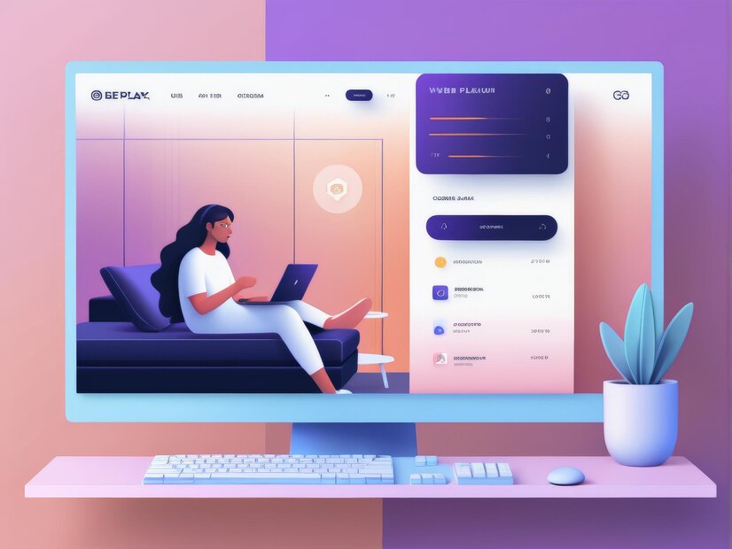
When it comes to creating visually appealing and highly functional website templates, incorporating distinctive framing elements can make a real difference in how a page feels. One technique that keeps showing up across editorial sites, portfolios, and modern SaaS marketing pages is adding boxed or framed sections to a layout, sometimes concentrated at the four corners, sometimes wrapping entire content blocks. This design choice is more than a visual flourish; done well, it contributes to how users read a page, where their eyes travel first, and how confidently they can find what they came for.
Why the Boxed Layout Trend Keeps Coming Back
Framing devices in design aren’t new; print magazines have used boxed pull-quotes and sidebar frames for a century to separate supplementary information from the main flow of text. What’s changed is how this idea translates to the web, especially with the recent rise of what’s often called “bento grid” design, named after the compartmentalized Japanese lunch box, where a page is broken into a grid of distinct, individually bordered or shadowed content cards rather than one continuous scroll. Apple’s product pages popularized this look at scale over the last few years, and it’s since spread through SaaS landing pages, portfolio sites, and app marketing pages because it does something genuinely useful: it lets a designer present several unrelated pieces of information (a stat, a testimonial, a feature screenshot) on the same screen without them visually bleeding into each other.
Corner-boxed layouts specifically, where framing elements sit in the four corners of a section or the whole page, work a little differently. Rather than compartmentalizing content into a grid, they use the corners as anchor points, drawing the eye toward the edges of the viewport and leaving the center open for a hero image, headline, or focal illustration. It’s a layout technique borrowed loosely from print poster design, where a strong central image is framed by smaller supporting text or icons at the corners, and it works well on the web specifically because it gives a page visual structure without needing heavy borders or dividers running through the middle of the content.
Why Use a Website Template with Four Corner Boxes?
- Enhanced Visual Appeal: Adding boxed elements to the corners of your template creates an engaging layout that draws the user’s eyes naturally around the content rather than letting them land flat in the center and stop. These boxed sections can be used for various purposes, such as highlighting promotions, social proof, contact shortcuts, or call-to-action buttons.
- Functional Design: Corner boxes can be strategically used to host interactive elements like navigation shortcuts, contact information, live chat triggers, or quick-access links. This approach maximizes the use of screen real estate on wide desktop viewports and helps keep the main content area free of clutter.
- Customizable for Brand Identity: With custom WordPress themes, the four-corner box treatment can be adapted to match a brand’s aesthetic. Whether you prefer bold, saturated color blocks or minimalist hairline outlines, the pattern flexes to suit very different visual identities without losing its underlying structure.
Practical Use Cases for Four Corner Boxes
- E-commerce Sites: Use corner boxes for limited-time offers, shipping guarantees, or promo codes to draw attention to conversion-driving information without cluttering the main product imagery.
- Portfolio Websites: Feature social links or a quick “view resume” button in a corner so it stays visible and accessible without competing with the featured work displayed front and center.
- Blogs and Content Platforms: Add a “trending now” module or featured-post card in a corner for easy discovery, giving return visitors a fast path to new content without disrupting the reading experience for first-time visitors.
- SaaS Landing Pages: Corner-anchored trust badges (security certifications, customer logos, uptime stats) reinforce credibility at the edges of a hero section while keeping the headline and CTA visually dominant in the center.
How to Actually Build This in CSS
Under the hood, corner-boxed layouts are usually built one of a few ways, and which approach makes sense depends on how much flexibility you need. The simplest method uses absolute positioning on pseudo-elements: setting a container to position: relative and then placing ::before and ::after elements at top: 0; left: 0; and bottom: 0; right: 0; respectively, each styled as a small bordered box or icon. This keeps the corner decorations out of the document flow entirely, so they don’t affect how the rest of the content wraps or reflows on smaller screens.
For layouts where the corner boxes actually need to hold real content, headings, buttons, or images, a CSS Grid approach tends to hold up better. Defining a grid-template-areas layout with named areas for each corner and a large central area lets you place genuine HTML elements precisely without relying on absolute positioning, which also means the corner content stays properly accessible to screen readers and keyboard navigation, something pseudo-element decoration alone can’t provide since generated content isn’t exposed to assistive technology the same way. A basic four-corner grid might define grid-template-columns: auto 1fr auto and grid-template-rows: auto 1fr auto, placing named grid areas at each of the four corners and letting the center area, spanning the middle row and column, hold the primary content.
Box shadows and borders are the other major visual tool at play here, and it’s worth being deliberate about them for performance reasons as much as aesthetics. A soft, low-opacity box shadow (something like box-shadow: 0 4px 12px rgba(0,0,0,0.08)) reads as considerably more modern than a hard 1px border in most 2026 design systems, but stacking several layered shadows across many corner elements on a single page can measurably affect paint performance, especially on lower-end mobile devices, so it’s worth testing actual render performance rather than assuming a subtle shadow is free.
Implementing the Pattern in Page Builders
You don’t need to hand-code CSS to pull this off; most modern WordPress page builders have caught up to this trend directly. Elementor’s Container element (which replaced the older Section and Column widgets) supports absolute positioning and custom flex or grid layouts natively, making corner-anchored elements straightforward to build visually. Divi’s Theme Builder and its newer Divi 5 flexbox-based layout system offer similar positioning controls, and Bricks Builder, which has gained real traction among WordPress developers specifically because it exposes raw CSS grid and flexbox properties in its interface, is arguably the most direct route to this look without writing custom code at all. For a more lightweight, block-based approach, native WordPress Gutenberg Group blocks combined with a theme that supports full CSS custom properties (Kadence and Astra both do this well) can achieve the same layout using block-level padding, position settings, and the Group block’s built-in overlay and background controls.
Responsive Behavior: The Part Most Tutorials Skip
Corner-boxed layouts look striking on a wide desktop viewport, but they need real rethinking below tablet width, not just scaling down. At around 768px and narrower, four independently positioned corner elements simply don’t have room to breathe without overlapping the central content or each other. The most reliable pattern is to collapse the corner elements into a single stacked column above or below the main content on mobile, using a CSS Grid’s grid-template-areas to redefine the layout entirely inside a media query rather than trying to shrink and reposition the same absolute-positioned elements. This is one of the clearest cases where “responsive” has to mean a genuinely different layout structure, not just smaller versions of the same one; a corner icon that made sense as a 40px accent in a 1200px-wide hero section usually needs to become a full-width row item once the viewport narrows past 480px, both for tap-target sizing (keep interactive corner elements at a minimum 40x40px touch target) and simple legibility.
Microinteractions and Hover States
Because corner elements often function as secondary navigation or quick links rather than passive decoration, they benefit from the same interaction polish you’d apply to a primary button. A subtle scale transform on hover (transform: scale(1.05) paired with a smooth transition: transform 0.2s ease) signals interactivity without being distracting, and it’s worth pairing that with a visible focus state for keyboard users, since corner elements are easy to overlook when testing tab order but just as easy for a keyboard-only visitor to land on unexpectedly. A soft focus ring using outline or box-shadow that matches your site’s accent color, rather than relying on the browser’s default blue outline, keeps the visual language consistent while still meeting basic accessibility expectations.
Where This Sits Alongside Neo-Brutalism
It’s worth placing corner-boxed and bento-style layouts against the broader neo-brutalist design trend that’s been running alongside it since around 2023, since the two get confused fairly often despite pulling in slightly different directions. Neo-brutalism on the web leans into visible structure: hard borders, high-contrast color blocking, deliberately “undesigned” typography, and an almost defiant rejection of soft shadows and rounded corners. Corner-boxed bento layouts share the same instinct toward visible compartmentalization, but they usually stay softer, rounded corners, subtle shadows, muted palettes, which makes the pattern far more adaptable across industries. A fintech dashboard, a children’s education platform, and a minimalist portfolio can all use a corner-boxed or bento grid structure while looking nothing alike, because the underlying grid logic is doing the organizational work while the surface styling, color, radius, shadow depth, carries the actual brand personality. That flexibility is a big part of why the pattern has had staying power rather than fading as a one-season trend.
A Worked Example: Building a Corner-Anchored Hero Section
Walking through one concrete build makes the abstract advice above easier to apply. Start with a full-width hero container set to position: relative with a fixed minimum height (something like min-height: 90vh on desktop) so the corner elements have a stable frame of reference regardless of how much text the central headline contains. Inside that container, place four small elements, say, a client logo strip in the top-left, a “watch the demo” video trigger in the top-right, a scroll-down indicator in the bottom-left, and a live chat or contact prompt in the bottom-right, each positioned with position: absolute and a consistent inset (commonly 24px to 40px from each edge on desktop, tightened to 16px on tablet). The central headline and CTA button sit in normal document flow, centered both horizontally and vertically using flexbox on the parent container (display: flex; align-items: center; justify-content: center;), which keeps them properly responsive even while the corner elements use absolute positioning around them.
The detail that separates a polished build from an amateur one is what happens at the in-between breakpoints, not just the extremes. At exactly 768px, a naive implementation often shows a headline overlapping a corner badge for a few dozen pixels of viewport width before the mobile stacking kicks in. Testing the design at 5 to 10px increments through your breakpoint range, not just checking 1440px, 768px, and 375px, catches these overlap bugs before a real visitor does. It’s tedious, but it’s the difference between a hero section that looks intentional at every size and one that quietly breaks for a meaningful slice of your mobile traffic.
Performance: What Actually Costs You
Corner-boxed layouts get a reputation for being performance-heavy, but the actual cost usually comes from specific implementation choices rather than the pattern itself. Multiple layered box-shadows on several elements simultaneously visible in the viewport force the browser to repaint larger areas on scroll and resize than a single flat border would, which shows up as janky scrolling on mid-range Android devices even when it’s imperceptible on a high-end desktop monitor during development. The fix isn’t to avoid shadows entirely, it’s to use a single, well-tuned shadow value applied consistently via a CSS custom property (--card-shadow: 0 2px 8px rgba(0,0,0,0.06)) rather than five slightly different shadow values scattered across a stylesheet, each recalculated independently by the rendering engine. Background images or icons placed in each corner should also be served through modern formats (WebP or AVIF) at the actual rendered size rather than a full-resolution asset scaled down by CSS, since four unnecessarily large corner images can add real weight to a hero section’s initial load, exactly the section a visitor sees first and judges the whole site by.
Common Mistakes with This Pattern
The most frequent mistake is treating all four corners as equally important, which produces a busy, directionless layout where a visitor’s eye has nowhere obvious to land first. Strong corner-boxed designs almost always establish a clear hierarchy, one corner (often top-left, following natural reading order in left-to-right languages) carries the most weight, while the others are genuinely secondary. Another common problem is inconsistent spacing logic between corners; if the top-left element sits 32px from the edge but the bottom-right sits 40px, the asymmetry reads as a mistake rather than a deliberate choice, even to visitors who couldn’t articulate why the layout feels slightly off. Finally, a lot of builds forget that RTL languages flip this entire logic; a layout hardcoded with left and right values rather than logical properties like inset-inline-start and inset-inline-end will need a second, separate implementation for Arabic or Hebrew content rather than adapting automatically, which is easy to miss if RTL support isn’t tested until late in a project.
Custom WordPress Themes with Flexible Designs
Custom WordPress themes and plugins empower website owners to implement distinctive features like corner-boxed layouts without extensive coding. Themes built with flexibility and performance in mind, ones that expose theme.json-based design tokens for spacing and color rather than hardcoding values into templates, make it far easier to apply a corner-box treatment consistently across a whole site rather than as a one-off hero section that doesn’t match the rest of the design. When a theme centralizes its spacing scale, color palette, and border-radius values as reusable tokens, updating the corner-box aesthetic sitewide, say, moving from sharp corners to a softer 12px radius as a brand refresh, becomes a handful of token edits rather than a manual pass through every template file, which matters enormously once a site has grown past a single hero section into dozens of pages using the same pattern.
How to Implement Boxed Corners in WordPress
If you’re looking to integrate this feature into your WordPress site, start by selecting a theme that supports custom layouts natively or a page builder like Elementor, Bricks, or Divi that exposes grid and flex controls directly in its interface. Sketch the layout on paper or in Figma first, deciding exactly what each corner element needs to communicate, before touching the builder, since corner-boxed designs fall apart quickly when content gets added ad hoc without a plan for how much text or how many elements each corner can realistically hold. Test the layout at your actual content lengths too; a corner box designed around a two-word label will often break visually the moment a client adds a longer heading, so build with realistic worst-case content from the start rather than lorem ipsum placeholder text that’s shorter than what will actually ship.
It’s also worth planning for content management from the start, not just the initial build. If a corner element is going to be edited by someone without design training, a site owner updating a promo badge seasonally, for instance, expose that content through a proper custom field (using Advanced Custom Fields or the native block editor’s block bindings) rather than hardcoding it into a template, so future updates don’t require touching CSS or risking a broken layout. A corner-boxed design that only looks good immediately after the developer hands it off, and starts drifting the moment a non-technical editor adjusts the text, isn’t really finished yet, however polished the initial screenshot looked.
Interesting Reads:
Best Software for Analyzing Video for Anomalies