A Shopify Design System: Sharing Tokens Between Shopify and WordPress Themes
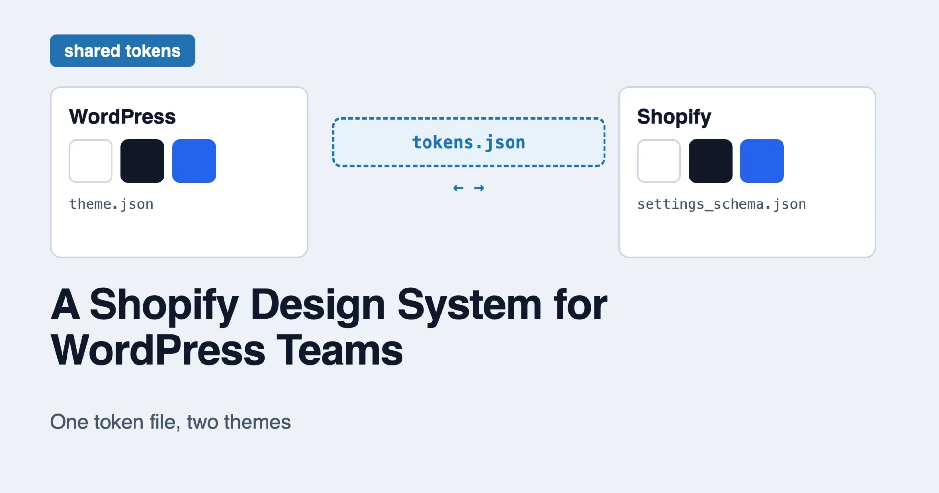
Short answer: Shopify’s own design system, Polaris, is for apps that run inside the Shopify admin. It is not the design system for a store’s storefront theme. A storefront theme keeps its design decisions in theme settings. If you want a Shopify design system that matches your WordPress theme, you share a small file of tokens (colors, type, spacing) and generate each platform’s own format from it. You do not share components.
This post explains that split, shows what a Shopify theme actually stores, and sketches a one-file token setup that feeds a WordPress theme.json and a Shopify theme. Shopify facts come from shopify.dev and the Shopify GitHub repositories. The generator code is my own sketch, and I have not run it, so treat it as a starting point.
Two things people call a Shopify design system
Search for “shopify design system” and you land on two different ideas. They are easy to mix up.
Polaris is Shopify’s design system for apps. The Shopify app design docs say it plainly: “For apps embedded into the Shopify admin, we recommend using the components and best practices of Polaris, Shopify’s unified system for building app interfaces.” The page on Polaris web components describes the library as a way “to display data, get input from merchants, and trigger API calls.” Its aim, in the docs’ words, is that your app “looks and feels native to the Shopify admin.”
Notice who that is for. It is for people building apps that merchants use in the admin. The pages I read do not mention storefront themes at all. So Polaris tells you how a settings screen in an app should look. It does not tell you how a customer-facing product page should look.
Theme design decisions are the second idea. A merchant’s storefront is a theme, and the theme holds its own colors, fonts and layout choices. This is the one a WordPress theme builder cares about, because it is the direct equivalent of a WordPress theme’s design settings.
If you are building a store front end and a WordPress site for the same brand, the second idea is the one to share. Polaris does not apply, unless you also build an app for the Shopify admin.
If you want the broader tour of how Shopify themes work for people who know WordPress, I wrote it in Shopify Theme Development for WordPress Theme Developers. This post builds on it and stays on one topic: shared tokens.
Where a Shopify theme keeps its design decisions
A Shopify theme has a config folder with two files that matter here. The docs describe both.
settings_schema.json“controls the organization and content of the Theme settings area of the theme editor.” It is required.settings_data.json“contains the saved values from the settings insettings_schema.json.” It is also required.
So the schema says which controls exist, and the data file stores what the merchant picked. Liquid, Shopify’s template language, reads the values through the settings object. The docs say theme settings are “accessed through the settings object,” so a setting with the id color_primary is read as settings.color_primary.
This is the same split you know from a WordPress block theme. In theme.json, settings decides what the editor offers, and the saved choices live in the database. Shopify just uses two files and a different vocabulary.
The theme_info entry
The schema file is an array of group objects. Each group has a name and a settings array. One special group describes the theme itself. The docs say to add an object named theme_info, and that it requires theme_name, theme_author, theme_version and theme_documentation_url, plus either theme_support_email or theme_support_url, but not both. Include both, or leave out a required key, and you get an error.
The docs show it for Dawn:
[
  {
    "name": "theme_info",
    "theme_name": "Dawn",
    "theme_author": "Shopify",
    "theme_version": "1.0.0",
    "theme_documentation_url": "https://help.shopify.com/manual/online-store/themes/os20/themes-by-shopify/dawn",
    "theme_support_url": "https://support.shopify.com/"
  }
]
One small catch: the example on the docs page has a trailing comma after the support URL, which is not valid JSON. I removed it above. The docs say the content must be valid JSON, so copy the version here and not the one on the page.
What kinds of settings exist
The input settings page lists the types and what Liquid gets back for each. The ones that matter for a design system are these.
| Setting type | What Liquid returns |
|---|---|
color | A color object, or blank |
color_scheme_group | Defines a set of color schemes in the schema |
color_scheme | The selected scheme, or nil if the theme has no scheme group data |
font_picker | A font object |
range | A number |
select | A string |
text_alignment | A string |
There are many more types, for products, collections, images and links. Those hold content choices, not design tokens, so they do not belong in a shared token file.
Two details are worth knowing.
Colors come back as objects. The Liquid color object has properties you can read. The docs’ example for the color #334fb4 lists red (51), green (79), blue (180), alpha, hue, saturation, lightness, chroma, and two ready-made strings: rgb (“51 79 180”) and oklch (“47% 0.16 268”). That means Shopify hands you a color already split into channels, which is handy for CSS variables that need opacity.
Fonts come back as objects too. The font_face filter takes a font object and outputs a CSS @font-face rule:
{{ settings.type_header_font | font_face }}The docs also describe an optional font_display parameter that sets the font-display value in the output.
I could not confirm on the pages I read how a color object prints when you output it directly, with no property. So the code later in this post uses the documented rgb property instead of guessing.
Settings at three levels
The docs say “theme settings can be applied at the section, block, and theme levels.” Sections are modular parts of a page that a merchant can add, remove and reorder. Blocks sit inside sections. The docs advise providing blocks “to add, remove, or reorder content at the section level,” and warn against blocks that are “too granular.”
For tokens, the theme level is the one you want. That is where colors and fonts that apply everywhere belong. Section and block settings are for local choices, such as the alignment of one banner.
What Dawn and Horizon say about themselves
Two Shopify reference themes come up often.
Dawn is the theme many people start from. Its README describes “a HTML-first, JavaScript-only-as-needed approach to theme development.” Its principles include being “web-native in its purest form,” lean and fast, server-rendered (“HTML must be rendered by Shopify servers using Liquid”), and functional rather than pixel-perfect across browsers.
Horizon is newer. Its README calls it “the flagship of a new generation of first party Shopify themes” and says it “incorporates the latest Liquid Storefronts features, including theme blocks.” The README also says Shopify is “not accepting contributions to Horizon at this time,” and that themes based on Horizon are not eligible for the Shopify Theme Store, which recommends the Skeleton Theme instead. I am passing on what the README says. Check the current README before you build on it, as that kind of policy can change.
Neither README mentions CSS variables or color schemes, so I will not claim how either theme handles them. If you want to see how a real theme turns settings into CSS, open its layout and snippets folders and read. That is a better source than any blog post.
Why share tokens and not components
Here is the key point for a two-platform design. A design token is a named value, such as color-primary: #2563eb or space-4: 1rem. It has no markup and no platform in it. Any system that can read a JSON file can use it.
A component is different. A product card in a WordPress block theme is block markup and block styles. A product card in a Shopify theme is Liquid, inside a section, with a schema. They share a look, but no code. You build the card twice.
So the practical design system for both platforms is:
- One file of tokens, owned by the design.
- A small script per platform that turns the tokens into that platform’s format.
- Components built separately on each side, reading the tokens.
I made the same argument about portability in One Design System, Four Platforms: How Brndle’s Tokens Survive the Astro/Ghost/Shopify Roadmap. That post is about one theme’s roadmap. This one is a how-to for the general case.
A token file both platforms can read
Keep it small. Roles, not shades, as in any good token set.
{
  "color": {
    "base": "#ffffff",
    "contrast": "#111827",
    "primary": "#2563eb"
  },
  "radius": {
    "card": "0.75rem"
  }
}
Three colors and one radius. A real file would have a spacing scale and a type scale too, but this is enough to show the flow.
Which platform owns the tokens?
Pick one owner, and it should not be a theme. The file lives in its own small repository or a shared folder, and both themes pull from it. If the WordPress theme owns it and the Shopify theme copies it by hand, the two will drift in a month.
One caution for Shopify: the merchant can change theme settings in the editor. Values stored in settings_data.json are the merchant’s choices, so your token file sets the defaults and the merchant may override them. That is a feature, but it means “one source of truth” holds for defaults, and you should decide whether you want merchants to override brand colors at all.
Direction one: tokens to WordPress
A block theme wants colors as a palette in theme.json. The handbook shows each entry as an object with color, name and slug, and says WordPress creates CSS variables in the form --wp--preset--{type}--{slug}. So primary becomes --wp--preset--color--primary.
Here is a small Node script that reads the token file and writes a palette. It is a sketch. I did not run it.
import { readFileSync, writeFileSync } from 'node:fs';

const tokens = JSON.parse(readFileSync('tokens.json', 'utf8'));

const palette = Object.entries(tokens.color).map(([slug, color]) => ({
  slug,
  name: slug.charAt(0).toUpperCase() + slug.slice(1),
  color,
}));

const out = {
  settings: {
    color: { palette },
    custom: { radius: tokens.radius },
  },
};

writeFileSync('theme-tokens.json', JSON.stringify(out, null, 2));
The output is a fragment, and the script writes it to a separate file on purpose. Merge it into your real theme.json by hand or with a second step, so you never overwrite hand-written settings by accident.
The custom entry follows the handbook: custom settings are “output as CSS custom properties.” So radius.card should become --wp--custom--radius--card. That naming comes from the WordPress CSS variable rules, and I did not re-verify it for this exact case.
Direction two: tokens to Shopify
On the Shopify side you need two outputs. First, schema entries so the merchant sees color pickers with your defaults. Second, a bit of Liquid that turns the settings into CSS variables so your stylesheet can use them.
The schema step reuses the same token file:
import { readFileSync, writeFileSync } from 'node:fs';

const tokens = JSON.parse(readFileSync('tokens.json', 'utf8'));

const settings = Object.entries(tokens.color).map(([key, value]) => ({
  type: 'color',
  id: `color_${key}`,
  label: key.charAt(0).toUpperCase() + key.slice(1),
  default: value,
}));

const schema = [{ name: 'Brand colors', settings }];

writeFileSync('settings-colors.json', JSON.stringify(schema, null, 2));
The setting type color is in the docs’ list, and so is the settings array inside a named group. I could not confirm on the pages I read that id, label and default are the exact attribute names, so check the input settings reference before you merge this into config/settings_schema.json. As with WordPress, the script writes a fragment and does not touch your real file.
The Liquid side is a style block, placed in your layout file. It uses the documented rgb property of the color object, which returns channels like 51 79 180:
<style>
  :root {
    --color-base: rgb({{ settings.color_base.rgb }});
    --color-contrast: rgb({{ settings.color_contrast.rgb }});
    --color-primary: rgb({{ settings.color_primary.rgb }});
  }
</style>
CSS accepts the space-separated form, so rgb(51 79 180) is valid, and you can add opacity with rgb(51 79 180 / 0.5). That is a useful trick for hover backgrounds, because you can write rgb(var(--primary-channels) / 0.1) if you output the channels alone.
One honest caveat: Shopify’s docs, in the pages I read, do not describe this “settings to CSS variables” pattern as a recommended practice. It is a common approach that follows from the settings object and the color object, and I am presenting it as my suggestion. A color setting can also return blank, so in a real theme you may want a fallback with a Liquid if or a CSS default.
The shared names
Once both outputs exist, give the two platforms the same role names. This is the whole point.
| Token role | WordPress CSS variable | Shopify setting id | CSS variable in the Shopify theme |
|---|---|---|---|
| Base color | --wp--preset--color--base | color_base | --color-base |
| Contrast color | --wp--preset--color--contrast | color_contrast | --color-contrast |
| Primary color | --wp--preset--color--primary | color_primary | --color-primary |
The names on the left are WordPress’s pattern. The names on the right are yours to choose. A small tip: if you want your component CSS to look the same on both platforms, define one extra layer of your own variables on the WordPress side too, such as --color-primary: var(--wp--preset--color--primary);. Then the component CSS only ever reads --color-primary, and each platform fills it in its own way.
What does not travel
Tokens are the easy half. Be clear about the rest before you promise a client a shared design system.
Layout. A WordPress template is block markup. A Shopify template is JSON that places sections, and the sections are Liquid files. There is no automatic conversion.
Components. Cards, headers, forms and product galleries are built twice.
The editor experience. WordPress editors work with blocks and patterns. Shopify merchants work in the theme editor with sections and blocks. The tools differ, so the training differs too.
Commerce logic. Cart, checkout and product data belong to the platform. A WordPress store would use a plugin, and a Shopify store uses Shopify. Tokens do not touch any of that.
Accessibility checks. Contrast must be checked on each platform with its real colors. If a merchant can change a color, they can pick an unreadable pair. Shopify’s color object gives you lightness values you can use, but I have not seen the docs describe a built-in contrast check, so plan your own.
Where Brndle fits
Brndle is the WordPress theme this site is about. Its public roadmap listed Shopify as “researching” with a Q1 2027 target when I checked it on 30 October 2026, and the same roadmap marked Astro as in development and Ghost as in design. That is from the earlier post I linked above, and I did not re-check the roadmap for this one. Nothing about Brndle on Shopify has shipped, so this post does not describe a Brndle Shopify theme.
What Brndle does have today is the shape that makes this approach possible. Its colors and fonts are stored as plain keys and hex values, not buried in templates, and they can be exported as JSON. That is the same idea as the token file in this post. If you build your own cross-platform setup now, you do not need to wait for anyone’s roadmap. A token file and two small scripts are enough to start.
A simple decision guide
Use a shared token file when:
- One brand runs both a WordPress site and a Shopify store.
- You want the same colors and type on both without copying values by hand.
- You can name an owner for the token file.
Skip it when:
- The Shopify store and the WordPress site are separate brands.
- The brand is still changing every week. Wait until the colors settle.
- Only one platform is live. Add the second platform’s output when it exists.
Start with colors only. They show the problem and the payoff quickly. Add type and spacing next. Leave motion and shadows for last.
Frequently asked questions
Is Polaris the design system for Shopify themes?
No. The Shopify docs recommend Polaris for apps embedded in the Shopify admin. The pages I read do not mention storefront themes. A theme keeps its design settings in settings_schema.json and settings_data.json.
Where do Shopify themes store colors and fonts?
In theme settings. settings_schema.json defines the controls, settings_data.json stores the saved values, and Liquid reads them through the settings object.
Can I use CSS variables in a Shopify theme?
CSS variables are plain CSS, so they work in a theme’s stylesheet. The docs I read do not prescribe a pattern for filling them from settings. The approach in this post, a <style> block that sets variables from settings, is my suggestion.
What is the difference between Dawn and Horizon?
Per their READMEs, Dawn is an HTML-first reference theme with minimal JavaScript, and Horizon is described as the flagship of a new generation of first-party themes that uses theme blocks. Read each README for current details.
Can WordPress and Shopify really share one design system?
They can share tokens: colors, type scales, spacing and radius. They cannot share components, because the markup and template systems are different. Plan to build components twice.
Does a shared token file replace theme.json?
No. theme.json stays the place WordPress reads its settings. The token file is the source that you generate part of theme.json from.
Do I need to know Liquid?
For the Shopify side, yes, at least enough to read settings and output a style block. Liquid is Shopify’s template language, and its docs are on shopify.dev.
Will this work with the Shopify Theme Store?
I did not check the Theme Store’s review rules, so I cannot say. If you plan to submit a theme, read the current submission requirements first.
The short version
Polaris is for apps in the Shopify admin. A storefront theme keeps its design decisions in theme settings, read in Liquid through settings. To share a design between a Shopify store and a WordPress theme, keep one small token file and generate each platform’s own format from it. Share tokens, build components twice, and decide up front who owns the file.
Start with three colors and one script per platform. If the names line up and the two sites look like one brand, add type and spacing. That is a small project, and it avoids the usual drift between a store and a site.
Source note: Polaris statements come from the Shopify docs pages on Polaris web components and app design guidelines. Theme settings, setting types, the color object, the font_face filter and theme_info come from the shopify.dev pages on config files, input settings, Liquid objects and Liquid filters. Dawn and Horizon statements come from their GitHub READMEs. WordPress details come from the Theme Handbook. The code samples are my own sketches and were not run or tested. The attribute names id, label and default for settings were not confirmed on the pages I read. Brndle roadmap status comes from an earlier post on this site and was not re-checked.