Five CSS Features That Change How You Build Block Themes
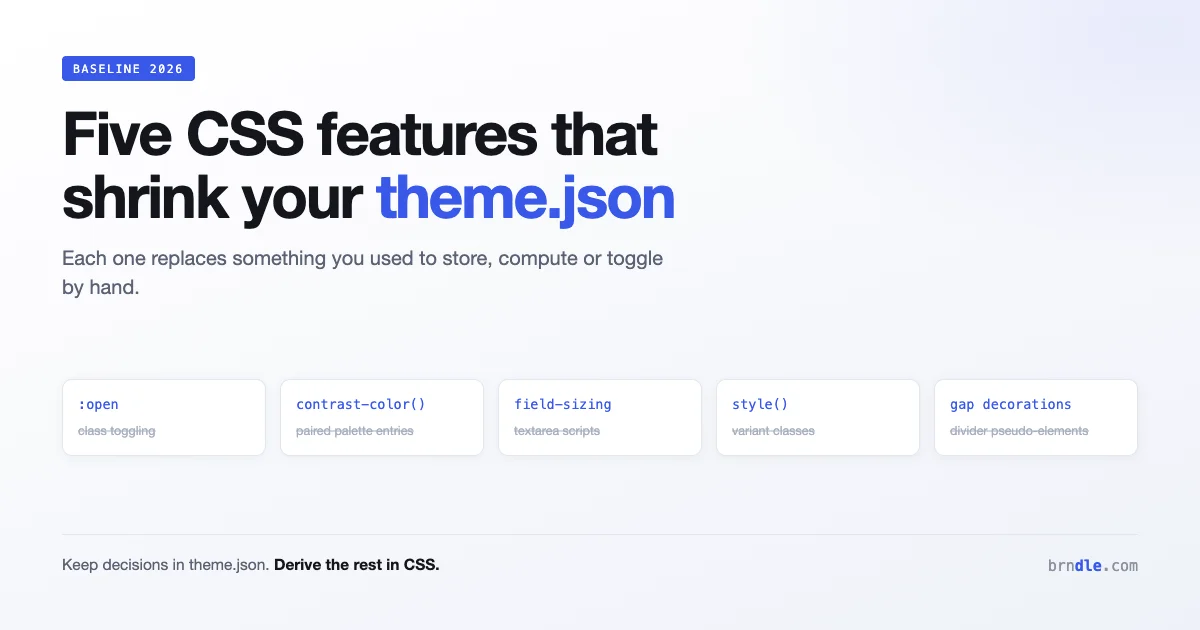
Five CSS features crossed into Baseline this year that change how you build a block theme. Not in the sense of new syntax to learn, but in the sense of deleting things: a JavaScript dependency here, a colour token there, a media query you no longer need.
This is a working guide to what is newly safe to use in 2026, what each one replaces in a block theme, and how each fits alongside theme.json rather than fighting it.
What Baseline actually promises
Worth a paragraph because it changes how confidently you can ship.
Baseline is a status describing support across Chrome, Edge, Firefox and Safari. Newly available means the feature works in the current version of all four. Widely available means it has been in all four for roughly two and a half years, which is the point at which most teams stop thinking about it.
Everything below is Newly available. That means it works in current browsers and does not work in versions from before the feature landed. For a block theme this usually argues for progressive enhancement rather than avoidance: use the feature, make sure the fallback is acceptable rather than broken.
| Feature | What it replaces | theme.json relevance |
|---|---|---|
:open | JS class toggling on details and dialog | Element styles, block styles |
contrast-color() | Manually paired text colours per palette entry | Palette and duotone definitions |
field-sizing | Auto-growing textarea scripts | Form block styling |
Container style() queries | Class-based variant plumbing | Custom properties from settings |
| Gap decorations | Pseudo-element divider hacks | Layout and spacing presets |
:open, and deleting your accordion JavaScript
The :open pseudo-class matches elements that are in their open state. That covers details when expanded, dialog when shown, and picker-style inputs while their picker is displayed.
For block themes this is most useful with the details block, which renders a native details element. Previously, styling the expanded state meant either the [open] attribute selector or a script toggling a class:
/* The old attribute selector approach */
.wp-block-details[open] > summary {
    border-bottom: 1px solid var(--wp--preset--color--contrast-2);
}

/* Now, and it covers dialog and pickers too */
.wp-block-details:open > summary {
    border-bottom: 1px solid var(--wp--preset--color--contrast-2);
}
For details alone the win is modest, since [open] already worked. The real gain is that one pseudo-class now covers every open-state element, so a theme that styles disclosure widgets, modals and pickers uses one consistent pattern instead of three different mechanisms. If you are also choosing tooling around this, our comparison of the best CSS frameworks in 2026 covers how much of this native capability makes a framework unnecessary.
Where this genuinely removes code is any custom block that reimplemented disclosure behaviour in JavaScript because styling the native state was awkward. That block can now be markup and CSS.
The pattern worth internalising: prefer the state the browser already tracks over a class you have to keep in sync.
contrast-color(), and the end of paired palette entries
This is the one with the biggest implications for theme.json.
Every theme author has built the same thing: a palette where each colour needs a companion text colour that reads against it. Define a background, then work out whether text on it should be near-black or near-white, then encode that pairing somewhere.
In theme.json that usually shows up as palette entries that exist only as partners:
{
  "settings": {
    "color": {
      "palette": [
        { "slug": "primary", "color": "#3858e9", "name": "Primary" },
        { "slug": "on-primary", "color": "#ffffff", "name": "On primary" },
        { "slug": "accent", "color": "#f6c344", "name": "Accent" },
        { "slug": "on-accent", "color": "#1e1e1e", "name": "On accent" }
      ]
    }
  }
}
Half that palette is machinery rather than design, and it clutters the colour picker your users see. Worse, the pairing is a manual judgement that goes wrong when someone edits a colour in the site editor and the partner does not follow.
contrast-color() hands the decision to the browser. Give it a background colour and it returns a colour that contrasts adequately with it:
.wp-block-button__link {
    background-color: var(--wp--preset--color--primary);
    color: contrast-color(var(--wp--preset--color--primary));
}
Now the palette holds only real colours, and the text colour is derived. When a user changes primary in the site editor, the button label follows automatically instead of becoming unreadable.
How to adopt it without breaking older browsers
Because the fallback matters here, do not simply swap. Declare a sensible static value first and let the modern declaration override it:
.wp-block-button__link {
    background-color: var(--wp--preset--color--primary);
    color: var(--wp--preset--color--base);
    color: contrast-color(var(--wp--preset--color--primary));
}
Browsers that do not understand the second declaration ignore it and keep the first. Browsers that do apply the derived colour. This is the oldest trick in CSS and it remains the right one.
Two honest limitations. The function optimises for contrast, not for brand, so it will return black or white rather than your carefully chosen off-white. And it evaluates against the colour you pass, not against whatever is actually painted behind a translucent element, so it can be confidently wrong where you have layered transparency.
field-sizing, and auto-growing inputs without script
field-sizing: content makes a form control size itself to its content instead of to a fixed default.
The classic case is the textarea that should grow as someone types. Every implementation of that has been JavaScript listening for input and setting height from scrollHeight. It is a few lines, everyone writes it slightly differently, and it misbehaves on paste and on initial render.
.wp-block-post-comments-form textarea.wp-block-search__input {
    field-sizing: content;
    min-height: 3lh;
    max-height: 20lh;
}
The min-height and max-height are not optional in practice. Without a minimum, an empty textarea collapses to one line and looks broken. Without a maximum, a long comment pushes your submit button off screen.
Note lh as the unit, which is the line height of the element. Sizing a text control in lines rather than pixels holds up better when your typography scale changes, which in a block theme it does whenever a user adjusts font size in the site editor.
The fallback is a normally sized textarea, which is exactly what everyone had before. This is about as safe as progressive enhancement gets.
Container style queries and theme.json custom properties
Container queries on size, which we covered in our guide to building truly responsive components, have been usable for a while. What completed this year is style() queries, which let a container respond to the computed value of a custom property rather than to its width.
This pairs unusually well with theme.json, because every setting you define there becomes a custom property. Define something in settings.custom:
{
  "settings": {
    "custom": {
      "density": "comfortable"
    }
  }
}
That produces --wp--custom--density, which you can then query:
@container style(--wp--custom--density: compact) {
    .wp-block-group {
        padding-block: var(--wp--preset--spacing--20);
    }
}
What this buys you is variants without variant classes. Previously, offering a compact mode meant adding a class at the top of a subtree and writing descendant selectors for everything that should respond. Now the value cascades like any custom property and each component decides for itself what to do about it.
For a design system that is a meaningful simplification: the switch is a property, the response is local, and nothing needs to know the class name.
Two caveats worth knowing before you build on it. Style queries currently work on custom properties rather than arbitrary CSS properties, so you cannot query whether something is display: flex. And a container that establishes containment for style queries has the same containment implications as any other container, so read what you are opting into before applying it broadly.
Gap decorations, and deleting divider pseudo-elements
Gap decorations let you draw lines in the gaps of a grid or flex layout, which sounds small until you count how many times you have faked it.
The old approach was a pseudo-element on each item, positioned into the gap, with careful rules to suppress it on the last item in each row. That last part is the problem: in a responsive grid you do not know how many items are in a row, so “no line after the last one” is not expressible.
/* Roughly the old approach, and it never handled wrapping properly */
.wp-block-columns > .wp-block-column:not(:last-child)::after {
    content: "";
    position: absolute;
    inset-block: 0;
    inset-inline-end: calc(var(--wp--style--block-gap) / -2);
    border-inline-end: 1px solid var(--wp--preset--color--contrast-3);
}
Gap decorations move this into the layout itself, so the browser draws the rules where gaps actually are, including after a wrap. The practical effect for a block theme is that a columns block or a query loop grid can carry dividers that survive being resized, which the pseudo-element version never reliably did.
This one is the newest of the five and the least broadly supported at time of writing, so treat it as decoration in the literal sense: pleasant when present, unremarkable when absent. Do not encode meaning in a line that half your visitors will not see.
What this means for design tokens
Zoom out from the individual features and there is a pattern worth naming, because it changes how a token layer should be structured.
Design systems built over the last decade encoded relationships as tokens. A background token and a matching foreground token. A spacing token and a tighter variant for compact contexts. A border token and a divider colour that happened to match it. The relationships were real, but the only way to express them was to compute them at build time and ship both ends.
What these features share is that the browser can now compute several of those relationships at runtime. That splits a token layer cleanly in two:
- Decisions that a human makes and a user might change: brand colours, the type scale, the spacing rhythm. These belong in
theme.json, where the site editor exposes them. - Derivations that follow mechanically from decisions: which text colour reads on that background, how tall a control needs to be for its content, whether a divider appears. These belong in CSS, computed.
The practical test for whether a token is a decision or a derivation: if a designer changed the parent value, would you have to go and update this one by hand? If yes, it is a derivation and it should not be a stored value.
Applying that to a typical block theme palette usually removes a third of it. Every on- prefixed entry, every -hover variant that is just a fixed darkening, every -border that is the same colour at lower opacity. None of those are decisions. They were storage for arithmetic nobody could do at runtime.
{
  "settings": {
    "color": {
      "palette": [
        { "slug": "primary", "color": "#3858e9", "name": "Primary" },
        { "slug": "accent", "color": "#f6c344", "name": "Accent" },
        { "slug": "base", "color": "#ffffff", "name": "Base" },
        { "slug": "contrast", "color": "#1e1e1e", "name": "Contrast" }
      ]
    }
  }
}
Four entries where there were eight or ten, a colour picker a user can actually understand, and the derived values computed where they are used. The theme is smaller and it responds correctly when someone changes a colour, which the larger version never did.
This is the argument for adopting these features that survives past the novelty: not that the syntax is nicer, but that a token layer holding only genuine decisions is a smaller thing to maintain and a harder thing to get out of sync.
Putting it together in a theme
A sensible order of adoption, given these all landed close together.
- contrast-color() first. It removes real complexity from your palette and improves what happens when users edit colours. Biggest payoff, lowest risk with a fallback declaration.
- field-sizing next. It deletes a script and the fallback is the current behaviour. Almost no downside.
- :open when you touch disclosure styling. Not urgent, since
[open]works, but it is the more general pattern. - Style queries when you have a real variant need. Powerful, and adopting it because it is new rather than because you need it adds indirection for nothing.
- Gap decorations last, as pure enhancement.
A note on where to put this CSS. Block themes give you several options and the choice matters for specificity. Styles that belong to a specific block go in that block’s stylesheet registered through block_stylesheet or in styles in your theme, so they load only when the block is used. Global element styles belong in theme.json under styles.elements where they can be expressed there.
Anything using these new functions has to live in an actual stylesheet, because theme.json expects values rather than arbitrary CSS. That is a real constraint: you cannot put contrast-color() in a palette definition. The palette stays declarative, and the derivation happens in CSS that consumes it.
Where each one sits in a block theme’s structure
Knowing a feature is safe is half the question. The other half is where the code belongs in a block theme, because block themes give you four places to put styles and they do not behave the same way.
theme.json styles. Declarative values, compiled by WordPress into stylesheets with low specificity that users can override in the site editor. This is the right home for anything a user should be able to change: colours, spacing, typography.
The theme stylesheet. Ordinary CSS, higher specificity, not editable by users. This is where the five features here have to live, since they are functions and queries rather than values.
Per-block stylesheets. Registered so they load only when the block is present. Best for anything specific to one block, and the reason a heavy details-block treatment does not cost anything on pages without a details block.
Block style variations. Registered named variations that appear in the editor as options.
The distinction that catches theme authors out is specificity. Styles from theme.json are deliberately generated with low specificity so user choices in the site editor can override them. Styles in your stylesheet are not, which means a stylesheet rule can silently defeat a user’s colour choice in the editor.
/* Too strong: beats the user's site editor choice */
.wp-block-button .wp-block-button__link {
    color: contrast-color(var(--wp--preset--color--primary));
}

/* Better: same specificity story as generated styles */
.wp-block-button__link {
    color: contrast-color(var(--wp--preset--color--primary));
}
The general rule when adding CSS that consumes preset properties: keep selectors as flat as the job allows. A user changing a colour in the site editor and seeing nothing happen is a bug report you will struggle to reproduce, because it depends on which selector won.
Testing this properly
Four checks, in the order that finds problems fastest.
- Front end in a current browser. Confirms the feature works at all.
- Front end with the feature disabled. In Chrome and Firefox you can toggle experimental features, but the simpler method is commenting out the modern declaration and confirming the fallback is acceptable rather than broken.
- Site editor canvas. The editor loads additional styles, and this is where specificity conflicts show up.
- Change a palette colour in the site editor and watch what follows. This is the check that validates
contrast-color()is actually doing its job. Set primary to something very light, then something very dark, and confirm the label flips.
That last test is worth doing deliberately rather than assuming, because it is the entire argument for the change. If the label does not flip, your selector specificity is wrong or you are passing a colour that is not the one being painted.
Questions people are asking
Can I use contrast-color() inside theme.json?
No. theme.json holds values, not CSS functions, so the derived colour has to be applied in a stylesheet that reads the preset custom property. Keep real colours in the palette and derive companions in CSS.
Do these work in the site editor as well as the front end?
Yes, since the editor renders your theme’s styles in the canvas. Check both anyway, because the editor applies additional styles of its own and a specificity conflict can show up in one and not the other.
Is it safe to drop my JavaScript for auto-growing textareas?
If your minimum supported browsers include the versions where field-sizing landed, yes. If you support older ones, the fallback is a normal fixed-height textarea, which is acceptable for most sites. It is not acceptable if the growing behaviour is load-bearing for the interface, in which case keep the script until support is wider.
Will using these hurt performance?
No, and several improve it by removing JavaScript. Style queries add some containment work, which is not a concern at the scale a typical theme uses them.
How do I know which of these my users’ browsers support?
Check your own analytics rather than a general support table. A theme sold to enterprise clients has a different browser mix from a personal blog, and Baseline status is a floor rather than a description of your specific audience.
Should I use @supports for these?
For contrast-color() and field-sizing, the declaration-override fallback shown above is simpler and does the same job. Reach for @supports when you need to change layout structurally depending on availability, rather than swap one value.
Your checklist
- Audit your
theme.jsonpalette for entries that exist only as text-colour partners. - Replace those with
contrast-color()in CSS, keeping a static fallback declaration first. - Add
field-sizing: contentto comment and search inputs, withmin-heightandmax-heightinlh. - Switch
[open]selectors to:opennext time you touch them. - Consider a
settings.customproperty plus a style query where you currently ship variant classes. - Treat gap decorations as enhancement only.
- Verify everything in the site editor canvas as well as the front end.
One practical warning before you start deleting palette entries. Removing a preset that existing content references will change how that content renders, because a block saved with has-on-primary-color now points at a class with no matching rule. If your theme has shipped, treat palette removals as a migration rather than a cleanup: keep the old entries defined, stop offering them in new work, and remove them only once you know nothing depends on them. On a theme that has never shipped, delete freely.
The theme through all five is the same: less state you have to track yourself. A class you toggle, a colour you pair by hand, a height you calculate, a variant you thread through selectors, a divider you position manually. Each of those was a workaround for something the browser could not do, and each is now something the browser does.