Construction website design plays a significant role in the construction industry, serving as a crucial element for businesses looking to thrive in the digital landscape. As construction companies, builders, architects, and design professionals increasingly turn to the internet for networking and information, the importance of a well-designed website cannot be overstated.
These websites have become integral marketing tools, allowing construction firms to showcase their projects, attract new clients, and stay ahead of the competition. Web designers specializing in construction websites focus on creating unique, visually appealing designs that not only reflect the company’s brand but also cater to the specific needs of the industry.
Construction Websites with Exceptional Design
By incorporating features such as project galleries, client testimonials, and informative content, these websites aim to engage visitors and convert them into leads. Additionally, responsive design ensures that the websites are accessible across various devices, further enhancing the user experience.
Construction Websites with Exceptional Design
Here, we’ve curated a list of 40 construction company websites that exemplify the best in design and functionality. These websites not only serve as sources of inspiration but also demonstrate the impact that effective web design can have on a construction business.
1. Connect Homes- Construction Website Design
The success of this construction website can be attributed to its interactive and engaging design, featuring a captivating introductory animation. The site utilizes high-quality images that exude professionalism and visual appeal, enhancing its overall aesthetic. Moreover, the strategic use of different font weights demonstrates thoughtful design choices, contributing to a cohesive and visually appealing layout.
One key aspect of the website’s effectiveness lies in its interactive elements, which not only grab the user’s attention but also encourage exploration. The use of animations and transitions adds a dynamic element to the site, making it more engaging and memorable for visitors.
2. Mike Schaap Builders
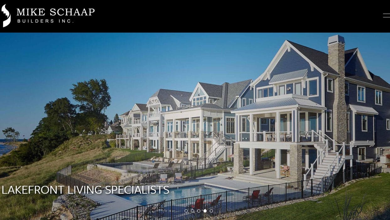
The website’s hero slider is a standout feature, combining simplicity with elegance to create a visually pleasing focal point. This element not only grabs the attention of visitors but also sets the tone for the rest of the site.
Despite its seemingly simple design, the website’s use of negative space is particularly noteworthy. By strategically incorporating empty spaces around elements, the design achieves a sense of balance and harmony. This not only enhances the overall aesthetic but also helps guide the user’s focus to key information and visuals.
3. Luxury Simplified- Construction Website Design
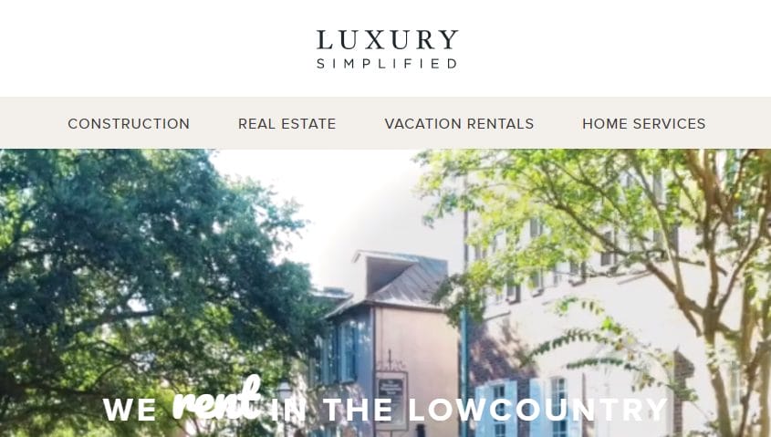
This construction company’s website excels in several aspects that contribute to its effectiveness. The hero section, for example, features an engaging video background that instantly captivates visitors, setting a vibrant and dynamic tone for the site.
In the services section, the use of unique and beautiful pictures enhances the presentation of the company’s offerings, making them visually appealing and engaging. This attention to detail not only showcases the services effectively but also creates a memorable impression on visitors.
One of the key strengths of the website is its clear and easy-to-find contact information. By prominently displaying this information and ensuring easy navigation throughout the site, the company makes it simple for visitors to get in touch, promoting better engagement and potential leads.
4. Ditto- Construction Website Design
This construction website stands out for its simple, modern, and stylish design, which creates a visually appealing and engaging experience for visitors. The use of high-quality photography, a hallmark of Ditto’s website, adds a level of professionalism and aesthetic appeal that sets it apart.
One of the key strengths of the website is its straightforward structure and navigation. The layout is clean and well-organized, making it easy for visitors to find the information they’re looking for. This user-friendly design enhances the overall usability of the site, ensuring a pleasant experience for visitors.
Also Read: 10 Best Small Business Website Designers Excelling in Their Field
5. Maman Corp- Construction Website Design
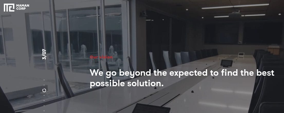
Browsing through the Maman’s Corp construction website is a truly immersive experience. Every detail of the site is captivating, from its engaging videos to its scroll-triggered transitions that keep visitors intrigued and involved.
One of the key strengths of the website is its thoughtful design, which extends to its choice of typeface and color scheme. The typeface is selected to enhance readability and convey a sense of professionalism, while the color scheme is carefully chosen to create a visually appealing and cohesive look.
6. Hutchinson Builders
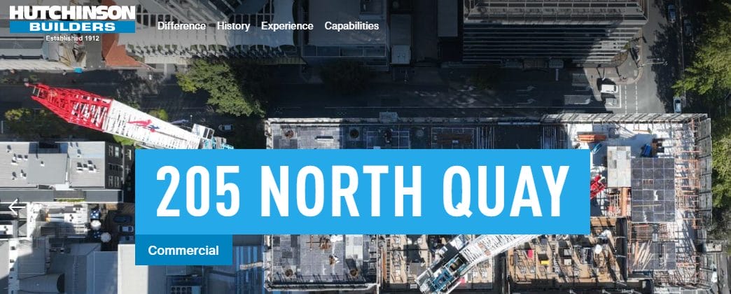
This construction website is visually appealing, with a well-thought-out design that incorporates various sizes of high-quality images and fonts. The consistent use of brand colors throughout the site adds to its overall attractiveness and professionalism.
One of the key strengths of the website is its easy navigation. The firm’s contact information, services page, and projects page are all readily accessible, making it convenient for visitors to find the information they need.
Also Read: HVAC Website Design Strategies for Building a Highly Effective and Well-Optimized Site
7. Bill Huey + Associates
The website of this commercial construction company stands out for its meticulous design and attention to detail. The structured layout is not only visually appealing but also user-friendly, ensuring that visitors can easily navigate the site and find the information they need.
One of the key strengths of the website is its consistent use of colors, which helps to create a cohesive and harmonious look. The subtle animations add a touch of interactivity without being distracting, enhancing the overall user experience.
8. Toll Brothers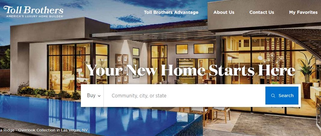
Construction Website DesignThe Toll Brothers’ website stands out for its elegant and sophisticated design, setting a high standard in the construction industry. The use of exceptionally high-quality background images throughout the site adds a level of professionalism and aesthetic appeal that is unmatched.
One of the key features of the website is the filter applied to the hero image, which enhances contrast and makes overlaid text easily readable. This attention to detail ensures that visitors can quickly grasp the message conveyed by the text, improving the overall user experience.
Also Read: Exploring Top WPForms Alternatives for Seamless Form Building
9. Re-Bath
The effectiveness of this construction company’s website can be attributed to several key elements. The homepage features images of smiling people and subtle backdrop art, creating an atmosphere of trust and friendliness. Despite the presence of a considerable amount of text, the website’s use of whitespace and section breaks makes the content visually appealing and easy to read.
One standout feature is the call-to-action button leading to the contact page, which is prominently displayed and always visible. This makes it easy for visitors to take the next step and contact the company for more information or to inquire about their services.
Also Read: SiteGround vs GoDaddy: Which Web Hosting Provider is Right for You?
10. Segale Bros- Construction Website Design
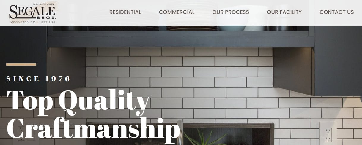
This construction website design is a prime example of excellence in both aesthetics and functionality. The color scheme is carefully chosen and well-balanced, enhancing the overall visual appeal of the site and creating a cohesive look. The colors complement the typefaces used, further contributing to the site’s polished and professional appearance.
One of the standout features of the website is the on-scroll transitional effects, which add a sense of vitality and interactivity to the homepage. These effects not only make the site more engaging but also help to draw the user’s attention to important content and features.
Conclusion on Construction Website Design
For business owners in the construction industry, a well-designed website is crucial for success. However, finding websites that accurately represent a company’s brand can be challenging. To help, we’ve curated a list of inspiring websites from around the web.
If your company is seeking a reliable partner to create an exceptional construction website and provide a great experience throughout the process, look no further. We offer to design a custom mockup of your new website at no cost or commitment. If you’re satisfied with our design, we can proceed with the project. If not, there’s no obligation. Click the button below to learn more.
Interesting Reads:
10 Best Small Business Website Designers Excelling in Their Field
Mastering Hotel Website Design: Best Practices and Inspiring Examples
Exploring Top WPForms Alternatives for Seamless Form Building

