What to Test in Your Block Theme for WordPress 7.2
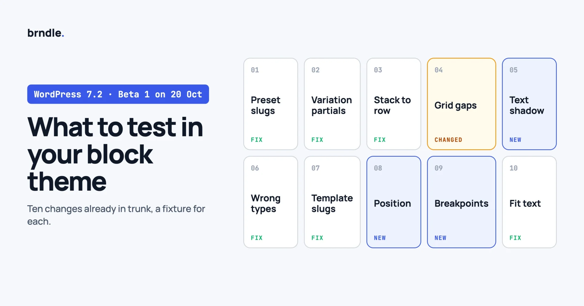
WordPress 7.2 Beta 1 is due on 20 October 2026 and the release on 8 December. You do not have to wait for the beta to start. Ten changes that affect block themes are already in WordPress trunk, and most of them are fixes to things themes have been working around: preset references that silently failed, responsive styles that were dropped, block gaps that produced no CSS. This post lists each one with a small fixture to test it.
A note on method. Every item below comes from a commit in the wordpress-develop trunk, read on 12 October 2026, with its Trac ticket linked. Trunk is not a release. A change can be adjusted or reverted before 7.2 ships, so treat this as the list to run against Beta 1, not a promise of what the final release contains. We will add a note here if the beta changes any of it.
In this guide:
- The dates that matter
- A test setup that takes ten minutes
- Ten things to test, each with a fixture
- Two fixes you may already have in 7.1
- Workarounds you can now remove
- What about Ipsum, the proposed default theme?
- A one-page checklist
- Questions theme authors ask
Which dates matter for a theme author?
These are from the WordPress 7.2 development cycle page. Check it again before you plan around a date, because schedules move.
| Date | Milestone | What to do |
|---|---|---|
| Now | Trunk | Build the fixtures below and run them on a nightly build |
| 20 October | Beta 1 | Run the full list. Report anything broken while it is cheap to fix |
| 10 November | Beta 4 | Re-run. Decide which workarounds you are removing |
| 17 November | Release Candidate 1 and the Field Guide | Read the dev notes against your list. Set your “Tested up to” plan |
| 1 December | Release Candidate 3 | Final pass on your demo content |
| 8 December | WordPress 7.2 | Ship your compatible release the same week |
What test setup do you need?
A throwaway site on a nightly build, your theme, and a page of fixtures. Do not test on a client site or your demo.
# On a local or staging site you can afford to lose
wp core update --version=nightly
wp config set WP_DEBUG true --raw
wp config set WP_DEBUG_LOG true --raw
wp theme activate your-theme
If you would rather click than type, the WordPress Beta Tester plugin switches a site to nightlies from the Tools menu, and after 20 October to the beta channel.
Then make one page called “7.2 fixtures” and add the blocks from each test below. Keep a second site on the current 7.1 release with the same page, so you can compare the two front ends side by side. A difference between them is the thing you are looking for.
Three habits make the list quick to run:
- Check the front end and the editor. Several of these changes are in server-rendered CSS, so the editor can look right while the front end is wrong, or the reverse.
- Read the generated stylesheet, not only the page. View source and search for the selector or the custom property named in each test.
- Keep
debug.logopen. One of the changes turns a fatal error into a quiet skip, and the log is where you see what was skipped.
1. Do your preset slugs with numbers or capitals now resolve?
What changed. WordPress turns a preset slug into kebab case when it generates the custom property, so a colour with the slug n27 becomes --wp--preset--color--n-27. But a reference written as var:preset|color|n27 was converted as typed, to --wp--preset--color--n27, which was never declared. The style silently fell back. Trunk now kebab-cases the slug in the reference too (#66121), and does the same for variable names in responsive styles (#65927).
Who is affected. Any theme with slugs that change under kebab-casing: a letter next to a digit (gray100, n27), or camel case (brandBlue).
Fixture. Add a palette colour with a slug like this, and use it in styles by reference:
{
  "version": 3,
  "settings": { "color": { "palette": [
    { "slug": "gray100", "name": "Gray 100", "color": "#f4f4f5" }
  ] } },
  "styles": { "blocks": { "core/quote": {
    "color": { "background": "var:preset|color|gray100" }
  } } }
}
Expected on 7.2. The quote block has the grey background, and the stylesheet uses --wp--preset--color--gray-100 in both the declaration and the reference. On 7.1 the background is missing.
Watch for. If you worked around this by hand-writing var(--wp--preset--color--gray-100), nothing breaks. If you worked around it with extra CSS that sets the colour again, you now have two sources for one value. Remove the extra.
2. Do responsive styles in your style variation files survive?
What changed. @tablet and @mobile styles were silently dropped from block style variations declared as a standalone JSON file in a theme’s styles/ folder. The same styles worked when the variation was declared inside theme.json. Trunk adds the breakpoint states to the schema for partials so the two behave the same (#65992).
Fixture. A partial at styles/block/card.json:
{
  "version": 3,
  "slug": "card",
  "title": "Card",
  "blockTypes": [ "core/group" ],
  "styles": {
    "spacing": { "padding": { "top": "3rem", "bottom": "3rem" } },
    "@mobile": { "spacing": { "padding": { "top": "1rem", "bottom": "1rem" } } }
  }
}
Expected on 7.2. A group with the Card style has 3rem of vertical padding on desktop and 1rem at phone width. On 7.1 it stays at 3rem.
Watch for. Variations that looked fine because the mobile override never applied. When it starts applying, layouts you approved months ago will change at small widths. Screenshot your demo at 390 pixels on both versions.
3. Does a stack that becomes a row on tablet really become a row?
What changed. row is the default flex direction, so the base layout never declares it. When a tablet or mobile override switched a vertical Stack to horizontal, the base flex-direction: column kept applying and the block stayed vertical. Trunk now outputs flex-direction: row in the override (#66096).
Fixture. A Stack with three buttons, with a viewport override that sets the layout to horizontal for tablet.
Expected on 7.2. Vertical on desktop, horizontal at tablet width. On 7.1 it stays vertical.
4. Do grid and gap values still look right?
What changed. Block gap values are now normalised in the layout support. The commit says it makes sure incorrect gap values do not cause errors, fixes responsive column sizing in Grid when the vertical and horizontal gaps differ, and makes sure layouts that do not support separate axis gaps still get correct values (#66263).
Fixture. Three blocks on the fixtures page:
- A Grid with a minimum column width and different row and column gaps, for example 3rem vertical and 1rem horizontal.
- A Columns block with a custom horizontal gap.
- A Group whose
blockGapcomes from a spacing preset.
Expected on 7.2. Grid columns wrap at the width you set, using the horizontal gap in the calculation. On 7.1, a grid with unequal gaps can wrap earlier or later than it should.
Watch for. Product or post grids in your patterns that show one column more or fewer at a given width. That is the fix working, and it can still be a visible change to a demo.
5. Do you want text shadow as a preset?
What changed. Text shadow becomes a proper block support. Blocks can opt in under their typography supports, and themes can define presets in theme.json. The text-shadow property is also added to the list of CSS properties allowed in inline styles (#65869). In the trunk source, the new settings are typography.textShadow and typography.textShadowPresets, a preset generates --wp--preset--text-shadow--{slug}, and the class is has-{slug}-text-shadow.
Fixture. This is our reading of the trunk code, so confirm the shape against the 7.2 dev note when it is published:
{
  "version": 3,
  "settings": { "typography": {
    "textShadow": true,
    "textShadowPresets": [
      { "slug": "soft", "name": "Soft", "textShadow": "0 1px 2px rgba(0, 0, 0, 0.25)" }
    ]
  } }
}
Expected on 7.2. The stylesheet declares --wp--preset--text-shadow--soft. Blocks that opt in show a text shadow control.
Watch for. If you set text shadow on headings over images through custom CSS today, plan to move it to a preset once 7.2 is your minimum version. Until then, keep the CSS. We covered the earlier, styles-only form in Three New theme.json Powers in WordPress 7.1.
6. Does a malformed theme.json value still take the site down?
What changed. WP_Theme_JSON no longer throws a fatal TypeError when theme.json or global styles data contains a value of the wrong type. The commit covers spacing scale arrays, block variation selectors and custom block CSS, and says the motivation was a real fatal where the custom CSS processor tried to split a value that was not a string. It also notes that such values “could be user- or AI-generated” (#66286).
Fixture. On the throwaway site only, put an object where a string belongs:
"styles": { "blocks": { "core/paragraph": { "css": { "color": "red" } } } }Expected on 7.2. The site loads and the bad value is ignored. On 7.1 this kind of mistake can produce a fatal error.
Watch for. A quieter failure is still a failure. A value that used to crash the page now does nothing, so a typo in a style variation can ship unnoticed. Validate your JSON files against the schema in your build, and do not rely on core to tell you.
7. Are your nested templates still found under the same slug?
What changed. Block template and template part slugs are now derived by stripping the theme directory and the template directory from the front of the file path. The commit says slugs are correct regardless of where the theme is located or how its folder is named, and for templates in nested subdirectories (#65580). A separate trunk change constrains block template file resolution to the template directory.
Who is affected. Themes that keep templates or parts in subfolders, themes whose folder name contains the word templates or parts, and child themes.
Fixture. No new file needed. In the Site Editor, open the template list and the template part list and compare them with 7.1. Then check that customised templates saved in the database still attach to the right file.
Expected on 7.2. The same list, with any oddly named entries corrected.
Watch for. A user-customised template that no longer matches its file because the slug changed. If you find one, that is worth a bug report during the beta, with the folder layout that triggers it.
8. Do sticky and positioned blocks behave per viewport?
What changed. The position block support gains per-viewport output, so position can be set within viewport states (#66166).
Fixture. A sticky Group at the top of a long page, with a different position setting for the mobile state.
Expected on 7.2. Sticky on desktop, and whatever you set for the phone state at phone width.
Watch for. Custom CSS in your theme that un-sticks a header at small widths with a media query. It will keep working, but it now competes with a setting the user can change. Decide which one owns the behaviour.
9. Does your custom CSS use the same breakpoints as core?
What changed. A new public function, wp_get_viewport_media_queries(), returns the media queries core uses for viewport states. By default the keys are @mobile and @tablet, and an option adds @desktop (#66150).
if ( function_exists( 'wp_get_viewport_media_queries' ) ) {
	$queries = wp_get_viewport_media_queries();
	// Use $queries['@mobile'] and $queries['@tablet'] when you print
	// your own CSS, so your breakpoints match the editor's.
}
Why it matters. If a theme’s stylesheet switches layout at 782 pixels and the editor’s mobile state switches somewhere else, users see two different “phone” layouts between those widths. For custom blocks and any CSS you generate in PHP, read the queries from core. For a static stylesheet, at least compare your numbers with what the function returns and note the difference.
10. Does fit text work on your dynamic blocks?
What changed. The has-fit-text class is now injected into the block wrapper during server-side rendering, so fit text also takes effect on dynamically rendered blocks (#65973). A related performance change skips the state styles work for blocks that have no style attribute, which is most blocks on most pages.
Fixture. A dynamic block that renders a heading, such as a post title or a query title, with fit text switched on.
Expected on 7.2. The wrapper has the class and the text scales to the container. Check that your own heading sizes and clamp() rules do not fight it.
Which two fixes might you already have?
Two changes from the same period were also committed to the 7.1 branch, so a current 7.1 point release may already include them. Test them anyway if you built a workaround.
- Block style variations with a block gap. A variation that declared
spacing.blockGapsilently produced no CSS, because the layout support check ran against the variation, which is not a registered block (#66044). - Element styles set only inside a breakpoint. The stylesheet returned nothing for an element style that existed only inside a breakpoint, and printed a stray pseudo-class rule in one responsive case (#65827).
Which workarounds can you now remove?
Go through your stylesheet and your theme.json looking for these patterns. Each exists because of a bug in the list above.
| If your theme has | It was probably for | What to do |
|---|---|---|
Hand-written var(--wp--preset--...) where a var:preset|... reference would do | Slug not kebab-cased in references (test 1) | Leave it, or switch to references once 7.2 is your minimum |
| A media query repeating a style variation’s mobile padding | Responsive styles dropped from partials (test 2) | Remove after 7.2 is your minimum, or you set it twice |
flex-direction: row !important in a breakpoint | Stack to row override ignored (test 3) | Remove. It will block the user’s own setting |
CSS setting gap on .is-style-* groups | Variation block gap producing no CSS (#66044) | Remove once you confirm the generated rule is there |
| Custom grid column widths to correct wrapping | Unequal axis gaps in Grid (test 4) | Test without it first |
The rule we follow: a workaround stays until the fixed version is the lowest one the theme supports, and it is deleted in the same release that raises the minimum. Write the ticket number in a comment next to each one so the next person knows when it can go.
What about Ipsum, the proposed default theme?
Ipsum was announced on 16 September 2026 as the proposed default theme for 7.2: a deliberately minimal blog theme and a blank canvas, with a name that ends the run of year-named default themes. When we looked on 12 October, the trunk themes folder did not contain it yet, so there is nothing to test against today.
What it means for a commercial theme is mostly about expectations. A blank default tells new users that a theme is a starting point they are meant to fill in, and it makes the comparison with a finished commercial theme more obvious, in your favour. It also becomes the theme support staff ask customers to switch to when isolating a bug, so make sure your patterns and block styles do not assume your own theme’s CSS is present. Run your patterns on a blank block theme now and see what falls apart.
A one-page checklist
- Nightly site and a 7.1 site, same fixtures page on both.
- Preset slugs with digits or capitals: reference resolves (test 1).
- Style variation partials: mobile and tablet styles apply (test 2).
- Stack switches to row at tablet width (test 3).
- Grid with unequal gaps wraps at the right width (test 4).
- Text shadow preset declared and offered (test 5).
- A wrong-typed value is skipped, and your build validates the JSON (test 6).
- Template and part lists match, customised templates still attach (test 7).
- Sticky header override per viewport (test 8).
- Your breakpoints compared with
wp_get_viewport_media_queries()(test 9). - Fit text on a dynamic heading (test 10).
- Form elements, if you style them in
theme.json: see Form Styling Is Moving Into theme.json. - Demo screenshots at 390, 768 and 1280 pixels on both versions, compared.
debug.logempty after loading every template once.
Questions theme authors ask
Is it too early to test before Beta 1?
No, as long as you treat the results as provisional. Building the fixtures is the slow part, and they work the same on the beta. Problems reported before and during the beta are also the ones most likely to be fixed before release.
Where do you report a problem?
On WordPress Trac for core behaviour, with the smallest theme.json that shows it. If the ticket for the change is still open, comment there. Include both versions and what you expected.
Should you raise your theme’s minimum version to 7.2?
Not at release. Most of this list is fixes, so your theme works on 7.1 as it does today. Raise the minimum when you want to depend on a new feature, such as text shadow presets, and when your customers have had time to update.
Will any of these break an existing site?
They change output in places where the old output was wrong. That can still surprise a site owner: a mobile padding that starts applying, a grid that wraps differently. Tell your customers in your release notes which layouts may shift and why.
Do classic themes need this list?
Only if they ship a theme.json. Tests 1, 4 and 6 apply to any theme with one. The template and style variation items are for block themes.
What is not on this list?
Editor interface changes, which arrive through the Gutenberg plugin and are easier to judge on the beta, and anything announced but not yet in trunk. We left those out on purpose. A test list should only contain things you can run.
We will run this list again on Beta 1 and note here what changed. If you want a block theme whose palette, spacing and patterns are built to survive changes like these, start at brndle.com.