Form Styling Is Moving Into theme.json: What Works Today and What 7.2 Adds
Every block theme with a design system has the same hole in it. Colours, spacing, typography and buttons come out of theme.json and stay consistent because nobody can edit them by hand. Then a contact form appears, and the inputs look like whatever the browser decided, so somebody writes CSS in style.css to fix it. That CSS is now outside the system: it does not read your tokens unless you remember to, the editor does not know about it, and a client who changes the palette in the Site Editor gets a form that stays the old colour.
Two things are closing that hole. One shipped quietly in WordPress 6.9 and is available in every site you run today. The other is on the roadmap for 7.2 in early December. This guide covers what you can do right now, what is coming, and how to structure a theme so the second one is a settings change rather than a rewrite.
What you can already do: form elements in theme.json
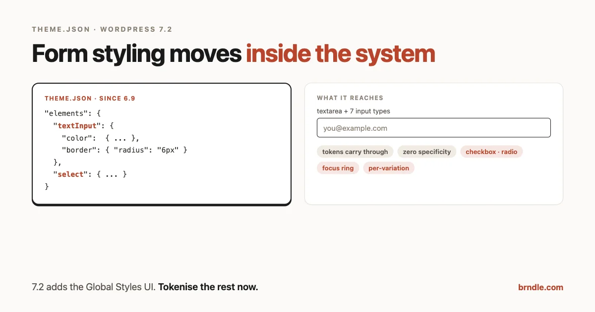
WordPress 6.9 added two element types to theme.json that most theme authors have not noticed: textInput and select. They join the familiar set of link, heading, button, caption and cite.
Here is the whole thing in practice:
{
	"version": 3,
	"styles": {
		"elements": {
			"textInput": {
				"color": {
					"background": "var(--wp--preset--color--base)",
					"text": "var(--wp--preset--color--contrast)"
				},
				"border": {
					"radius": "6px",
					"width": "1px",
					"style": "solid",
					"color": "var(--wp--preset--color--contrast-2)"
				},
				"spacing": {
					"padding": {
						"top": "0.6rem", "right": "0.8rem",
						"bottom": "0.6rem", "left": "0.8rem"
					}
				},
				"typography": {
					"fontSize": "var(--wp--preset--font-size--small)"
				}
			},
			"select": {
				"border": { "radius": "6px" }
			}
		}
	}
}
We ran that through WP_Theme_JSON on WordPress 7.1 to see exactly what core generates, because the selector is the interesting part:
textarea, input:where([type=email],[type=number],[type=password],[type=search],[type=text],[type=tel],[type=url]) {
	background-color: var(--wp--preset--color--base);
	border-radius: 6px;
	border-color: var(--wp--preset--color--contrast-2);
	border-width: 1px;
	border-style: solid;
	color: var(--wp--preset--color--contrast);
	font-size: var(--wp--preset--font-size--small);
	padding-top: 0.6rem;
	padding-right: 0.8rem;
	padding-bottom: 0.6rem;
	padding-left: 0.8rem;
}

select {
	border-radius: 6px;
}
Three things worth noting in that output.
The input selector is deliberately narrow. It lists seven input types by name and wraps them in :where() so specificity stays at zero. Checkboxes, radios, file inputs and range sliders are not included, which is correct: styling those with text-input rules produces a mess. It also means your theme still needs its own rules for them.
Your tokens carry through. Because the values are var(--wp--preset--color--*) references, a palette change in the Site Editor moves the form with everything else. That is the entire point, and it is the thing hand-written form CSS never does.
The select rule has no :where(). It is a plain element selector, so it sits at specificity 0-0-1 and a stray .my-form select in a stylesheet will still beat it. Worth knowing before you conclude that your theme.json is being ignored.
What is still missing today
No checkbox, no radio, no file input, no range, no fieldset or legend, and no focus states through theme.json. Core defines pseudo-selectors such as :hover and :focus only for link and button elements, so a focus ring on an input is still a stylesheet job.
That gap matters for accessibility, so keep it deliberate rather than accidental:
/* Focus states are not expressible in theme.json yet.
   Keep them in one place and use the same tokens. */
:where(textarea, input, select):focus-visible {
	outline: 2px solid var(--wp--preset--color--contrast);
	outline-offset: 2px;
}
Scoping form styles to a block, and where that stops
Element styles are not limited to the global level. You can nest them under a block, which is how you give a newsletter group or a search area its own input treatment without a class name:
{
	"version": 3,
	"styles": {
		"blocks": {
			"core/group": {
				"elements": {
					"textInput": { "border": { "radius": "2px" } }
				}
			}
		}
	}
}
That produces a correctly scoped rule, again at zero specificity:
:root :where(.wp-block-group textarea.wp-block-group input:where([type=email],[type=number],[type=password],[type=search],[type=text],[type=tel],[type=url])) {
	border-radius: 2px;
}
Now the limitation, which is the part worth knowing before you plan a system around it. We tried the same thing one level deeper, inside a registered block style variation:
"blocks": {
	"core/group": {
		"elements":   { "textInput": { "border": { "radius": "2px"  } } },
		"variations": {
			"card": {
				"elements": { "textInput": { "border": { "radius": "14px" } } }
			}
		}
	}
}
On WordPress 7.1, with the variation registered and variation output enabled, the only rule generated was the block-level one. The variation’s element styles produced nothing.
So the practical boundary today is: global elements, yes; per-block elements, yes; per-variation elements, no. If your design system has a “Card” or “Inverse” variation that needs different input styling, that still belongs in a stylesheet keyed on the variation’s class:
:where(.is-style-card) :where(textarea, input) {
	border-radius: var(--wp--custom--radius--large, 14px);
}
Keep that rule next to the variation’s other styles rather than in a general forms file, so it moves with the variation if it ever becomes expressible in theme.json.
The companion stylesheet, written once
Everything theme.json cannot express yet still needs to exist, and the goal is that it reads from the same tokens so it never drifts. This is the whole of it for a typical theme:
/* Form controls: the parts theme.json cannot express yet.
   Every value is a token so the palette stays the source of truth. */

:where(textarea, input, select):focus-visible {
	outline: 2px solid var(--wp--preset--color--contrast);
	outline-offset: 2px;
}

:where(input[type="checkbox"], input[type="radio"]) {
	accent-color: var(--wp--preset--color--primary);
	inline-size: 1.1em;
	block-size: 1.1em;
}

:where(textarea, input)::placeholder {
	color: var(--wp--preset--color--contrast-2);
	opacity: 1; /* Firefox lowers this by default. */
}

:where(textarea, input, select)[disabled] {
	background-color: var(--wp--preset--color--base-2);
	color: var(--wp--preset--color--contrast-2);
	cursor: not-allowed;
}

:where(textarea, input):user-invalid {
	border-color: var(--wp--preset--color--error, #b8442b);
}

@media (prefers-reduced-motion: no-preference) {
	:where(textarea, input, select) {
		transition: border-color 120ms ease;
	}
}
Two notes on that. accent-color is the one-line way to bring checkboxes and radios into your palette without rebuilding them out of pseudo-elements, and it keeps the native control, which is better for accessibility than almost every custom replacement. And :user-invalid only matches after the user has interacted, unlike :invalid, which paints an empty required field red before anyone has typed anything.
Where each piece lives today
| Styling | Today | Direction in 7.2 |
|---|---|---|
| Text inputs, textarea | theme.json elements | Same, plus a UI in Global Styles |
| Select | theme.json elements | Same, plus a UI |
| Per-block inputs | theme.json blocks | Unchanged |
| Per-variation inputs | Stylesheet | Not announced |
| Checkbox, radio | Stylesheet | Possibly, “common form elements” |
| Focus, placeholder, disabled, invalid | Stylesheet | Not announced |
| Buttons | theme.json elements, with pseudo states | Unchanged |
The right-hand column is the reason to tokenise rather than wait. Only two rows are likely to move, and the ones that stay are the ones you would have had to write anyway.
What 7.2 adds
According to the roadmap published on 18 September, WordPress 7.2 is due in early December, and the form work is stated plainly: give users “the ability to style common form elements consistently in Global Styles, without writing custom CSS”.
Read that as two separate changes with different consequences for a theme author.
A Global Styles interface for form elements. Today the JSON above is developer-only. A UI means the person you handed the site to can change input styling without opening a file, and they will. That is good, and it means your defaults have to be right rather than merely present.
Broader coverage, most likely. “Common form elements” reads as more than two element types. Do not design around any specific list until the tracking issues land, but do design around the direction: form controls are becoming part of the styling system rather than sitting outside it.
Three other items in the same roadmap matter for design systems:
- Responsive styling gets “a public API for third party blocks with custom controls”. Responsive values inside block settings, expressed through an API your own blocks can use, is a structural change to how a theme expresses breakpoints. We covered the current syntax in the responsive
@prefix piece, and this is where it is heading. - Two new blocks. A Description List block and a Table of Contents block. Both are the kind of thing sites currently solve with a plugin or a pattern, and both will need styles in your system on day one.
- A new default theme called Ipsum, described as “an intentionally minimal blog theme that centers on a blank canvas to make your own”.
There is also early work on a “sudo mode” that gates privileged actions behind re-authentication. That is a security feature rather than a design one, but it is worth knowing about if you build admin-facing tools.
Why a blank-canvas default theme is a design-system story
It is tempting to file “new default theme” under news. It is more useful than that, because default themes are how most people learn what a block theme is supposed to look like, and what a reference theme.json is supposed to contain.
The Twenty-something themes were opinionated: a point of view on typography, a specific palette, layouts with personality. That makes them good showcases and awkward starting points, because half the work of using one is removing decisions you did not make.
A deliberately minimal default changes the reference implementation. If you build client themes, the practical question to ask when it lands is how small its theme.json is. A blank canvas either means “fewer opinions, same structure”, which is useful as a base, or “less structure”, which means your own base theme still does the heavy lifting. Either way, read its theme.json the week it ships, and diff it against your own starting point.
What is in the editor right now: Gutenberg 24.0
The roadmap is December. Gutenberg 24.0 shipped on 16 September, and several of its changes affect themes today.
- The Gallery block gets a grid variation. A real grid layout replacing the flex default, with column count and image cropping set per breakpoint through viewport states. If your theme ships gallery styling, check it against the new markup.
- Site Title can scale to fit. The block supports fit-text behaviour, so the title fills the available width instead of using a fixed size. That interacts with any fluid typography you have configured, so it is worth a look in a template rather than a description.
- Background images can come from a URL. Background image support no longer requires a Media Library entry, which is convenient and also means background images can now point anywhere. If your design system assumes theme-managed art direction, that assumption is now softer.
- Roughly 100 icons were redrawn into a consistent stroke-based language. If your admin-side UI borrows core icons, expect visual drift.
- Layout styles for block style variations were fixed, along with colour ramp handling for theme tokens. Both are small, and both are the kind of fix that silently changes output you were compensating for.
The last one is worth a sentence of advice. If your theme contains CSS written to work around a Gutenberg layout bug in style variations, that workaround is now a liability rather than a fix. This is the general hazard of compensating for upstream bugs in a design system: the compensation outlives the bug.
The parts of your site this already covers
Before writing any new CSS, it is worth knowing how much of a normal site is already inside the selector. Core renders real input and textarea elements in the places that matter most:
- The comment form. Author, email and website fields are
input type="text"and the comment box is atextarea, so all four pick up yourtheme.jsonstyling with no work. - The Search block. Its field is
input type="search", which is in core’s list. Its button is a button element, which yourbuttonelement styles already cover. - The login and registration screens. Standard inputs, though these are admin-side and styled by core rather than your theme, so treat them separately.
That is most of the forms on a content site covered by one block of JSON. What is left is usually a plugin: a contact form, a checkout, a membership signup. Those are worth testing individually rather than assuming either way.
When your styling loses, and how to tell
Everything core generates for elements is wrapped in :where(), which means zero specificity. That is deliberate, because it lets users override in the editor. It also means almost any rule a plugin ships will beat it.
The specificity arithmetic, in order:
| Rule | Specificity | Wins? |
|---|---|---|
:root :where(textarea, input:where(...)) from theme.json | 0-0-0 plus the :root prefix | Loses to almost everything |
select { } from theme.json | 0-0-1 | Loses to any class |
.wpforms-field input { } from a plugin | 0-1-1 | Wins |
#content input { } from an old theme | 1-0-1 | Wins everything above |
So when an input refuses to take your radius, do not add !important. Find out what is winning:
// In the console, on a page with the form:
const el = document.querySelector('input[type="text"]');
getComputedStyle(el).borderRadius;   // what you actually got
Then open the element in DevTools and read the Styles panel from the top: the winning rule is first, with the losers struck through beneath it. That tells you which stylesheet to argue with, and usually the honest answer is to accept the plugin’s markup and add one scoped rule of your own rather than fighting the cascade globally.
If you do need to win, prefer raising your own specificity by one class over using !important, because the user’s Global Styles changes should still be able to beat you. An !important in a theme is a decision that your client cannot undo through the interface, which is exactly what a design system is supposed to avoid.
A migration plan you can start today
You do not need 7.2 to benefit from any of this. The work is the same either way, and doing it now means December is a settings change.
1. Inventory your form CSS
Find everything in your theme that styles a form control:
grep -rn -E 'input|textarea|select|checkbox|radio|::placeholder|:focus' \
  --include='*.css' --include='*.scss' assets/ style.css | grep -v '\.min\.'
Most themes are surprised by the length of that list, and by how many of the values are hard-coded hex colours and pixel sizes that pre-date the palette.
2. Split it into three piles
- Expressible in theme.json today: background, text colour, border, padding and font size on text inputs and selects. Move these now.
- Not expressible yet, but token-able: checkboxes, radios, focus rings, placeholder colour, disabled states. Keep them in CSS but rewrite the values as
var(--wp--preset--*)so a palette change still moves them. - Genuinely bespoke: a custom select, a multi-step form layout, anything driven by a plugin’s markup. Leave it alone and document why.
That second pile is the important one. It is the difference between “we will adopt the new feature when it lands” and “we will delete some CSS when it lands”.
3. Check what your form plugin does
Core’s selector only reaches real input and textarea elements. Most form plugins render exactly those, which means your theme.json styling applies automatically, and that is usually what you want. Some render their own wrappers with strong selectors, which will win. Test with the plugin your clients actually use before promising consistency:
/* Does the plugin's field inherit your theme.json styling? */
/* Load a page with a form, then in the console: */
getComputedStyle(document.querySelector('input[type=text]')).borderRadius;
If that returns your radius, you are done. If not, find the rule that is winning before adding another one on top.
4. Decide who is allowed to change what
Once form styling reaches Global Styles, it becomes editable by whoever can open the Site Editor. For a client site, that may be exactly right, or it may be one more surface to constrain. Our guide to custom block supports and editor controls covers how to think about what to expose, and the same reasoning applies here: the controls you leave on are the decisions you are delegating.
What not to do yet
A roadmap is a statement of intent by people who ship on a schedule, not a specification. Between now and December the shape of the form styling work can change, and features do slip.
So: build against what exists today, which is the two element types plus your own tokenised CSS. Read the tracking issues before you restructure anything around the new API. And do not ship a client theme that depends on a proposal, including the new default theme, which is still described as a proposal rather than a decision.
The safe version of preparing for a release is making your current code easier to change. Tokenised form CSS is better than hard-coded form CSS regardless of what 7.2 ships, which is what makes it worth doing this week.
One check before you call it done
Global Styles output is generated for both the front end and the editor, but the editor canvas is a different document with its own stylesheets, and plugin form markup often only appears on the front end. So verify in three places rather than one:
- The front end, on a page with a real form from the plugin your client uses, not a hand-written input in a test post.
- The post editor, on the same page, to confirm what the person editing sees matches what visitors get.
- The Site Editor, where a future 7.2 will expose these controls, so you can see whether your defaults survive somebody clicking around in Styles.
The third one is the habit worth forming now. Any styling you move into Global Styles becomes editable by whoever holds the keys to that panel, and the question to answer before handover is not whether it looks right today, but whether it still looks right after a client has changed the palette twice.
The short version
theme.jsoncan style text inputs and selects today, since 6.9, throughstyles.elements.textInputandstyles.elements.select.- The generated selector covers seven input types and
textarea, wrapped in:where(). Checkboxes, radios and focus states are still yours. - WordPress 7.2, due early December, plans form styling in the Global Styles UI, a responsive styling API for third-party blocks, two new blocks, and a minimal default theme called Ipsum.
- Gutenberg 24.0 already changed the Gallery block, Site Title, background images and block style variation layout styles.
- Audit your form CSS now, move what fits into
theme.json, and tokenise the rest. - Test against the form plugin your clients use, not against a bare input.
The pattern behind all of this is worth naming. Every release, another thing that used to live in a stylesheet becomes part of the system that the editor understands. A design system built on tokens absorbs each of those changes as a deletion. One built on hand-written CSS absorbs them as a migration.