Responsive theme.json: The @ Prefix Syntax for Block Themes
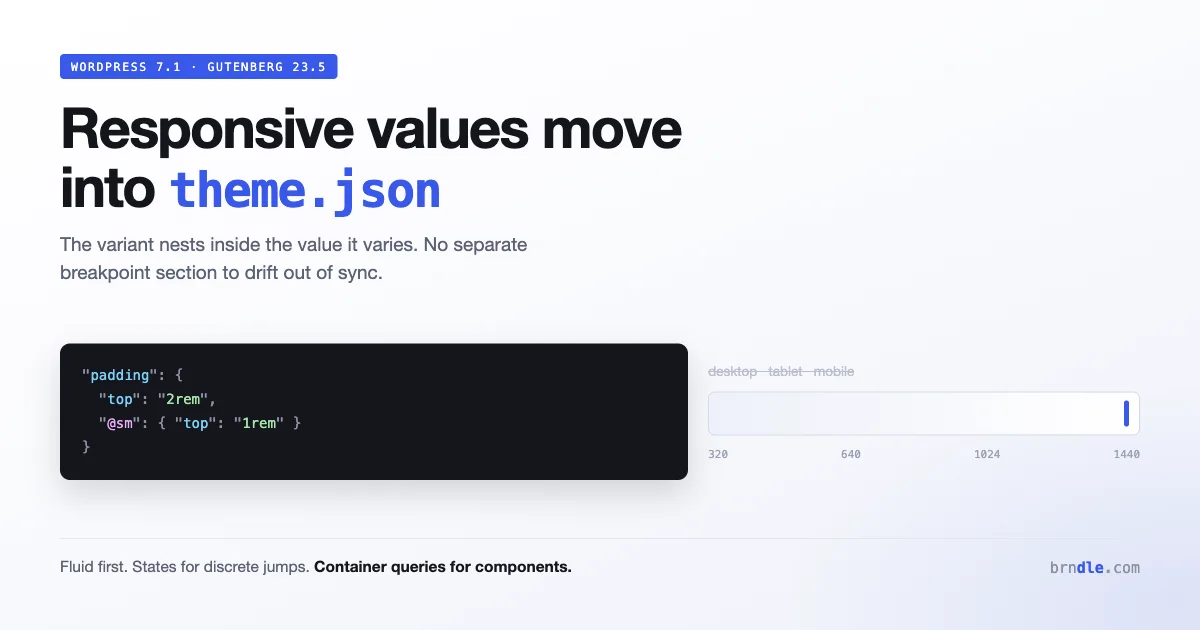
Block themes have had an awkward gap since the beginning: theme.json could express what a value is, but not that it should be different on a narrow screen. Responsive behaviour lived in your stylesheet, which meant half your design system was declarative and queryable and the other half was CSS nobody could introspect.
That gap is closing. Core has adopted an @ prefix convention for expressing responsive states inside style data, and Gutenberg 23.5 replaced the fixed desktop, tablet and mobile preview with a canvas you can drag to any width, a change we covered alongside the five CSS features reshaping block themes this year. Those two changes are the same change viewed from different ends.
Here is what the syntax looks like, why it is nested rather than sectioned, what it means for how you structure a block theme, and what is still unsettled.
The shape of it
A style value can carry variants keyed by a state, and states are prefixed with @ so they are distinguishable from ordinary style properties:
{
  "styles": {
    "spacing": {
      "padding": {
        "top": "2rem",
        "@sm": { "top": "1rem" }
      }
    }
  }
}
The base value applies, and the @sm variant applies within the small viewport state.
The important design decision is that the variant nests inside the value it varies, rather than living in a separate breakpoint section. Compare with how you would express the same thing in a stylesheet:
/* The value and its variant are in different places */
.wp-block-group { padding-top: 2rem; }

@media (max-width: 600px) {
    .wp-block-group { padding-top: 1rem; }
}
In CSS the relationship between those two declarations is implicit. You know they are related because they share a selector and a property, and you find the second one by searching. In a large theme that is how responsive rules drift: someone changes the base value and never learns the variant exists.
Nesting the variant inside the value makes the relationship structural rather than something you have to remember.
What this fixes
Three concrete problems, all familiar to anyone who has maintained a block theme past its first release.
| Problem | Before | With nested states |
|---|---|---|
| Finding the variants of a value | Grep the stylesheet and hope | Read the value in theme.json |
| Users editing responsive spacing | Not possible, it is in CSS | Editable, because it is data |
| Tooling that reads your design system | Sees only the base values | Sees the whole picture |
That middle row is the one that matters most for a commercial theme. Site owners routinely want a section to be tighter on mobile, and until now the honest answer was that they needed a child theme or custom CSS. A responsive value expressed as data is a value the site editor can eventually expose.
The third row matters if you build tooling. A script that reads theme.json to generate documentation, or to diff two themes, or to check contrast across a palette, currently sees an incomplete picture because the responsive half is in CSS it cannot parse. Moving that into the same file makes the design system introspectable.
Why the fixed device toggle had to go
This is where the editor change and the syntax change connect.
The old preview offered three states: desktop, tablet, mobile. That interface encoded an assumption, which is that there are three meaningful widths. Everyone knew this was false. We used it anyway because the alternative was worse.
Gutenberg 23.5 replaces it with a freely resizable canvas. You drag the edge and it resizes continuously, which means you see every width between your breakpoints rather than three arbitrary points.
For theme authors this is uncomfortable in a productive way. Layouts tested only at 360, 768 and 1200 pixels have gaps at the widths nobody looked at, and the new preview finds them immediately. Expect to spend an hour fixing things that were always broken and never visible.
It also changes what a state name means. @sm is not “a phone”. It is a range, and the value applies whenever the relevant dimension falls in that range, whether that is a phone, a narrow browser window or a block sitting in a sidebar.
The hook that went with it
One casualty worth knowing about: useResizeCanvas() is deprecated and non-operational. It answered the question “what width corresponds to this device”, which no longer has an answer.
getDeviceType() and setDeviceType() still work. They report which named state is selected, not the canvas width, and code that maps a device name to a pixel width is now making an assumption the editor does not guarantee.
Structuring a theme around this
Assuming this settles as expected, a few structural consequences worth planning for.
Fluid values first, states second
The best responsive value is one that does not need a variant. Before reaching for @sm, ask whether the property can interpolate instead. theme.json already supports fluid typography, and clamp() covers spacing:
{
  "settings": {
    "typography": {
      "fluid": true,
      "fontSizes": [
        {
          "slug": "large",
          "size": "1.5rem",
          "fluid": { "min": "1.25rem", "max": "2rem" },
          "name": "Large"
        }
      ]
    }
  }
}
A fluid value covers the entire width range with one declaration and has no boundaries to get wrong. Reserve state variants for changes that are genuinely discrete: a three column grid becoming one column is a jump, not an interpolation.
The heuristic: if the property is a number that could sensibly take any value in between, make it fluid. If the change is structural, use a state.
Container queries still own component-level behaviour
Viewport states describe the viewport. They cannot describe how much room a specific block has been given, which is a different question and usually the more relevant one.
A card in a wide content column and the same card in a narrow sidebar need different layouts at the same viewport width. Only a container query can express that, and our guide to truly responsive components covers the pattern in depth:
.wp-block-media-text {
    container-type: inline-size;
}

@container (max-width: 480px) {
    .wp-block-media-text {
        grid-template-columns: 1fr;
    }
}
So the division of labour is: viewport states in theme.json for global rhythm, container queries in CSS for component behaviour. They are not competing and a theme will use both.
Where each kind of style now belongs
Block themes offer several homes for styles and this change shifts the boundaries slightly.
theme.jsonstyles: values and their responsive variants. Low specificity, user-overridable, introspectable.- Theme stylesheet: anything requiring CSS functions, container queries, or selectors more complex than the block API expresses.
- Per-block stylesheets: block-specific treatment, loaded only when the block is used.
- Block style variations: named alternatives a user picks in the editor.
Things that were in your stylesheet only because theme.json could not express responsiveness should move. Things in your stylesheet because they need real CSS should stay.
A worked example: a hero section
Abstract syntax is easy to nod along to, so here is a complete example of the same component expressed both ways.
The requirement is ordinary. A hero group with generous padding and a large heading on wide screens, tighter padding and a smaller heading when narrow, and the columns inside it stacking below a certain point.
The stylesheet version, which is what most block themes ship today:
.wp-block-group.is-style-hero {
    padding-block: 6rem;
    padding-inline: 3rem;
}

.wp-block-group.is-style-hero .wp-block-heading {
    font-size: 3.5rem;
}

@media (max-width: 782px) {
    .wp-block-group.is-style-hero {
        padding-block: 3rem;
        padding-inline: 1.5rem;
    }
    .wp-block-group.is-style-hero .wp-block-heading {
        font-size: 2.25rem;
    }
}
Four declarations duplicated, a magic number appearing twice, and none of it visible to the site editor or to any tool reading your design system.
Rewritten, the type size becomes fluid because it is a matter of degree, the padding uses nested states because the design calls for a distinct step, and the stacking stays in CSS as a container query because it is component behaviour:
{
  "styles": {
    "blocks": {
      "core/group": {
        "spacing": {
          "padding": {
            "top": "6rem", "bottom": "6rem",
            "left": "3rem", "right": "3rem",
            "@sm": {
              "top": "3rem", "bottom": "3rem",
              "left": "1.5rem", "right": "1.5rem"
            }
          }
        }
      }
    }
  }
}
/* Fluid type: no breakpoint needed at all */
.wp-block-group.is-style-hero .wp-block-heading {
font-size: clamp(2.25rem, 1.5rem + 3vw, 3.5rem);
}
/* Component behaviour: container, not viewport */
.wp-block-group.is-style-hero {
container-type: inline-size;
}
@container (max-width: 640px) {
.wp-block-group.is-style-hero .wp-block-columns {
flex-direction: column;
}
}Three things improved. The heading now scales smoothly instead of jumping at one width, which removes the awkward zone just above the breakpoint where a large heading crowds a narrow column. The padding is data, so a site owner could eventually adjust it without touching CSS. And the stacking responds to the hero’s actual width, so dropping this hero into a narrower template still works.
The stylesheet also got shorter, which is the general pattern when you separate interpolation from discrete steps.
What this means for theme documentation
A smaller consequence, but one that catches commercial theme authors.
If your theme’s documentation explains responsive behaviour by describing your breakpoints, that documentation is about to describe an implementation detail rather than a contract. Users dragging a continuous canvas do not think in terms of your three breakpoints, and support questions will increasingly be about specific widths you never named.
The more useful framing for documentation is what changes rather than where. “The hero padding tightens on narrow screens” is a statement that survives a change to how states map to widths. “Below 782px the hero uses 3rem padding” is a statement that becomes wrong the moment anything shifts.
Worth reviewing your docs for hard-coded pixel values while you are making these changes, because they are the part most likely to be silently out of date.
What is still unsettled
Being honest about the state of this matters, because building a serialiser against a syntax that shifts costs more than waiting.
The state names. The convention has been adopted in core, but exact key names and how many states exist are the kind of detail that gets refined during a release cycle. Read the current core implementation rather than a summary, including this one.
How states map to widths. Whether the boundaries are fixed, theme-configurable, or derived from your layout settings is the question with the largest downstream impact, and it is worth confirming before you design around it.
Editor exposure. Whether users get interface controls for per-state values in 7.1, or whether this is initially a theme author facility, changes how you document your theme.
Which properties participate. Aspect ratio and flex alignment controls work inside viewport states. Whether every property does is less clear.
Practical advice: use it in a theme you control and can update. Do not build a public tool that writes this syntax until 7.1 has shipped and the shape has held for a release.
How to test responsive work now
The continuous canvas changes the testing method as much as the tooling, and the old habit of checking three widths no longer finds what it used to.
Sweep, do not sample. Drag slowly from your narrowest supported width to your widest and watch for the moment something changes. You are looking for jumps that feel abrupt, elements that collide just before a breakpoint, and text that wraps to an awkward orphan. These live in the ranges between the widths anyone checked.
Test the boundaries deliberately. Any discrete state change has two widths worth checking: one pixel either side of where it happens. A layout that looks fine at 600 and fine at 800 can be broken at 782 where the state flips, because that is where a three column grid becomes one column while the type size has not caught up.
Check the same block in different containers. Put your key blocks in a full width template, a constrained content column and a narrow sidebar, then sweep each. This is what separates a theme that responds to the viewport from one that responds to available space, and it is the most common gap in otherwise well built themes.
Check with real content lengths. Responsive layouts break on content, not on width. A heading of four words behaves differently from one of fourteen, and a card grid with one long title in it reveals alignment problems that placeholder text hides.
None of this needs tooling beyond the editor itself, which is the point of the change. The previous three-state preview made responsive testing feel complete when it was sampling three points on a continuous range.
Migrating an existing theme
If you have a mature block theme with a stylesheet full of media queries, the migration is worth doing incrementally rather than as a project.
- Inventory your media queries. Group them by what they change: spacing, typography, layout structure, or visibility.
- Convert the spacing and typography ones to fluid values where the change is a matter of degree. Many will disappear entirely rather than becoming state variants.
- Convert genuinely discrete changes to state variants in
theme.json. - Convert component-level rules to container queries, not to viewport states. A rule that changes how one block lays out internally is almost always a container query in disguise.
- Leave the rest. Media queries are not deprecated and a theme that uses them is not wrong.
Step two usually removes more code than step three adds, which is the pleasant surprise in this migration. A large share of responsive CSS in themes is interpolation expressed as steps.
Questions people are asking
Do I have to migrate my media queries?
No. Media queries in a theme stylesheet work exactly as they always have and nothing deprecates them. The reason to migrate specific rules is that data is more useful than CSS for anything a user or a tool needs to read, not that CSS stopped working.
Does this work in the site editor and the front end?
Styles from theme.json are compiled into stylesheets applied in both, so yes. Verify in the editor canvas anyway, since the editor adds styles of its own and specificity conflicts appear in one context and not the other.
Is @sm the same as a 600px breakpoint?
Treat it as a named state rather than a fixed pixel value. How states map to widths is one of the details still settling, and hard-coding an assumption about it in your documentation is how you write something that becomes wrong.
Should I use this instead of container queries?
No, they answer different questions. Viewport states describe the browser. Container queries describe the space a block occupies. A block in a sidebar needs the second one, and no viewport state can substitute for it.
What happens in browsers or WordPress versions that do not support this?
The generated CSS is ordinary media queries, so browser support is not the concern. The concern is WordPress version: a theme using the syntax on a version of core that does not understand it will have those variants ignored, and the base value applies. Check your theme’s minimum supported version before relying on it.
How does this interact with block style variations?
They compose rather than compete. A style variation is a named alternative a user picks; responsive states describe how any given value behaves across widths. A variation can carry its own state variants, which is how you express something like a compact card style that is tighter still on narrow screens without inventing a second variation for the narrow case. That combination is where the two features together remove the most duplication, because the old approach needed a class per variation multiplied by a media query per breakpoint.
Will this replace media queries in my stylesheet entirely?
No, and it is not trying to. Style data can express values that vary by state. It cannot express everything a stylesheet can, including complex selectors, pseudo-elements, animation and anything needing a CSS function. A mature theme will keep a stylesheet, and the difference is that it will be smaller and contain the things that genuinely need CSS rather than the things that had nowhere else to live.
Does this affect performance?
The generated output is ordinary CSS in the same stylesheets WordPress already produces from theme.json, so there is no new runtime cost. Expressing more of your design system as data does grow that generated stylesheet slightly, which is offset by the theme stylesheet shrinking. Net effect for a typical theme is a wash.
Can I use this in a child theme?
Yes, child theme theme.json merges with the parent as usual, so a child can add or override responsive variants the same way it overrides any other value.
Your checklist
- Install Gutenberg on a test site and drag the canvas through every width on your key templates.
- Fix the layout gaps that surfaces. They were always there.
- Grep your stylesheet for
useResizeCanvasand remove it. - Inventory your media queries and group them by what they change.
- Convert spacing and type steps to fluid values first, since many disappear.
- Express genuinely discrete changes as nested state variants in
theme.json. - Move component-level rules to container queries rather than viewport states.
- Wait for 7.1 to ship before building public tooling against the syntax.
- Review your theme documentation for hard-coded pixel breakpoints and describe behaviour instead.
A last practical note on timing. Everything described here is testable today through the Gutenberg plugin and lands properly with 7.1 on 19 August. The sensible sequence for a theme you maintain is to do the editor sweep now, since it finds real layout bugs that exist regardless of any syntax change, and hold the theme.json migration until the release. The bugs are yours either way. The syntax is not settled until it ships.
The direction here is one WordPress has been moving in for years: take things that lived in CSS as a matter of necessity and express them as data that both the editor and the theme can read. Colours went first, then typography, then spacing. Responsiveness was the obvious remaining gap, and closing it makes theme.json a description of the design system rather than a description of its non-responsive half.