Choosing a Font Pair: Matching Brndle’s 9 Font Pairings to Site Type and Reading Length
Key takeaways
- Brndle ships 9 font pairs in the live
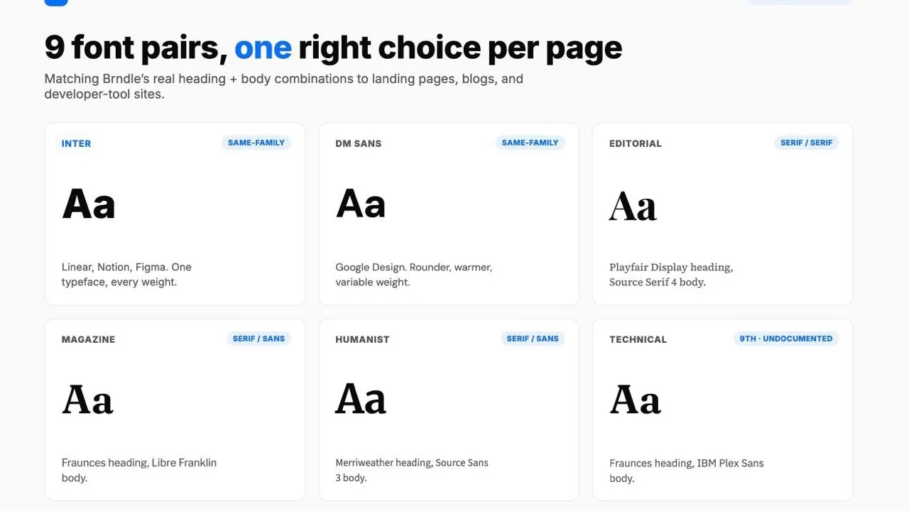
FontPairs::pairs()array on main, not the 8 the class advertises. The docblock says “8 research-backed font pairings” and the admin settings schema describes the control as “8 self-hosted woff2 pairs,” but the array itself defines nine keys. The ninth, undocumented in both places, is'technical': Fraunces headings over an IBM Plex Sans body. - The nine pairs use three different pairing strategies, not one. Five are same-family pairs, where heading and body share one typeface and contrast comes from weight alone (System UI, Inter, Geist Sans, IBM Plex Sans, DM Sans). Three are serif-heading, sans-body contrast pairs (Magazine, Humanist, Technical). One is a serif/serif pair that contrasts construction rather than category (Editorial: a high-contrast display serif heading over a workhorse text serif body).
- Font-loading cost is not equal across the nine. System UI ships zero font files and loads instantly because it points at whatever OS font is already on the device. The five same-family pairs load one typeface. The four two-family pairs load two, which is roughly double the font requests, and
SettingsServiceProvider::outputFontPreloads()only preloads the first file in the pair, which is always the heading font, never the body font. - Which pair earns its place depends on where the text gets read: a landing page with a five-word headline and two lines of body copy has a different typeface job than a 2,000-word blog post somebody reads for six minutes.
- The active pair is one string,
font_pair, inside Brndle’s single options row. Change it from the Brndle admin screen’s Typography section, or with a POST to thebrndle/v1/settingsREST endpoint, documented below with the real request body.
Pick a font pair for a new theme and the instinct is to open the dropdown, glance at eight or nine previews rendered at the same 32px heading size, and choose whichever one looks most “designed.” That’s a reasonable first pass and a bad final answer, because none of Brndle’s font pairs were built to be judged at a single size in a settings panel. They were built to carry real content: a five-word hero headline on a landing page, a 2,000-word blog post somebody reads on a train, a code sample label on a developer-tool marketing site. A typeface that looks sharp as a 48px display headline can get noticeably harder to read at 16px across three paragraphs, and a typeface built for comfortable six-minute reads can look flat and unremarkable blown up to hero size. The font-pair decision is a reading-length decision wearing a visual-design costume.
This piece does three things, all against Brndle’s actual source rather than its marketing copy. It lists what the theme really ships, pulled from app/Settings/FontPairs.php on the live repository, including the pair the class docblock and the admin settings schema both still fail to mention. It maps each pair to the kind of site and reading length it’s actually suited for, not just what it looks like in a static preview. And it covers the two practical questions that follow from picking one: what it costs to load, and how to change it, both drawn from SettingsServiceProvider.php rather than guessed. It’s the typography half of the same verification work behind our audit of all 12 Brndle color schemes for WCAG AA contrast: read the source, not the settings-panel preview.
In this guide
- Brndle’s real font pairs: 9, not 8, verified against the source
- Three pairing strategies hiding inside those nine pairs
- Matching a pair to site type and reading length
- What each pair actually costs to load
- How to change the active pair
- FAQ
Brndle’s real font pairs: 9, not 8, verified against the source
app/Settings/FontPairs.php in the brndle-themes/brndle repository, read directly on 30 October 2026, defines pairs() as a keyed array: each entry carries a human name, a heading CSS font-family string, a body CSS font-family string, an array of local woff2 file definitions for @font-face, and a source attribution naming a well-known product that uses a similar pairing. The class comment above it reads “8 research-backed font pairings used by well-known products.” Count the keys in the array itself and there are nine. The admin settings schema in app/Settings/Defaults.php has the identical drift in its own words, describing the font_pair control as offering “8 self-hosted woff2 pairs.” Both descriptions are stale in the same direction, which is a small, specific tell that the ninth pair was added after the copy was written and nobody went back to update either place that counts them.
Here is the array, quoted directly rather than paraphrased, with the file definitions trimmed to their family names for space (the full entries also carry per-weight woff2 filenames):
'system'    => ['name' => 'System UI',     'heading' => 'system-ui stack',              'body' => 'system-ui stack',        'source' => 'GitHub'],
'inter'     => ['name' => 'Inter',         'heading' => '"Inter", sans-serif',          'body' => '"Inter", sans-serif',    'source' => 'Linear, Notion, Figma'],
'geist'     => ['name' => 'Geist Sans',    'heading' => '"Geist Sans", sans-serif',     'body' => '"Geist Sans", sans-serif','source' => 'Vercel'],
'plex'      => ['name' => 'IBM Plex Sans','heading' => '"IBM Plex Sans", sans-serif',  'body' => '"IBM Plex Sans", sans-serif', 'source' => 'IBM'],
'dm-sans'   => ['name' => 'DM Sans',       'heading' => '"DM Sans", sans-serif',        'body' => '"DM Sans", sans-serif',  'source' => 'Google Design'],
'editorial' => ['name' => 'Editorial',     'heading' => '"Playfair Display", serif',    'body' => '"Source Serif 4", serif', 'source' => 'NYT, Intercom'],
'magazine'  => ['name' => 'Magazine',      'heading' => '"Fraunces", serif',            'body' => '"Libre Franklin", sans-serif', 'source' => 'Premium editorial'],
'humanist'  => ['name' => 'Humanist',      'heading' => '"Merriweather", serif',        'body' => '"Source Sans 3", sans-serif', 'source' => 'Publishing'],
'technical' => ['name' => 'Technical',     'heading' => '"Fraunces", serif',            'body' => '"IBM Plex Sans", sans-serif', 'source' => 'Technical product'],
That last key, 'technical', is the one the docblock and the admin description string both miss. It pairs Fraunces, a soft-contrast display serif with a slightly quirky, almost hand-drawn wonkiness at larger sizes, against IBM Plex Sans as the body face, the same workhorse sans IBM designed for its own technical documentation. The combination reads as “a developer tool that still wants a personality,” which is a specific, deliberate-looking choice, not a placeholder somebody forgot to name. Whoever added it clearly thought about what the pairing should communicate; they just didn’t go back and fix the “8” in two other files.
What each one actually feels like set in real text, not just as a font-family string:
- System UI, whatever the visitor’s OS already renders (San Francisco on Mac/iOS, Segoe UI on Windows, Roboto on Android). Zero personality by design; maximally fast and maximally familiar, because it’s the same typeface the visitor’s operating system chrome is already set in.
- Inter, the SaaS-dashboard default of the last several years, for a reason: tall x-height, even stroke weight, legible at small sizes, flattering at large ones. The Linear/Notion/Figma attribution is accurate; this is the typeface of a thousand product UIs.
- Geist Sans, Vercel’s in-house face, slightly more geometric and narrower than Inter, with a crisper, more “engineered” feel at display sizes. Reads as deliberately current rather than neutral.
- IBM Plex Sans, a touch more humanist than Geist or Inter, with small, specific personality in letters like the lowercase “l” and the numeral “1.” Built for IBM’s own technical docs, so it carries that register natively.
- DM Sans, rounder terminals, a friendlier geometric sans than Inter, reads warmer in body copy. Google Fonts’ own flagship variable sans.
- Editorial, Playfair Display’s sharp thick/thin contrast at heading size against Source Serif 4’s calmer, screen-optimized body serif. Both serifs, but a display serif over a text serif, the way a newspaper masthead sits over its own column type.
- Magazine, Fraunces’ soft, slightly wonky serif curves at heading size against Libre Franklin’s clean grotesque-sans body. The most visually “designed” of the nine at a glance; reads as a print magazine’s web edition.
- Humanist, Merriweather, built specifically to be read on screens at body size, paired with Source Sans 3. The most classically “blog” of the nine: a serif heading that doesn’t shout, a sans body built for paragraphs.
- Technical, Fraunces again, this time over IBM Plex Sans instead of Libre Franklin. Swapping one half of the pair changes the whole register from “magazine” to “developer tool with a point of view.”
Three pairing strategies hiding inside those nine pairs
Read the array as data rather than as nine independent choices and a pattern falls out: Brndle’s font pairs aren’t nine unrelated ideas, they’re three different answers to the same question of how a heading should relate to the body text under it.
Same-family, weight-only contrast. System UI, Inter, Geist Sans, IBM Plex Sans, and DM Sans all set heading and body to the identical font-family string. The only thing separating a heading from a paragraph in these five pairs is size and weight (Brndle’s heading_scale setting and whatever font-weight the block applies), not a change of typeface. This is the Linear/Notion/Stripe house style: one well-made variable font doing every job in the interface, which keeps the page feeling like one coherent voice rather than a headline “announcing” something different from what the body text is doing.
Serif-heading, sans-body contrast. Magazine, Humanist, and Technical all pair a serif heading against a sans-serif body. This is the classic editorial move: a serif at display size reads as considered and a little more formal, a sans at paragraph size reads as clean and fast to scan, and the contrast between the two signals “heading” and “body” through category, not just size. It’s the oldest trick in print design, inherited wholesale by the web.
Serif/serif, construction contrast. Editorial is the one pair that doesn’t fit either bucket. Both Playfair Display and Source Serif 4 are serifs, so the contrast isn’t category, it’s construction: Playfair is a high-contrast “display” serif with dramatic thick-to-thin stroke transitions, built to be looked at for two seconds at 48px. Source Serif 4 is a comparatively low-contrast “text” serif, built to be read for six minutes at 17px without the stroke contrast turning into eye strain. This is a more sophisticated move than serif/sans contrast and it’s also the easiest one to get wrong with a substitution, since swapping either half for a different serif can collapse the contrast entirely if the replacement doesn’t have a genuinely different construction.
Knowing which bucket a pair falls into predicts how it’ll behave outside the settings-panel preview. Same-family pairs stay calm and quiet at any length, which is exactly why they dominate SaaS dashboards: nothing about the typography competes with the content. Serif/sans pairs read as more considered and are better at drawing the eye to a specific headline, which is why they skew toward editorial and magazine-style sites where the headline is doing real selling work. The one serif/serif pair is the most distinctive-looking of the nine and also the pickiest about context: it wants real editorial content under it, not three bullet points and a pricing table.
Matching a pair to site type and reading length
Four site shapes, mapped to the pairs that actually fit each one’s typical content and reading length, not just its vibe.
Marketing and landing pages: short punchy headlines, two lines of body copy
A landing page’s job is a five-to-nine-word headline doing most of the persuading, with the body copy underneath rarely running past two sentences before a CTA button. That content shape rewards a typeface that looks confident and current blown up to 48–64px and doesn’t need to prove it can carry a long paragraph, because it never has to. Geist Sans and DM Sans are the strongest fits here: both have the geometric, slightly engineered look that reads as “modern product” at display size, and both ship as true variable fonts, meaning the headline weight and the button-label weight come from the same file at effectively no extra network cost. System UI is the pragmatic choice when the priority is raw page speed over a distinctive look, since it loads nothing at all. Inter is the safe middle option: it was built for interfaces, not long-form reading, and it looks exactly as confident at hero size as it does in a pricing table.
Content-heavy and blog-first sites: paragraphs people actually read at length
A blog post or a documentation page asks something different of a typeface: it has to stay comfortable across several hundred words without the reader noticing the font at all. Humanist (Merriweather heading, Source Sans 3 body) is the most purpose-built pair in the whole set for this, because Merriweather was specifically designed by its creators to perform at body-text sizes on low-resolution screens, not just as a display face borrowed for the job. Editorial (Playfair Display, Source Serif 4) is the better pick when the brand wants more of a magazine or newsroom feel and the body text is genuinely long-form, since Source Serif 4 is itself optimized for on-screen paragraph reading. Inter remains a legitimate choice for a blog that wants a cleaner, more technical register than either serif option, the way Notion’s own blog reads.
Technical and developer-tool aesthetic: documentation, changelogs, API references
A developer-tool site’s copy is a mix of prose and inline code, and the typeface needs to feel at home next to a monospace snippet without competing with it. IBM Plex Sans is the most literal fit: it’s part of the same IBM Plex superfamily that includes Plex Mono, so even though Brndle’s pair uses only the Sans half, the family’s whole design language was built around sitting next to code. Technical (Fraunces, IBM Plex Sans) is the more distinctive option for a dev tool that wants to look less like generic SaaS and more like a product with a personality, think a CLI tool’s marketing page that still wants a touch of warmth in its headlines. Geist Sans earns its place here too on pure association: it’s Vercel’s own face, and a lot of the developer-tool audience already reads it daily in Vercel’s dashboard and docs.
Agency and portfolio sites: a headline that has to look designed
An agency or portfolio homepage is one of the few places where the headline is allowed to be the whole point, and a plain sans can read as under-designed in that specific context. Editorial and Magazine both do real work here: Playfair Display and Fraunces both have enough character at large display sizes to anchor a hero section on their own, and both pairs keep a sober, legible sans or text-serif underneath for the project descriptions and case-study copy that follow. Technical is worth considering for an agency that specifically wants to signal “we build software,” not just “we design,” since Fraunces-over-Plex reads as design-literate without reading as a magazine.
What each pair actually costs to load
SettingsServiceProvider::outputFontPreloads() is the method that turns a chosen font_pair key into actual network requests, and reading it line by line answers the performance question more precisely than any generic “variable fonts are faster” advice would:
$fontPairKey = Settings::get('font_pair', 'inter');
$pairs = FontPairs::pairs();
$pair = $pairs[$fontPairKey] ?? $pairs['inter'];

// System fonts need no loading.
if (empty($pair['fonts'])) {
    return;
}

$fontsDir = get_theme_file_uri('public/fonts');

// Preload the primary font file for faster LCP.
$primaryFont = $pair['fonts'][0];
echo '<link rel="preload" as="font" type="font/woff2" href="' . esc_url($fontsDir . '/' . $primaryFont['file']) . '" crossorigin>' . "\n";

foreach ($pair['fonts'] as $font) {
    $css .= '@font-face{font-family:"' . $font['family'] . '";src:url(' . esc_url($fontsDir . '/' . $font['file']) . ') format("woff2");font-weight:' . $font['weight'] . ';font-style:' . $font['style'] . ';font-display:swap;}';
}
Four concrete consequences fall out of this code, not out of general font-performance folklore:
- System UI is the only zero-cost pair. Its
fontsarray is empty, so the method returns immediately: no preload tag, no@font-faceblock, no font request at all. Every other pair downloads at least one woff2 file. - Variable-font pairs download one file regardless of how many weights get used. Inter and DM Sans each define a single entry with a
weightrange (100 900and100 1000respectively), meaning every weight from thin to black comes from one woff2 file with a variable font-weight axis. That one file is what gets preloaded. - Static same-family pairs download one request per weight actually used. Geist Sans and IBM Plex Sans each define four separate static files (400/500/600/700). Only the first in the array, weight 400, gets the preload hint; 500, 600, and 700 load as ordinary, non-preloaded requests the first time a block actually calls for that weight.
- Two-family pairs preload the heading font, never the body font. Editorial, Magazine, Humanist, and Technical each define entries for both families, and
$pair['fonts'][0], the one entry that gets the preload hint, is always the heading face (Playfair Display, Fraunces, Merriweather, Fraunces again). The body face, the one that actually dominates a long blog post’s text, loads without a preload hint in every one of these four pairs. On a content-heavy page using one of these pairs, the body text is arguably the more LCP-relevant element, and it’s the one not getting the fast path.
The practical read: a performance-sensitive marketing page has a genuine reason to default toward System UI, Geist Sans, or DM Sans over one of the two-family editorial pairs, independent of how each one looks. And a content-heavy site choosing Humanist or Editorial for the reading-comfort reasons above should know, going in, that the body serif is the unpreloaded half of the pair, a tradeoff worth accepting for reading comfort but worth knowing about rather than discovering in a Lighthouse report. Every @font-face declaration does carry font-display:swap, so in every case text renders immediately in a fallback face and swaps in once the webfont arrives, rather than leaving an invisible-text flash; that part of the loading strategy is consistent across all nine pairs. For the general mechanics behind self-hosted woff2 files, subsetting, and the theme.json Font Face API that a block theme like Brndle builds on, see How to Optimize Web Fonts in Block Themes Using the theme.json Font Face API.
How to change the active pair
The active pair lives as one string, font_pair, inside Brndle’s single settings row, in the same “typography” section as two related controls worth knowing about: font_size_base (a 12–24px range that drives the root html { font-size }, so every rem-based measurement in the theme scales with it) and heading_scale (a 1.10–1.50 ratio, default 1.25, roughly a musical major third, that sets the geometric step between h6 and h1 inside .prose content). Changing the font pair without touching either is a safe, independent change; the three controls are stored together but don’t depend on each other.
Two ways to change it, both reading from the same single options row under the hood.
From the admin screen. SettingsServiceProvider::registerAdminPage() registers Brndle as a top-level WordPress admin menu item (position 59, which WordPress places directly after Comments and directly before Appearance), pointing at a single React app mounted into #brndle-settings-root. The settings schema groups font_pair into a 'typography' section with a select control, so inside that admin screen it appears as a dropdown in the Typography section, next to the base font size and heading scale controls it’s grouped with in the schema.
Over the REST API. The same route covered in our piece on Brndle’s token architecture and its Astro/Ghost/Shopify roadmap handles this too: POST /wp-json/brndle/v1/settings, gated behind current_user_can('manage_options'), same as every other route registerRestRoutes() registers. A request that only changes the font pair looks like this:
curl -X POST "https://example.com/wp-json/brndle/v1/settings" \
  -H "Content-Type: application/json" \
  -H "X-WP-Nonce: <your_rest_nonce>" \
  --cookie "wordpress_logged_in_cookie=..." \
  -d '{"font_pair": "technical"}'
The key has to match one of the nine real array keys above (system, inter, geist, plex, dm-sans, editorial, magazine, humanist, or technical), not the human-readable name. FontPairs::resolve(string $pairKey) is the method that turns whichever key is stored into the actual heading and body family strings used at render time, and it falls back to 'inter' for any key it doesn’t recognize, so a typo in the key name degrades to the default pair rather than breaking the page. Once saved, the change takes effect on the next page load, since outputCssVariables() and outputFontPreloads() both read the current setting fresh on every wp_head call rather than from a cached value.
FAQ
How many font pairs does Brndle actually ship?
Nine, confirmed by counting the keys in FontPairs::pairs() on the live repository. The class docblock says “8 research-backed font pairings” and the admin settings schema separately describes the control as “8 self-hosted woff2 pairs.” Both are stale in the same direction; the actual array has always had nine by the time of this reading.
What is the undocumented ninth pair, and why does it matter?
It’s the 'technical' key: a Fraunces heading over an IBM Plex Sans body, attributed in the source to “Technical product.” It matters because it’s a genuinely different, usable option (serif personality plus a documentation-grade sans) that two separate pieces of the theme’s own copy currently fail to mention, so anyone skimming the docblock or the settings description alone would not know it exists.
What’s the default font pair if I never change it?
Inter, confirmed both by Defaults::settings(), which sets 'font_pair' => 'inter', and by the fallback inside FontPairs::resolve(), which returns the inter entry for any unrecognized key.
Which pair is best for a SaaS landing page with a short, punchy headline?
Geist Sans or DM Sans for a deliberately modern, product-forward look; System UI if raw load speed outweighs having a distinctive typographic voice. All three are same-family pairs, so the headline and the body copy share one typeface and never fight each other for attention.
Which pair reads best across a long blog post?
Humanist (Merriweather heading, Source Sans 3 body), because Merriweather was purpose-built for comfortable on-screen reading at body-adjacent sizes, not borrowed from a display-type use case. Editorial is the next-best option for a more magazine-leaning brand voice, since its body face, Source Serif 4, is also optimized for on-screen paragraph reading.
Is there a pair that suits a developer-tool or technical-product aesthetic?
IBM Plex Sans on its own (the plex pair) is the most literal fit, since it’s part of the same type family IBM built around sitting next to code and technical documentation. The technical pair (Fraunces plus IBM Plex Sans) is the more distinctive option for a dev tool that wants a headline with some personality rather than a purely neutral one.
Do variable fonts actually load faster than the static-weight pairs?
Inter and DM Sans each ship as one variable woff2 file covering their full weight range, so using several different weights across a page costs one font request, not several. Geist Sans and IBM Plex Sans ship four separate static files, one per weight (400/500/600/700), so a page using all four weights makes four separate font requests, though font-display:swap means none of them blocks text from rendering in the meantime.
Why does a two-family pair load differently than a same-family pair?
A same-family pair like Inter or Geist Sans needs only one typeface downloaded, since heading and body both resolve to the same font-family string. A two-family pair like Editorial, Magazine, Humanist, or Technical needs both families downloaded, roughly doubling the number of font requests, and outputFontPreloads() only ever preloads the first entry in the array, which in every two-family pair is the heading face, not the body face.
How do I actually change the font pair?
Either through the Typography section of the Brndle admin screen (top-level “Brndle” menu item, positioned between Comments and Appearance), where it’s a select dropdown, or with an authenticated POST to /wp-json/brndle/v1/settings with a body of {"font_pair": "<key>"}, using one of the nine real keys.
Can I add my own font pair instead of picking one of the nine?
Yes, through the brndle/font_pairs filter, an ordinary apply_filters() call inside FontPairs::pairs(). A plugin or child theme can hook it and return the array with an additional entry; the admin dropdown and the REST-driven resolution logic will both pick up anything added there without any other code change.
Does the font pair choice affect heading size and scale too, or only the typeface?
Only the typeface. Heading size is controlled separately by heading_scale (the ratio between h6 and h1 inside .prose content, default 1.25) and font_size_base (the root pixel size everything else scales from). Both live in the same “typography” settings section as font_pair but are independent values; changing one doesn’t touch the others.
The takeaway
Brndle’s font-pair picker isn’t eight evenly-interchangeable looks, it’s nine, grouped into three real pairing strategies, with real, unequal loading costs attached to each one. A landing page and a blog post are not the same reading problem, and the typeface that wins a two-second glance at a settings-panel preview isn’t always the one that holds up across a six-minute read. Pick the pair for the content it has to carry, check which half of a two-family pair is actually getting preloaded if performance is tight, and if the docblock and the admin description string both still say “8,” read the array instead. It’s had nine keys for a while now, and the ninth one, a Fraunces-and-Plex pairing nobody wrote a line of marketing copy for, might be the most interesting option on the list.
Sources, read on 30 October 2026
- brndle-themes/brndle: app/Settings/FontPairs.php, the nine pairs and the
resolve()fallback logic - brndle-themes/brndle: app/Settings/Defaults.php, the default
font_pairvalue and the typography settings schema, including the stale “8 self-hosted woff2 pairs” description string - brndle-themes/brndle: app/Providers/SettingsServiceProvider.php, the admin menu registration, the REST routes, and
outputFontPreloads()