Best 10 Cold Color Palettes for 2026
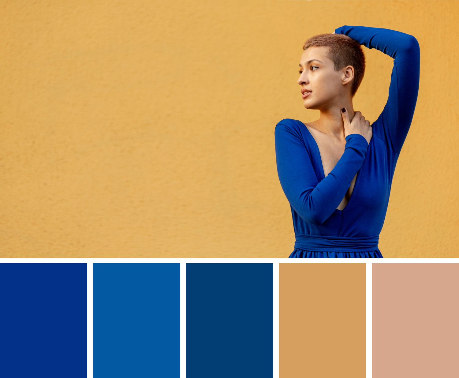
Cold palettes carry a specific kind of weight. Blues, grays, and icy greens read as calm rather than cold in the negative sense, more often signaling trust, precision, and clarity than distance. That’s exactly why so many finance apps, healthcare brands, and winter campaigns lean on this end of the color wheel rather than warmer tones. Below are ten cold palettes with exact HEX codes, plus enough color theory to help you actually use them well instead of just copying values into a design file.
Why cold palettes work the way they do
Color psychology isn’t an exact science, but the pattern holds up consistently across design research: cool hues, blues, greens, and violet-leaning grays, read as calm, orderly, and trustworthy. Warm hues read as energetic and urgent. Neither is better; they’re tools for different jobs.
Designers reach for these associations constantly, sometimes without even naming the theory behind the choice. It just feels right for a certain kind of brand, and that instinct is usually the color psychology research talking.
That’s why cold palettes dominate industries built on trust and precision. Banks and financial apps use blue almost universally, not by coincidence but because blue consistently tests as the color people associate most with reliability. Healthcare brands lean cool for similar reasons, projecting cleanliness and calm rather than urgency. And anything winter-themed reaches for cold tones because the association between blue and cold temperature is close to universal across cultures.
Ten cold color palettes for 2026
1. Arctic Chill
- Icy Blue: #A8DADC
- Cool Gray: #457B9D
- Frost White: #F1FAEE
- Deep Navy: #1D3557
This palette captures arctic landscapes with soft blues against dark navy. It works particularly well for winter product launches, outdoor gear brands, and anything wanting a crisp, clean feel without going stark white-on-white.
2. Glacial Ice
- Ice Blue: #DAE8FC
- Silver Gray: #B0BEC5
- Powder Blue: #90A4AE
- Charcoal: #263238
A frostier, more muted variation that leans into minimalism. The narrow tonal range makes it a strong candidate for tech products and SaaS dashboards where you want the interface to recede and let content take focus.
3. Mountain Mist
- Slate Gray: #708090
- Pale Blue: #B0C4DE
- Steel Blue: #4682B4
- Graphite: #2F4F4F
Inspired by misty mountain landscapes, this palette carries a slightly more industrial edge than Arctic Chill. It suits outdoor and adventure brands, architecture portfolios, and anything wanting a grounded, weathered feel.
4. Winter Ocean
- Ocean Blue: #0077B6
- Seafoam Green: #90E0EF
- Aqua Mist: #CAF0F8
- Deep Teal: #023E8A
A more saturated palette built for energy without abandoning the cold end of the spectrum. It works well for marine and aquatic brands, water-focused products, and anything that needs cold tones to feel refreshing rather than somber.
5. Polar Twilight
- Dusky Blue: #4A6FA5
- Iced Lavender: #D9E2F1
- Arctic White: #F4F7F9
- Storm Gray: #3C4E5A
Soft, muted, and slightly moody. The lavender undertone gives this palette a quieter, more introspective feel than the others, useful for evening-themed content, meditation and wellness apps, or anything positioned as calming rather than energizing.
6. Frozen Forest
- Evergreen: #014421
- Frosty Mint: #B5EAEA
- Icy Blue: #E6FAFF
- Dark Pine: #1A3D36
The one genuinely green-leaning palette on this list, pairing cold greens with frosty blues. It reads as fresh and natural rather than clinical, making it a strong fit for eco-conscious brands, holiday campaigns, and anything blending winter with nature imagery.
7. Nordic Blues
- Midnight Blue: #003366
- Cool Aqua: #66B2FF
- Ice Gray: #C9E4FF
- Slate: #4D6470
Deep midnight blue paired with brighter aqua accents creates strong contrast within a narrow hue range, which is genuinely useful for interfaces where you need visual hierarchy without introducing a completely different color family.
8. Frostbite
- Frosted Lilac: #D3CCE3
- Icy Pink: #F3E5F5
- Pale Gray: #E2EAF5
- Deep Plum: #4A3F55
The outlier in this list, technically cool-toned but leaning into lilac and pink rather than blue. It’s a good option when you want the calm associations of a cold palette without the corporate feel blue can sometimes carry, suited to beauty branding and winter event materials.
9. Snowbound
- Snow White: #F8F9FA
- Winter Sky: #BAC3C9
- Cloud Gray: #7D8B8C
- Ash Blue: #3B4A59
An almost monochrome palette built from whites and grays with only a whisper of blue. It’s the most minimalist option here, well suited to editorial design, architecture, and any brand that wants to project restraint over energy.
10. Aurora Borealis
- Cool Mint: #A0E7E5
- Pale Lavender: #B4AEE8
- Ice Green: #C6FFDD
- Deep Navy: #392F5A
Inspired by the northern lights, this is the most colorful entry on the list, combining mint, lavender, and green against a deep navy anchor. It works best when you want a cold palette that still feels a little magical rather than purely clinical.
How to actually use a cold palette without it feeling flat
The biggest risk with any cold palette is that it can slide into feeling sterile or emotionally distant if you use it without variation. A few practical fixes.
Vary your saturation and value, not just your hue. Every palette above already does this by design, pairing a deep saturated anchor color with lighter, softer tones, but it’s worth understanding why: a palette built from four colors of identical intensity reads as flat no matter how nice the individual hues are.
Add one small warm accent if the design calls for a focal point. A single warm-toned button, icon, or highlight against an otherwise cold palette draws the eye more effectively than another cold tone ever could, precisely because it breaks the pattern the rest of the page establishes.
Use your darkest tone sparingly and deliberately. Every palette here includes a near-black or deep navy anchor color, and that color works best in small doses, headlines, borders, key UI elements, rather than as a dominant background that can tip a design from “cool and confident” into “dark and heavy.”
Cold versus warm: when to reach for which
It helps to think of temperature not as a fixed brand decision but as a dial you adjust based on what you’re trying to communicate on any given page or piece.
Reach for cold palettes when the goal is trust, calm, or precision: a pricing page, a security feature, a data dashboard, anything where you want the visitor to feel like careful thought went into what they’re looking at. Reach for warm palettes when the goal is urgency, appetite, or excitement: a limited-time offer, a food brand, an entertainment product.
Neither temperature is inherently superior; the mistake is picking one out of habit rather than matching it to the specific job a page or campaign needs to do. Plenty of strong brand systems use both deliberately rather than picking one temperature forever. A financial app might run cold blues and grays through its core interface, then use a single warm accent color exclusively for calls to action, so that “add funds” or “confirm transfer” buttons stand out precisely because they’re the only warm element on an otherwise cold screen.
Seasonal and campaign-specific use
Cold palettes get an obvious seasonal boost around winter holidays, and several of the palettes above, Arctic Chill, Frozen Forest, Aurora Borealis, are explicitly built with that seasonal association in mind. But limiting cold palettes to winter-only use undersells their year-round utility.
Summer campaigns for anything water-related, pools, beaches, marine products, benefit from cold palettes like Winter Ocean specifically because blue reads as refreshing regardless of season. Tech product launches lean cold year-round because the association with precision and innovation isn’t seasonal at all. The seasonal framing in this list’s naming is more about mood than a hard rule about when these colors are appropriate to use.
Building variations from these palettes
None of these ten combinations need to be used exactly as listed. Treat them as starting points rather than fixed prescriptions.
Swap the anchor tone for a different palette’s anchor if the accent colors work but the darkest shade feels wrong for your specific project. Nordic Blues’ midnight blue anchor, for instance, could easily replace Glacial Ice’s charcoal if you want that palette’s light, airy accents with a more distinctly blue foundation instead of a neutral gray one.
Adjust saturation uniformly across a palette using a color tool rather than eyeballing individual hex codes, which keeps the relationships between colors consistent even as the overall intensity shifts up or down for different use cases, a muted version for a background, a more saturated version for an accent.
And don’t feel locked into exactly four colors. These palettes work as a foundation; adding a fifth neutral, an off-white or a near-black, for text and backgrounds is standard practice and doesn’t disrupt the palette’s core identity.
Accessibility and contrast with cool palettes
Cold palettes can be deceptively easy to get wrong on contrast, since many of the lighter tones in these palettes, ice blues, pale lavenders, soft grays, sit closer together in perceived brightness than they look at first glance. Before finalizing any pairing, run your text and background combination through a contrast checker rather than trusting your eye alone. A palette that looks perfectly readable on a calibrated design monitor can fail accessibility standards once it’s rendered on an average phone screen in daylight.
As a rule, pair light palette colors like Frost White or Arctic White with your darkest anchor tone for body text, and reserve the mid-tone blues and grays for backgrounds, borders, or large decorative elements rather than small text.
Pairing cold palettes with typography
Cool colors pair naturally with clean, geometric sans-serif typefaces, which reinforces the sense of precision and order these palettes already carry. A heavily decorative or handwritten typeface can fight against that mood, creating a visual disconnect between what the color scheme implies and what the type implies.
If you want warmth without abandoning a cold palette entirely, typography is often a better lever to pull than adding warm colors. A slightly rounded sans-serif or a serif with generous curves can soften a cold palette’s clinical edge while keeping the color scheme fully intact.
Weight matters as much as shape here. A very thin, light-weight typeface layered over a pale cold background can end up feeling insubstantial, almost cold in the negative sense the palette is trying to avoid. A slightly heavier weight, even within the same clean sans-serif family, tends to read as more confident against these lighter backgrounds.
Where these palettes work best across a real project
Backgrounds and large surfaces should generally stay on the lighter, less saturated end of whichever palette you pick, Frost White, Arctic White, Snow White, or similar. These colors are doing the least visual work and should recede rather than compete with content.
Primary UI elements, buttons, navigation bars, cards, work well with the mid-tone colors in each palette, the steel blues and cool grays that carry enough presence to be noticed without overwhelming the page.
Text and high-contrast details belong with the darkest anchor tone in each palette. Deep Navy, Dark Pine, Charcoal, and their equivalents provide the contrast needed for readable body text against the lighter backgrounds these palettes are built around.
Accents and calls to action are where you have the most creative freedom. This is the spot where breaking from the cold palette entirely with a single warm color often produces the strongest result, since contrast in temperature draws attention more effectively than contrast in value alone.
Tools for building and testing your own cold palette
If none of the ten palettes above is an exact fit, building a custom variation isn’t difficult with the right tools. Color contrast checkers let you verify text and background combinations meet accessibility standards before you commit to a final palette, which matters more with cold palettes than warm ones given how close many of the lighter tones sit together in perceived brightness.
Color harmony generators, the kind that build analogous, complementary, or triadic combinations from a single starting hue, are useful for extending any of these four-color palettes into a fuller design system with additional supporting shades for hover states, disabled states, and other UI variations these base palettes don’t explicitly cover.
And a simple practice worth adopting regardless of tooling: mock up your chosen palette on an actual page layout, not just as isolated color swatches, before finalizing it. Colors that look balanced as four small squares side by side sometimes behave differently once they’re spread across a full page with varying proportions of each color.
Save the final palette as reusable design tokens rather than hardcoding hex values throughout a project. Even a simple naming convention, primary, secondary, accent, background, saves considerable rework later if a single color in the palette needs adjusting down the line.
Frequently asked questions
Are cold color palettes suitable for all industries?
They’re strongest for finance, healthcare, technology, and anything winter or nature-themed, where trust, precision, and calm are the desired associations. Industries built around energy, urgency, or warmth, food, entertainment, fitness, often benefit more from warmer palettes, though a cold palette with a single warm accent can bridge the gap.
How do I make a cold palette feel less clinical?
Vary saturation and value across your chosen colors rather than using flat, uniform tones. Add one deliberate warm accent for focal points. And consider softer typography to balance the precision the color scheme already conveys.
Which of these palettes works best for a website background?
Snowbound and Glacial Ice are the safest choices for large background areas since their light, low-saturation tones won’t overwhelm content or fight with text for attention. Reserve the more saturated palettes like Winter Ocean or Aurora Borealis for accents, headers, or smaller decorative elements.
Can I mix colors from two different palettes on this list?
Yes, provided you’re intentional about it rather than combining them at random. Palettes that share a similar hue family, Arctic Chill and Nordic Blues, for instance, both centered on blue, mix more naturally than pulling colors from a blue palette and a lavender-leaning one like Frostbite without a clear reason.
Do cold palettes work for print design as well as digital?
Generally yes, though it’s worth checking how a palette translates from RGB, which these hex codes represent, to CMYK for print, since some blues and teals shift noticeably when converted for physical printing. Always request a physical proof before a large print run if color accuracy matters.
Testing a palette across dark and light interfaces
A cold palette that reads beautifully on a white background can behave very differently once placed against a dark interface, which matters increasingly as more products and websites offer a dark mode option alongside the standard light layout.
Icy blues and pale grays that look crisp and clean on white can turn muddy or lose contrast entirely against a near-black background, since the relationship between adjacent values shifts dramatically when the base surface changes. Before committing to any of these ten palettes for a digital product specifically, mock up both a light and dark version and check that text remains readable and accents remain visible in both contexts.
Deep navy and dark plum tones, present in several palettes here, actually tend to work better as the dark-mode background itself rather than as an accent color layered on top of one, since they’re already close in value to what a dark interface needs as its base surface.
Where fabricated or invented palette names cause real confusion
Evocative names like Arctic Chill or Nordic Blues are useful shorthand for remembering a palette’s mood, but they’re not official industry standards, and it’s worth being clear about that distinction when sharing a palette with a client or team. If a name matters for consistency across a project, document the actual hex codes as the source of truth and treat the descriptive name as a convenient label rather than something with fixed meaning outside this specific list.
Conclusion
Cold color palettes earn their reputation for calm and trust honestly, and the ten combinations here cover everything from near-monochrome minimalism to the more saturated, playful end of the cool spectrum. Pick based on the specific feeling you’re after, refreshing versus somber, clinical versus natural, minimal versus vivid, and don’t be afraid to break the palette’s rules with a single warm accent when a design genuinely needs a focal point.