12 Best Color Palette Tools for Business in 2026
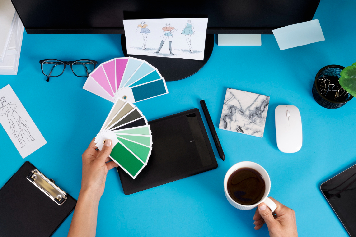
Creating the perfect color palette is essential for brand identity in 2026, and the tools built for the job now split into a few genuinely different camps: fast generators built for a quick spark of inspiration, professional-grade suites tied into a design workflow, AI tools that learn a specific person’s taste over repeated use, and accessibility-focused checkers that make sure a palette that looks great on a designer’s monitor is still readable for everyone else. Picking a tool without knowing which of those jobs you actually need is the most common reason a palette looks great in isolation and falls apart once it’s applied across a real website or product.
It’s worth separating the “generate ideas” phase from the “finalize a brand system” phase early, since they call for different tools. A quick generator is great for the first ten minutes of brainstorming; a brand’s actual, locked-in palette deserves a tool that checks contrast ratios and exports consistent hex codes a developer can implement without guesswork.
Top Color Palette Tools in 2026
1. Coolors
Coolors generates beautiful color palettes with a simple spacebar press, offering AI suggestions and extensive customization options, and its browser extension lets a designer pull a palette directly from any webpage they’re browsing for inspiration.
Pros: Fast generation, export options, color blindness simulator, trending palettes
Cons: Some features require premium, limited collaboration on free plan
Best for: Designers needing quick color inspiration
2. Adobe Color
Adobe Color offers professional-grade palette creation with color harmony rules, accessibility tools, and Creative Cloud integration, syncing a finished palette directly into Photoshop, Illustrator, or XD without needing to manually re-enter hex codes.
Pros: Professional features, Creative Cloud sync, accessibility checker, extract colors from images
Cons: Best with Adobe subscription, complex for beginners
Best for: Professional designers using Adobe Creative Cloud
3. Canva Color Palette Generator
Canva’s color tool extracts palettes from uploaded images and suggests complementary colors for your designs, feeding directly into Canva’s own design editor so a palette gets applied to a real layout within the same session it was generated.
Pros: Free to use, image extraction, integrates with Canva designs, easy interface
Cons: Limited advanced features, basic compared to professional tools
Best for: Small businesses using Canva for design work
4. Khroma
Khroma uses AI to learn your color preferences and generates unlimited palettes tailored to your style, starting with an initial training step where a user picks favorite colors from a large grid before the model starts producing personalized suggestions.
Pros: AI personalization, learns preferences, unlimited generations, favorites library
Cons: Initial training required, can be overwhelming
Best for: Designers wanting AI-curated color suggestions
5. Paletton
Paletton creates color schemes using color theory principles with real-time previews of how colors work together, including a mock webpage preview that shows a palette applied to sample text, buttons, and backgrounds before committing to it.
Pros: Color theory based, live previews, multiple scheme types, free to use
Cons: Dated interface, no image extraction
Best for: Those learning color theory fundamentals
6. Colormind
Colormind uses a deep learning model trained on palettes from movies, popular art, and photography to generate combinations that feel more naturally cohesive than purely mathematical color-wheel formulas, and it can lock specific colors in place while regenerating the rest around them.
Pros: AI-generated palettes trained on real visual references, lock-and-regenerate workflow, free to use
Cons: Interface is fairly bare-bones, no built-in accessibility checker
Best for: Designers wanting naturally cohesive palettes inspired by real-world visuals
7. Color Hunt
Color Hunt is a curated gallery of palettes submitted and voted on by a community of designers, which makes it less a generator and more a browsable trend library for spotting what’s currently popular across a specific aesthetic, like pastel, retro, or neon.
Pros: Large curated community library, easy to browse by trend and category, completely free
Cons: No generation tools of its own, palettes aren’t tailored to a specific brand or project
Best for: Browsing current color trends rather than generating a custom palette
8. ColorSpace
ColorSpace generates a full palette from just one or two starting colors, then shows the result applied to a live mockup, buttons, cards, gradients, so a designer can see how a palette actually reads in context rather than as a flat row of swatches.
Pros: Generates a full palette from minimal input, useful UI mockup previews, free to use
Cons: Limited export formats compared to Coolors or Adobe Color
Best for: Quickly expanding one or two brand colors into a full working palette
9. Material Design Color Tool
Google’s Material Design color tool builds a full palette of primary and accent shades with automatic tonal variations, calculating light and dark variants of each color and flagging which text-and-background combinations meet accessibility contrast standards as you build.
Pros: Built-in accessibility contrast checking, automatic tonal shade generation, free and export-ready for Android and web
Cons: Interface is utilitarian rather than inspirational, output leans toward Material Design’s specific visual style
Best for: Teams building a design system that needs accessible tonal variations built in from the start
10. Venngage Color Palette Generator
Venngage’s tool extracts a palette from an uploaded logo or image and immediately suggests how to apply it across infographics, reports, and presentation templates, aimed at marketing teams producing visual content rather than product designers building an interface.
Pros: Logo-to-palette extraction, immediate application to marketing templates, straightforward for non-designers
Cons: Geared toward marketing collateral rather than product or web design, best features require a Venngage subscription
Best for: Marketing teams building brand-consistent infographics and reports
11. Muzli Colors
Muzli Colors, part of the broader Muzli design inspiration toolkit, generates palettes and pairs them with curated design examples showing the palette in use across real websites and apps, which helps bridge the gap between an abstract set of hex codes and how they’ll actually look applied.
Pros: Palettes paired with real design examples for context, integrates with the broader Muzli inspiration feed, free to use
Cons: Fewer fine-grained customization controls than Coolors or Adobe Color
Best for: Designers who want palette inspiration paired with real-world application examples
12. Pantone Connect
Pantone Connect gives designers direct access to the Pantone Matching System within their design tools, which matters specifically for physical products, packaging, and print, where a brand color needs to match precisely across materials in a way that a plain hex code can’t guarantee.
Pros: Industry-standard color matching for print and physical products, integrates with Adobe Creative Cloud, ensures color consistency across manufacturers
Cons: Subscription required for full library access, overkill for purely digital-only brands
Best for: Brands needing precise, consistent color matching across packaging and print
Matching a Tool to What You’re Actually Building
A brand designing a new logo and needing a signature color story has different needs than a product team building a design system with dozens of interface states, or a marketing team producing weekly social graphics. Coolors, Colormind, and ColorSpace are built for the exploratory phase, fast generation, easy regeneration, low commitment. The Material Design Color Tool and Adobe Color are built for the phase after that, once a primary brand color is locked and a team needs a full, accessible, systematically derived set of tints and shades to build an actual interface with. Venngage and Canva sit in a third lane entirely, optimized for applying a palette to finished marketing content rather than generating one from scratch.
Physical products add a layer the purely digital tools don’t handle well. A palette that looks perfect as a hex code on a screen can shift noticeably once it’s printed on packaging or manufactured into a physical product, since screens and print use fundamentally different color models. That’s the specific gap Pantone Connect fills, and it’s worth budgeting for it separately from a team’s everyday digital design tools if a brand has any physical product or packaging component at all.
Why Accessibility Deserves a Real Check, Not a Guess
A palette that looks striking in a mockup can still fail basic readability once real text gets placed on top of it, and this is where a lot of otherwise well-designed brands quietly create a usability problem. Low-contrast text, light gray on white, pastel-on-pastel combinations, can look elegant to a designer with good vision on a calibrated monitor while being genuinely difficult to read for a meaningful share of any real audience, including users with low vision or color blindness and anyone viewing a screen in bright sunlight.
Contrast ratio checking should happen before a palette gets locked in, not after a product ships and a complaint comes in. Adobe Color and the Material Design Color Tool both build contrast checking directly into the palette creation process, which is a meaningfully better workflow than generating a palette first and checking accessibility as an afterthought. WCAG’s standard contrast guidelines call for at least a 4.5:1 ratio for normal body text against its background, and treating that number as a hard requirement rather than a nice-to-have during palette selection avoids a rework cycle later.
Going From a Generated Palette to a Working Design System
A palette that lives only as five swatches on a generator’s screen isn’t actually usable yet; the real work is turning those swatches into a documented, named system a whole team can implement consistently. That means assigning each color a functional role, primary, secondary, success, warning, error, neutral background, rather than leaving developers to guess which shade of blue was meant for a button versus a link. Tools like the Material Design Color Tool push toward this naturally by generating tonal variants with built-in roles, while a raw export from Coolors or Colormind hands over hex codes without that structure, leaving a team to build the naming convention themselves.
It also helps to test a palette against real content before finalizing it, not just against blank mockup rectangles. A color that looks balanced as an even five-swatch row can behave very differently once it’s holding actual body text, a product photo, or a data visualization with a dozen overlapping categories. ColorSpace and Paletton’s live-preview features exist specifically to catch this kind of gap between a palette that looks good in isolation and one that actually performs once real content is layered on top of it.
Version control matters more than most small teams initially plan for. A palette that gets tweaked informally over time, one designer nudging a blue slightly here, another adjusting a gray there, tends to drift into visible inconsistency across a product within a year or two. Keeping a single documented source of truth, whether that’s an Adobe Color library shared across a Creative Cloud team or a simple shared style guide referencing exact hex codes, prevents that slow drift from ever becoming a real rebrand-level problem.
Common Questions About Color Palette Tools
How many colors should a brand palette actually include?
Most well-built brand systems land somewhere around five to seven core colors, a primary, one or two secondary colors, and a handful of neutrals for text and backgrounds, plus tonal variations of each generated from tools like the Material Design Color Tool. Fewer colors than that limits flexibility across different contexts; significantly more tends to dilute brand recognition and makes consistent application harder for anyone building with the palette later.
Is it worth paying for a premium color tool, or are free tools good enough?
For a solo project or small business, free tools like Coolors, Colormind, and the Material Design Color Tool genuinely cover the core need. Paid tiers earn their cost mainly through team collaboration features, deeper export options, and integration with a broader paid design suite, which matters more for agencies and larger teams working across many projects than for someone finalizing a single brand’s palette.
Do AI-generated palettes actually look better than manually chosen ones?
Not inherently better, but often faster to arrive at something cohesive, particularly for someone without formal color theory training. Tools like Colormind and Khroma, trained on large sets of real visual references, tend to avoid the harsh or clashing combinations a beginner might land on manually, but a trained designer’s eye still catches contextual nuance, brand tone, cultural color associations, that a general-purpose model doesn’t account for.
What’s the difference between a hex code palette and a Pantone palette?
A hex code defines a color for screens using red, green, and blue light values, which is exactly right for websites, apps, and digital graphics. Pantone defines a color using a standardized physical ink or material match, which is what printers and manufacturers need to reproduce a color consistently across different presses, materials, and production runs. A brand with both digital and physical products typically needs both a hex-based digital palette and a Pantone reference for anything printed or manufactured.
How often should a brand’s color palette be revisited?
There’s no fixed schedule, but a periodic review, every few years for most brands, catches signs that a palette has started to feel dated or is being applied inconsistently across different teams and channels. A full rebrand is a bigger undertaking than most companies need; often a lighter refresh, adjusting a few secondary colors or tightening accessibility compliance, solves the actual problem without the cost of a complete visual identity overhaul.
Can a color palette generator replace a professional designer?
For a fast first pass or a personal project, yes, largely. For a brand’s permanent, public-facing identity, a generator is a strong starting point but rarely a complete substitute for a designer who can weigh in on how a palette interacts with typography, imagery, cultural associations, and a brand’s specific positioning, factors a generation tool doesn’t have visibility into.
Do these tools account for how colors look to colorblind users?
Some do, and it’s worth specifically checking for this feature rather than assuming it’s included. Coolors has a built-in color blindness simulator, and Adobe Color includes accessibility-focused palette options, but not every generator on this list checks for color blindness by default, so it’s worth running a finished palette through a dedicated simulator if this hasn’t already been verified.
Should a palette look different across light mode and dark mode?
Generally yes, and this is a common gap in palettes generated by simpler tools that only think in terms of a single light background. A color that reads clearly on white can lose most of its contrast against a dark background, which is exactly the kind of systematic tonal variation the Material Design Color Tool is built to generate automatically rather than leaving it to manual trial and error later.
Can the same palette work across a website, a mobile app, and printed materials?
Mostly yes for the digital pieces, since a website and a mobile app both work in hex or RGB color, but printed materials need a Pantone or CMYK conversion to reproduce accurately, and that conversion isn’t always a perfect one-to-one match. It’s worth testing a proof print of any color that’s especially important to brand recognition rather than assuming a screen color will translate exactly to paper.
What’s a reasonable amount of time to spend choosing a brand palette?
For most small businesses, a few focused hours across a couple of sessions, generating options, testing them against real content, checking accessibility, is enough to land on something solid. Palette selection is a place where more time doesn’t reliably produce a better outcome past a certain point; a designer or founder second-guessing a reasonable palette for weeks is usually spending effort better used elsewhere in the brand build.
Feature sets and pricing on these tools change fairly often as they add AI capabilities and new export formats, so it’s worth checking current plans directly on each tool’s site before standardizing a brand’s workflow around one.