7 of 11 Themes Failed Contrast. The Fix Could Not Live in PHP.
If your plugin renders UI on the front end, it has a choice to make about colour. Ship your own palette and look like a foreign object in every theme, or adopt the host theme’s brand colour and look native.
Adoption is the better answer, and it creates a problem most plugins never notice: you no longer know what colour your buttons are.
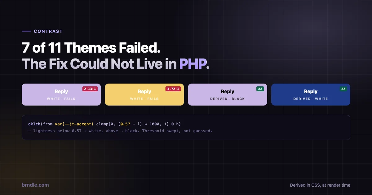
We hit this building Jetonomy’s front end. Adopting the theme accent and painting white text on it failed WCAG AA on seven of the eleven themes we tested. Reign’s lavender measured 2.13:1 against white, against a 4.5:1 requirement.
This is how we fixed it, and why the fix had to be written in CSS rather than PHP.
Adopting the theme colour
First, the part that works. A plugin can inherit whatever brand colour the active theme defines, using a chain of CSS custom property fallbacks:
:root {
  --jt-accent: var(--bx-color-accent,            /* BuddyX 5.1+   */
               var(--reign-colors-theme,         /* Reign 8.0+    */
               var(--brand,                      /* BuddyNext     */
               var(--wp--preset--color--primary, /* "primary" slug */
               var(--ast-global-color-0,         /* Astra         */
               var(--global-palette1,            /* Kadence       */
               var(--theme-palette-color-1,      /* Blocksy       */
               var(--nv-primary-accent,          /* Neve          */
               var(--wp--preset--color--accent,  /* GeneratePress */
               #0073aa)))))))));                 /* neutral default */
}
Nine themes, one declaration, resolved by the browser at runtime. The tokens are mutually exclusive in practice – a site runs one theme – so the ordering only decides precedence for the rare theme exposing two.
Two properties of this approach are worth noticing.
It follows dark mode for free. Each link is var(token, fallback), so when the theme flips its own token for dark mode, the adopted accent flips with it. No extra code, no media query, no observer.
It degrades to a sensible default. A theme exposing none of those tokens lands on #0073aa and looks deliberate rather than broken.
The same pattern applies to text and background:
--jt-text: var(--bx-color-fg, var(--text-1, var(--wp--preset--color--contrast, #1a1a1a)));
--jt-bg:   var(--bx-color-bg-elevated, var(--bg, var(--wp--preset--color--base, #ffffff)));
Where it breaks
Now the problem. A filled button is the adopted accent as background, with text on top. The text has to be readable.
The obvious implementation is white text, because brand colours are usually saturated and darkish. Usually.
Across eleven real themes, seven produced accent colours where white text failed AA. Pale brand colours, muted pastels, anything in the yellow-through-lavender range. The worst case measured 2.13:1 where 4.5:1 is required – not marginal, less than half.
A sample of what that looked like across the themes we checked:
| Theme accent | Against white | AA (4.5:1) |
|---|---|---|
| Deep navy | 12.4:1 | Pass |
| Standard WordPress blue | 5.1:1 | Pass |
| Muted teal | 3.6:1 | Fail |
| Warm amber | 1.7:1 | Fail |
| Pale lavender | 2.1:1 | Fail |
And the failure is invisible during development. You build against one theme, the contrast is fine, you ship. The site owner activates a different theme and your buttons quietly become unreadable, with nothing in any log to indicate it.
Why PHP cannot fix this
The instinct is to compute the right foreground server-side. Read the accent, calculate relative luminance, emit black or white text accordingly. Standard practice, and it is what we would do if the accent were a value we held.
It is not. --jt-accent resolves to a token defined by the active theme, and that resolution happens in the browser. PHP never sees the final colour. It sees a var() chain – a reference to something the CSS engine will look up after the page arrives.
We could have parsed the theme’s stylesheets server-side to find out. That means reading and interpreting CSS from an arbitrary theme, on every request or with a cache that goes stale the moment somebody edits Global Styles. It is brittle in exactly the way that produces support tickets nobody can reproduce.
The constraint is real: the value only exists at render time, so the decision has to be made at render time. Which means CSS.
Deriving the foreground in CSS
Relative colour syntax makes this possible. You can take an existing colour, decompose it, and build a new one from its parts:
@supports (color: oklch(from red l c h)) {
  :root {
    --jt-accent-fg:       oklch(from var(--jt-accent)       clamp(0, (0.57 - l) * 1000, 1) 0 h);
    --jt-accent-hover-fg: oklch(from var(--jt-accent-hover) clamp(0, (0.57 - l) * 1000, 1) 0 h);
  }
}
Reading that from the inside out:
oklch(from var(--jt-accent) ...) decomposes the adopted accent into OKLCH components, making l (lightness), c (chroma) and h (hue) available.
clamp(0, (0.57 - l) * 1000, 1) is the switch. If the accent’s lightness is below 0.57, (0.57 - l) is positive, multiplying by 1000 makes it large, and the clamp pins it to 1 – maximum lightness, white. If lightness is above 0.57, the expression goes negative and clamps to 0 – black. The multiplier turns a gradual value into a hard binary.
The 0 in the chroma position forces the result to pure greyscale, so you get actual black or actual white rather than a tinted approximation.
The output: black text on light accents, white text on dark ones, decided per site by the browser.
Buttons consume it directly:
.jt-btn-fill { color: var(--jt-accent-fg); }The threshold is measured, not chosen
0.57 is the part worth dwelling on, because it is the difference between an engineering decision and a guess.
We swept the threshold from 0.40 to 0.80 against the eleven real theme accents and checked AA compliance at each step. 0.56 to 0.58 is the only band where all eleven pass. We took the middle.
That is a small piece of work and it changes the nature of the number. A threshold picked because it looked about right is a value nobody can defend or revisit. A threshold derived from a sweep against real inputs has a stated method, a known safety margin, and a clear test for whether it still holds when the theme list grows.
If you take one thing from this post, take that. When you find yourself typing a magic number into a design system, the question is not “does this look right” – it is “what would I measure to find out”.
Hover state gets its own derivation, incidentally, because --jt-accent-hover is the accent mixed 85% toward black, which can cross the threshold and flip the choice. Deriving it separately costs one extra line and avoids a state where the resting button is readable and the hovered one is not.
Feature-gating, honestly
Relative colour syntax is not universal. The whole block sits behind @supports (color: oklch(from red l c h)), and engines without it fall back to the plain default already declared in :root:
--jt-accent-fg: var(--jt-white);Which is white text – exactly what the code did before. The guard is a strict improvement where supported and a no-op where not, so nothing regresses on an older browser.
That framing matters when you are deciding whether to adopt a newer CSS feature. The question is not “is this supported everywhere”. It is “what happens where it is not, and is that worse than today”. Here the answer is “identical to today”, which makes the decision easy.
Worth being clear about the limit, though: on a browser without relative colour syntax, users still get the failing contrast. This is a progressive enhancement, not a fix for everybody. If you need guaranteed compliance across all engines, the honest answer is to stop adopting arbitrary colours and ship your own accessible palette – a real tradeoff we chose not to make, because looking foreign in every theme has its own cost.
How to test this yourself
The reason this bug survives so long in most plugins is that nobody tests the combination. You test your plugin, and separately the theme works, and the failure only exists where they meet.
A cheap check, worth running once per release:
Collect the accent from each theme you support. Activate it, open devtools, and read the computed value of your accent token on :root. Five minutes per theme, and the list is reusable.
Run each through a contrast checker against white and against black. You are looking for accents where neither passes, and accents where white fails but black passes – the second group is the one hard-coded white text breaks.
Automate the regression. Once you have the accent list, the check is arithmetic rather than judgement:
// Rough AA check for large-ish UI text on a filled button.
const srgb = c => (c /= 255) <= 0.03928 ? c / 12.92 : ((c + 0.055) / 1.055) ** 2.4;
const lum  = ([r, g, b]) => 0.2126 * srgb(r) + 0.7152 * srgb(g) + 0.0722 * srgb(b);
const ratio = (a, b) => {
  const [hi, lo] = [lum(a), lum(b)].sort((x, y) => y - x);
  return (hi + 0.05) / (lo + 0.05);
};

// ratio(accentRgb, [255,255,255]) < 4.5  -> white text fails on this accent
Feed it your theme accent list in CI and the failure becomes a build error rather than a support ticket. That is the difference between knowing about seven failing themes and finding out from a customer.
The setting we deleted
One more piece, and it is the usability lesson rather than the CSS one.
Earlier versions had an inherit_colors setting, checked by default. While it was on, the palette override returned nothing – meaning a site owner who picked a custom accent colour had it silently discarded. They chose a colour, saved, and nothing happened. No error, no warning.
There was also inherit_fonts, which emitted --jt-font: inherit and changed nothing at all, because the font token chain already ended in inherit.
Both are gone in 1.8.0. Adoption is now unconditional, and the accent field is the single override: leave it at the default sentinel and the theme colour is adopted; set anything else and that wins.
The lesson generalises past this plugin. A setting that can silently discard the user’s input is worse than no setting. The owner did the thing the interface invited, got no feedback, and concluded the plugin was broken. Removing the toggle and making the behaviour unconditional is a smaller interface that does what it looks like it does – and the second setting was pure noise, doing nothing while implying it did something.
Both are the kind of thing that survives for years because nobody reads a checkbox and asks whether it earns its place.
Where each decision lives
Pulling the whole thing together, the layering is worth stating explicitly because it is the part that makes it maintainable:
| Layer | Decided by | When |
|---|---|---|
| Accent colour | Host theme token, via fallback chain | Browser, at render |
| Accent override | Admin accent field, if set | Server, inline :root |
| Foreground text | Derived from accent lightness | Browser, at render |
| One-off tweaks | Admin custom CSS | Server, appended last |
| Programmatic overrides | jetonomydynamiccss filter | Server, before output |
The rule that keeps it coherent: anything depending on a value the browser resolves must itself be resolved by the browser. The accent is resolved late, so the foreground has to be too. Everything that does not depend on the adopted colour can stay server-side, where it is easier to reason about.
Get that boundary wrong and you end up with a PHP function trying to guess what a CSS variable will become, which is the shape of the bug this whole post exists to avoid.
What to take from this
Three things, if you build UI that lives inside other people’s themes.
Adopt the host theme rather than fighting it. A fallback chain across the tokens real themes actually expose is cheap, and looking native is worth more than looking like your brand on somebody else’s site. Our post on accessible colour systems in block themes covers the palette side of the same problem.
Derive contrast, do not assume it. The moment you adopt an unknown colour, hard-coded foreground text is a bug you have not seen yet. Relative colour syntax makes the derivation a two-line CSS declaration.
Measure your thresholds. Sweeping a range against real inputs takes an afternoon and turns a magic number into a defensible one.
The wider point is that adopting the host theme moves a decision from build time to runtime, and anything that depends on that decision has to move with it. Contrast is the obvious one. If your UI also branches on whether a colour is warm or cool, or picks an icon set by background lightness, those calculations have the same constraint – and the same answer, now that CSS can do arithmetic on colours it did not author.
This sits one layer below the two design token systems WordPress itself now ships: theme.json for the front end, --wpds-* for the admin, and a plugin’s own tokens that defer to whichever theme is active. Three layers, and the interesting engineering is in how they hand off to each other.