WordPress Now Has Two Design Systems, and Only One Is theme.json
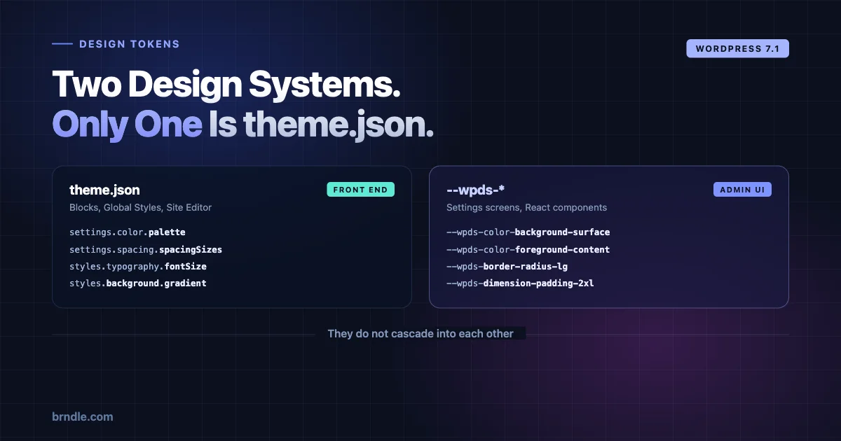
For the last three years, “design system in WordPress” has meant one thing: theme.json. Tokens for colour, spacing and typography, declared once, consumed by blocks, surfaced in the Site Editor. That is the system we have written about repeatedly, and it is the one most theme developers have built a mental model around.
WordPress 7.1 ships a second one.
It is called the design system theming layer, it exposes semantic tokens as CSS custom properties prefixed --wpds-, it comes with a React ThemeProvider, and it does not style your front end at all. It styles the admin interface.
Two token systems, two surfaces, two audiences. If you maintain a product that ships both a block theme and an admin screen – which is most commercial plugins and every theme with a settings page – you now have to hold both in your head and know which one applies where.
That distinction is the entire point of this post, so let us be precise about it before going near the syntax.
The two systems, side by side
theme.json | --wpds-* design tokens | |
|---|---|---|
| Styles | The front end, and block editor content | The WordPress admin interface |
| Consumed by | Blocks, Global Styles, the Site Editor | Admin screens, plugin settings pages, React components |
| Authored in | A JSON file in your theme | CSS custom properties, or ThemeProvider in React |
| Audience | Site owners and content editors | Plugin and core UI developers |
| Who changes it | The site owner, through the Site Editor | The developer, at build time |
The critical line is the first one. theme.json has never styled wp-admin, and --wpds-* does not style your theme. They do not overlap, they do not cascade into each other, and a token defined in one is invisible to the other.
If you have been treating “WordPress design tokens” as a single subject – and until 7.1 that was a reasonable simplification – it stops being one now.
One clarification before going further, because it is the question that comes up immediately. This is not a replacement, a migration path, or a sign that theme.json is being wound down. Nothing about block theme styling changes in 7.1 as a result of this. The two systems were built for different surfaces by different parts of core, and they will keep evolving separately. Treating this as “the new way to do design tokens in WordPress” would be a straightforward misreading, and an expensive one if it led you to move front-end styling somewhere it does not belong.
What actually ships
A new stylesheet, wp-theme, is registered by default and available as a dependency for plugins to enqueue. It provides a full set of semantic design tokens formatted as CSS custom properties.
Tokens cover four categories:
- Colour – background surfaces, foreground content, strokes
- Typography – font properties
- Spacing – padding and margins
- Borders – width and radius
Here is what the naming looks like in practice, taken from the card component:
--wpds-color-background-surface-neutral-strong
--wpds-color-foreground-content-neutral
--wpds-color-stroke-surface-neutral-weak
--wpds-border-width-xs
--wpds-border-radius-lg
--wpds-dimension-padding-2xl
And in use:
.card {
	background-color: var(--wpds-color-background-surface-neutral-strong);
	color: var(--wpds-color-foreground-content-neutral);
	border: var(--wpds-border-width-xs) solid var(--wpds-color-stroke-surface-neutral-weak);
	border-radius: var(--wpds-border-radius-lg);
	padding: var(--wpds-dimension-padding-2xl);
}
Read the token names, they are a taxonomy
The names look verbose until you notice they are structured, and then they become the most useful part of the whole system.
Take --wpds-color-background-surface-neutral-strong and split it:
wpds– the namespacecolor– the categorybackground– the role: is this paint behind something, text on top of something, or a line around somethingsurface– what kind of thing it applies toneutral– the semantic intent, as opposed to a huestrong– the emphasis step
Compare it with --wpds-color-foreground-content-neutral. Same namespace, same category, same semantic intent, but foreground instead of background and content instead of surface. Those two are designed to be used together – one is the paint, the other is the text that sits on it.
That pairing is the thing worth internalising. A token system where you can look at two names and know they are meant to be adjacent is doing real work. It is the difference between a palette and a system, and it is exactly the argument we made about what shadcn/ui gets right that block themes should copy – semantic naming over descriptive naming, so the name tells you the job rather than the value.
Note also what is absent. There is no --wpds-color-blue-500. The tokens describe intent, not appearance, which is what allows the values underneath to change without every consumer breaking.
Why this naming survives redesigns and yours might not
Put the two naming approaches next to each other and the difference becomes obvious.
/* Descriptive - names the value */
--plugin-blue: #3858e9;
--plugin-grey-100: #f0f0f1;
--plugin-radius-8: 8px;

/* Semantic - names the job */
--wpds-color-background-surface-neutral-strong;
--wpds-color-foreground-content-neutral;
--wpds-border-radius-lg;
The descriptive set breaks the first time the design changes. When --plugin-blue needs to become green, you either rename the token everywhere it is used or you leave a variable called blue holding a green value, which is worse. Every team that has shipped a design system has met one of those two outcomes.
The semantic set does not have that problem, because nothing in the name commits to a value. background-surface-neutral-strong describes a position in a system – paint, behind a surface, no semantic colour meaning, high emphasis. Change the hex underneath and every consumer follows without edits.
The cost is verbosity, and it is a real cost. --wpds-color-background-surface-neutral-strong is 46 characters and you will type it often. That trade is the correct one at the scale core operates at, where thousands of plugins consume the same tokens and renaming is effectively impossible. Whether it is correct for your own plugin depends on how many people consume your tokens and how long the product lives.
The useful takeaway is not “copy this naming scheme”. It is: decide whether your tokens name values or jobs, and be consistent. Mixing the two is worse than either.
ThemeProvider: the React half
The CSS custom properties are half the system. The other half is a React component, ThemeProvider, available through the wp-theme script handle. It wraps content and overrides the default token values for everything inside it.
import { ThemeProvider } from '@wordpress/theme';
import { Card } from '@wordpress/ui';

function Application() {
	return (
		<ThemeProvider
			color={ { primary: '#3858e9', background: '#11004d' } }
			cornerRadius="pronounced"
		>
			<Card.Root>
				<Card.Content>
					WordPress is designed for everyone. We believe great
					software should work with minimum set up,
					emphasizing accessibility, performance, security,
					and ease of use.
				</Card.Content>
			</Card.Root>
		</ThemeProvider>
	);
}
The props are deliberately few:
| Prop | Purpose |
|---|---|
color.primary | Primary seed colour – hex, rgb/rgba, or a CSS named colour |
color.background | Background seed colour, same formats |
cursor.control | Cursor for interactive controls, defaults to pointer |
cornerRadius | none, subtle, moderate or pronounced. Defaults to subtle |
isRoot | Applies theming to the document element. Maximum one per document |
You give it seed colours and it generates a harmonious ramp from them. You do not hand it fifty values; you hand it two and a roundness preference.
That is a genuine design decision worth noticing. Most theming APIs let you override everything, and the result is that every consumer overrides a different subset and nothing looks coherent. Constraining the surface to two seeds and a radius preset means a plugin can express brand identity while still looking like it belongs in wp-admin.
The new package in that example
Worth flagging something easy to skim past: the import is from '@wordpress/ui', and the component is Card.Root / Card.Content.
That is a compound component API – the pattern where a component exposes named sub-components rather than taking a pile of props – and it is the convention modern React design systems have converged on. Radix popularised it, shadcn/ui built on it, and it is now appearing in WordPress core packages.
If you have been building admin UI with @wordpress/components, this is a different package with a different API shape sitting alongside it. Worth watching where the line between the two settles.
The contrast caveat, stated plainly
Core is honest about a limitation, and it deserves emphasis rather than a footnote.
ThemeProvider generates a colour ramp from your seed colours. It cannot guarantee accessible contrast for every possible combination, and the documentation says due diligence is still required.
Read that as: the system will not stop you shipping a settings page that fails WCAG. Hand it a seed colour that is too light and the generated ramp will produce foreground and background pairings that look plausible in a component preview and fail a contrast check.
This is the same trap we covered in designing accessible colour systems in block themes, and the fix is the same: measure, do not eyeball. Contrast is a computed ratio between two luminance values. A generated ramp gives you convenience, not compliance, and the two are easy to confuse when the output looks tidy.
Practically, that means running your themed admin UI through a contrast checker at the seed colours you actually intend to ship, not at the defaults. Do it once per brand colour, not once per component.
What the tokens replace in a typical settings page
To see the value, look at what a plugin settings page usually contains today. Something close to this is in almost every commercial plugin:
.myplugin-panel {
	background: #fff;
	color: #1e1e1e;
	border: 1px solid #dcdcde;
	border-radius: 4px;
	padding: 24px;
	font-size: 13px;
}

.myplugin-panel__muted {
	color: #757575;
}
Every one of those values is a guess at what wp-admin uses. Some were copied from core’s stylesheet in 2021. Some were picked because they looked close. None of them update when core adjusts its palette, which means the page drifts a little further from looking native with each WordPress release.
The token version does not have that problem:
.myplugin-panel {
	background-color: var(--wpds-color-background-surface-neutral-strong);
	color: var(--wpds-color-foreground-content-neutral);
	border: var(--wpds-border-width-xs) solid var(--wpds-color-stroke-surface-neutral-weak);
	border-radius: var(--wpds-border-radius-lg);
	padding: var(--wpds-dimension-padding-2xl);
}
Same visual result today. The difference is what happens in eighteen months: the first version still renders 2021’s admin, and the second one tracks whatever core looks like then.
There is a real caveat. Tokens only help where a token exists. Core ships colour, typography, spacing and border tokens – which covers most of a settings page but not all of it. Layout, grid, transitions and z-index are still yours to manage, and inventing --myplugin- variables for those alongside --wpds- for the rest is fine, provided the boundary is obvious to whoever reads the file next.
When should a plugin theme its admin UI at all?
The capability existing does not mean you should use it. Three positions, and most plugins should pick the first.
Inherit, and change nothing. The correct default. Your settings screen looks like WordPress, which is what an administrator expects and what makes your plugin feel like part of the site rather than an embedded application. Every screen that differs from wp-admin costs the user a small amount of orientation.
Theme lightly. A primary colour that matches your product, everything else inherited. This is where ThemeProvider earns its place: two props, brand recognition, no divergence in layout, spacing or interaction. If you have a product with its own identity – the case for most commercial plugins – this is the sweet spot.
Theme heavily. A full brand takeover of your screens. Justifiable when your plugin is effectively an application that happens to live inside WordPress, and users spend hours in it rather than minutes. Rare. If you are reaching for isRoot you should be able to articulate why the whole document needs your identity rather than your own screens.
The failure mode to avoid is theming because the API is new. A settings page that looks nothing like wp-admin is not more professional; it is more disorienting, and it dates faster because it stops inheriting core’s improvements.
How this should relate to your theme.json
If your product ships both a block theme and admin screens, you now have brand colour defined in two places, in two formats, consumed by two systems that cannot see each other.
That is a synchronisation problem, and it will drift unless you decide up front where truth lives.
The approach that holds up: one source, two outputs. Keep your brand values in a single place – a JSON file, a small JS module, whatever your build already reads – and generate both the theme.json palette entries and the ThemeProvider seed props from it. Neither system is the source; both are consumers.
The approach that fails: hard-coding #3858e9 in theme.json and again in a React component. It works on day one. It drifts the first time someone adjusts the brand and updates one of them.
This is the same discipline we described in building a design token system in theme.json, extended by one output. The principle does not change – tokens have a single definition and many consumers – only the number of consumers does.
Worth being realistic about the seams, though. theme.json supports a full palette with arbitrary named entries. ThemeProvider takes two seeds. You cannot round-trip between them, and trying to force a perfect mapping will waste more time than it saves. Map your primary and your background, accept that the admin ramp is generated rather than specified, and move on.
A worked example of the sync problem
Concretely, here is the shape that holds up. One source file your build already reads:
// brand.tokens.js - the single source
export const brand = {
	primary:    '#3858e9',
	background: '#11004d',
	radius:     'moderate',
};
Generate the theme.json fragment from it at build time rather than hand-maintaining the palette:
// build/theme-json.js
import { brand } from '../brand.tokens.js';

export const palette = [
	{ slug: 'brand-primary',    name: 'Brand primary',    color: brand.primary },
	{ slug: 'brand-background', name: 'Brand background', color: brand.background },
];
And read the same source in your admin entry point:
import { ThemeProvider } from '@wordpress/theme';
import { brand } from '../brand.tokens.js';

export function AdminApp( { children } ) {
	return (
		<ThemeProvider
			color={ { primary: brand.primary, background: brand.background } }
			cornerRadius={ brand.radius }
		>
			{ children }
		</ThemeProvider>
	);
}
Now a brand change is one edit in one file, and both surfaces follow. The specific tooling does not matter – what matters is that neither theme.json nor the React component is the place the value is decided.
One caveat before you build this: it is only worth the indirection if you genuinely ship both surfaces. A theme with no admin screens does not need it, and a plugin with no block theme does not either. Adding a build step to solve a problem you do not have is its own kind of debt.
What this signals about where core is going
Three things worth reading into this release, carefully, without over-claiming.
The admin is being treated as a design system surface. For most of WordPress’s history, wp-admin styling has been ad hoc – a large stylesheet, some conventions, and a lot of plugins doing whatever they wanted. Shipping semantic tokens with a public API is a statement that the admin has a design system now, and that plugins are expected to consume it.
Theming is being constrained deliberately. Two seed colours and a radius preset is a small surface. That is a choice about coherence over flexibility, and it is the right one. An API that let every plugin override every token would produce an admin that looks like fifty different products.
The React component layer is consolidating. @wordpress/ui appearing with compound components alongside @wordpress/components suggests a direction, not a finished state. If you are starting new admin UI after August, it is worth understanding which package core intends you to build on before committing.
None of this changes what a block theme does. theme.json is not deprecated, not superseded, and not affected. But “I know WordPress design tokens” now means two systems rather than one, and the gap between people who notice that and people who do not will show up in how coherent their products look inside wp-admin.
What to do about it
Nothing urgent. This is a capability, not a migration – nothing breaks if you ignore it, and no existing admin CSS stops working.
The useful moves, in order:
Read your own admin CSS against the token list. Most plugin settings pages contain hard-coded hex values, pixel paddings and border radii that were guesses approximating wp-admin. Those are exactly what the tokens replace, and swapping them means your UI tracks core’s visual changes instead of drifting from them each release.
Decide your theming position before you write code. Inherit, light, or heavy – pick one deliberately. The decision is cheap now and expensive to reverse once screens are built.
Consolidate your brand values to one source if you ship both a theme and admin UI. This is the item worth doing properly, because it only gets harder as the number of places referencing your brand colour grows.
Check contrast at your real seed colours. Not the defaults, not a component preview. The generated ramp is convenient and it is not a guarantee.
One more thing worth settling early, because it will come up the first time a designer looks at a themed screen: the admin is not a place to express art direction. The front end is where your visual identity does its work, and site owners expect it to be distinctive. An administrative interface is a tool, and tools are judged on how quickly someone can find the control they need. Those are different jobs with different success criteria, and the fact that both now have a token system does not make them the same problem.
That is the honest reason the two systems staying separate is a good outcome rather than an inconvenience. If theme.json also styled wp-admin, every bold front-end palette would leak into a settings screen where it does not belong. Keeping them apart lets a theme be striking and its settings page be legible, without either compromising for the other.
WordPress 7.1 ships on 19 August, so none of this is usable in production yet. But the naming taxonomy is worth studying before then – it is a genuinely well-structured token system, and understanding why background-surface-neutral-strong and foreground-content-neutral belong together will make you better at naming your own tokens regardless of which system you are working in.