Best Free Outdoor Banner and Billboard Mockup PSDs for Realistic Presentations in 2026
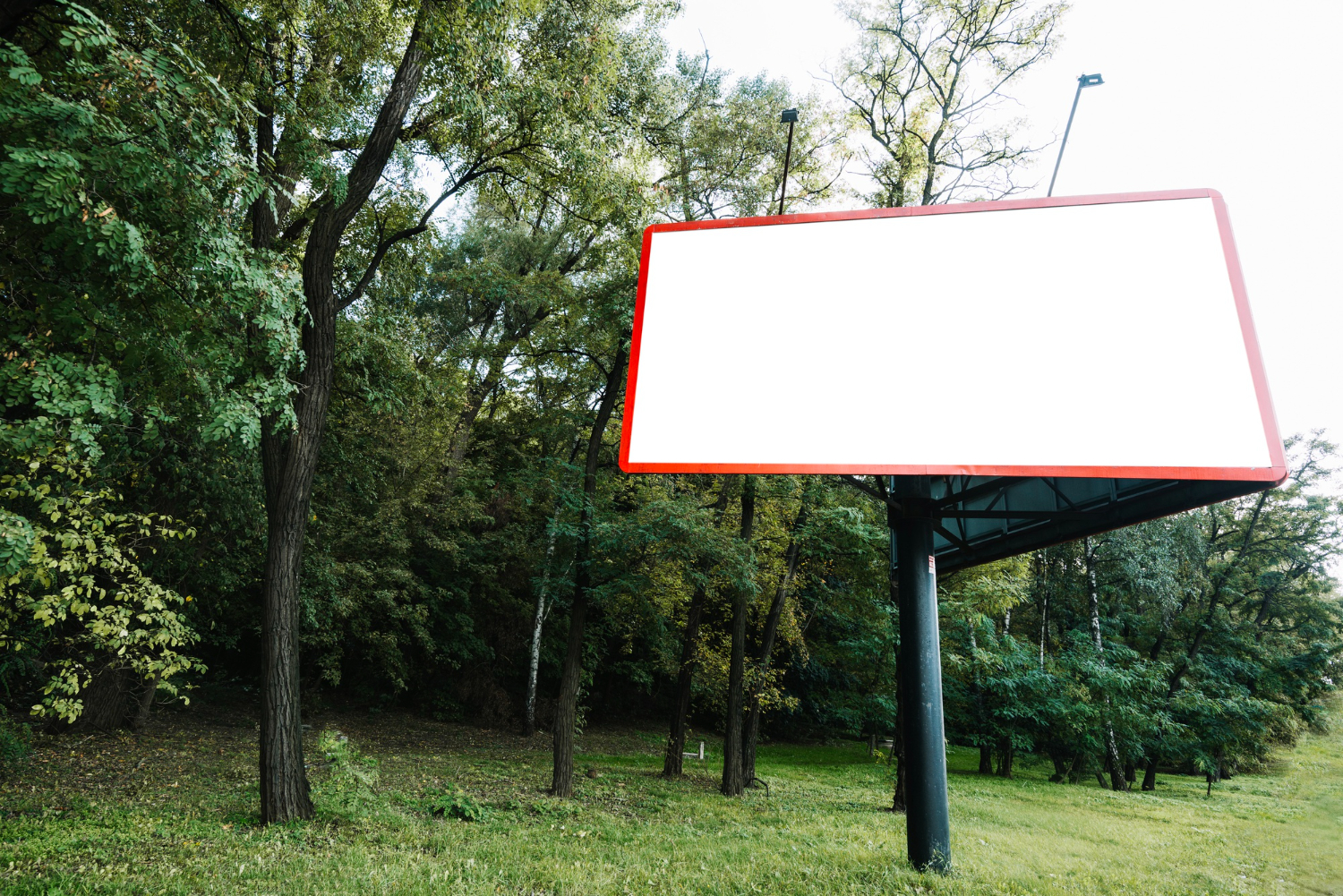
A billboard concept looks like a flat rectangle until someone actually sees it thirty feet in the air next to a highway. That gap between “here’s my design file” and “here’s how it will actually read to a driver doing sixty” is exactly what outdoor mockup PSDs exist to close. Instead of printing a banner and renting wall space just to test how a headline reads from across the street, a designer can drop the same artwork into a photorealistic scene in a few minutes and see the whole thing: scale, lighting, shadow falloff, how much of the message survives from a distance.
Outdoor advertising is unforgiving in a way that print collateral or a web banner isn’t. A brochure gets held six inches from someone’s face. A billboard gets glanced at for two or three seconds from a moving car, often in bad light, often at an angle. Mockups built specifically for banners and billboards account for that by putting your design into real environments: cluttered city intersections, empty stretches of highway, building facades with visible weathering. That context tells you things a flat Photoshop canvas never will, like whether your color contrast holds up against an overcast sky or whether body copy that looked fine on a laptop screen turns to mush at billboard distance.
Why Outdoor Mockups Earn Their Place in a Design Workflow
The obvious benefit is client communication. Most clients aren’t trained to look at a flat vector file and imagine it wrapped around a bus shelter or bolted forty feet up a pole. Show them the same design sitting inside a real photograph of a comparable location, and the conversation changes immediately. Feedback gets sharper because they’re reacting to something that resembles the finished product rather than an abstraction.
There’s also a practical cost argument. Physical proofing for outdoor media is expensive and slow. A vinyl print run, a temporary install, a site visit to check sightlines, all of that costs real money and real time, and it only tells you about one execution. A mockup lets you test five or six placements and lighting conditions in an afternoon at no cost beyond the time spent swapping layers. For freelancers and small studios pitching outdoor campaigns, that speed matters as much as the visual polish.
And a strong mockup does double duty as portfolio material. A flat banner design sitting on a plain background doesn’t sell the work the way the same design does when it’s shown mounted on a realistic billboard structure with proper perspective and depth. Anyone browsing a portfolio site or a Behance page reacts differently to context than to an isolated asset, which is part of why so many working designers keep a stock of go-to mockup templates on hand rather than building presentation scenes from scratch every time.
Freepik
Freepik has grown into one of the largest general repositories for design assets, and its billboard and banner mockup selection reflects that scale. The free tier includes a wide spread of outdoor scenes: roadside billboards shot at a slight angle, street-level banner poles, building-mounted displays photographed at dusk and in daylight. Most of the PSD files use smart object layers, so dropping in a finished design is a matter of double-clicking the smart object, pasting the artwork, and saving. Because Freepik pulls from thousands of independent contributors, quality varies more than on a tightly curated site, so it’s worth previewing the layer structure before committing to one, but the sheer volume means there’s usually a scene that matches almost any outdoor context a project calls for.
GraphicBurger
GraphicBurger built its reputation on photorealism rather than volume, and that shows in its billboard mockups. The files tend to be shot with careful attention to lighting and depth of field, which makes the finished composite harder to distinguish from an actual photograph of an installed sign. Layers are generally well organized and labeled clearly, which matters more than it sounds like it should when you’re working with a 300MB PSD file at 2 a.m. before a client deadline. The urban and roadside scenes on offer skew toward North American and European streetscapes, so it’s a strong fit for campaigns targeting those markets specifically.
Mockup World
Mockup World operates as a curator rather than a creator, aggregating free PSD mockups from studios and independent designers across the web and organizing them by category. Its outdoor advertising section covers street lamp banners, cityscape billboards positioned above traffic, and highway signage shot from a driver’s-eye perspective. Because everything is aggregated, file quality and organization vary from one download to the next, but the breadth of styles is genuinely useful when a brief calls for something specific, like a banner mounted at an unusual angle or a billboard set against a particular kind of skyline.
PixelBuddha
PixelBuddha sits between premium and free resource sites, offering a mix of both with the free selection still holding up well against paid competitors. Its outdoor billboard mockups lean toward two distinct moods: dense, high-traffic cityscapes with visible pedestrian and vehicle activity, and quieter suburban or highway settings with more negative space around the sign itself. That range is useful because a beverage ad and a real estate ad don’t want the same energy in their background scene. Files are high resolution and generally include properly named smart object layers, which keeps the editing process quick.
ZippyPixels
ZippyPixels covers a wider variety of perspectives than most billboard-focused sites, including low-angle shots looking up at building-mounted signage and eye-level banner placements meant to simulate a pedestrian’s view. Layer organization is generally solid, with separate groups for the sign structure, the environment, and lighting effects like glare or shadow, which gives more control over the final look than a flattened composite would. For campaigns that need to show a design at more than one physical scale, pairing a large building-mounted mockup with a smaller eye-level banner from the same source keeps the visual style consistent across both.
Pixeden
Pixeden has been producing design resources for long enough that its library includes some genuinely well-aged classics alongside newer additions, and its free outdoor mockups hold up on both resolution and realism. The urban advertisement scenes in particular tend to include convincing environmental detail, weathered concrete, visible signage clutter nearby, natural shadow work, that separates a good mockup from a mediocre one. Smart object layers are standard across the collection, and the site keeps free and premium options clearly separated so it’s easy to filter for what won’t cost anything.
Dribbble
Dribbble isn’t a dedicated mockup repository, but plenty of individual designers post free billboard and banner mockups as portfolio pieces or community giveaways, and searching the platform directly for “billboard mockup” or “outdoor banner mockup” turns up options that don’t show up anywhere else. The tradeoff is consistency: quality, file structure, and licensing terms vary designer to designer, so it’s worth reading the attached notes or reaching out to the creator before using a file commercially. What you lose in predictability, you sometimes gain in originality, since Dribbble mockups tend to experiment with unusual angles and settings that the bigger aggregator sites rarely bother with.
Mockups Design
Mockups Design keeps a tighter, more curated catalog than some of the larger aggregators, and its outdoor selection covers roadside billboards, building-mounted urban banners, and a handful of transit-adjacent placements like bus shelter panels. The PSD files are generally well organized with clearly labeled smart object layers, and the photography behind each scene tends toward natural, slightly overcast lighting that reads as neutral rather than stylized, which makes it easier to judge how a design will actually perform in ordinary daylight conditions rather than in a dramatically lit hero shot.
Getting the Most Out of a Mockup File
Once a PSD is downloaded, the workflow is fairly consistent across sources. Open the file in Photoshop and look through the layers panel for a smart object, usually labeled something like “Place Your Design Here” or “Your Artwork.” Double-clicking that layer opens a separate editing window where the actual design file gets pasted or placed. Saving and closing that window pushes the artwork back into the main composite, where it automatically inherits the mockup’s perspective, warp, and masking.
That’s the mechanical part, but the details that separate an average mockup from a convincing one live in the adjustment layers most files include alongside the smart object. Lighting and shadow layers, when present, should be nudged rather than ignored. A billboard mockup shot at dusk with long shadows will look wrong if the inserted design has crisp, high-contrast edges that don’t match the ambient light in the rest of the scene. Reducing opacity slightly on a highlight layer, or adding a touch of the mockup’s dominant shadow color back over the artwork, usually closes that gap. It’s a small step that a lot of people skip, and it’s the difference between a composite that reads as a real photograph and one that reads as a sticker pasted onto a background.
Color grading matters too. Most of these scenes were shot or rendered with a particular color temperature, warm for late-afternoon urban shots, cool and flat for overcast highway scenes, and a design that was built against a pure white canvas can look oddly saturated once it’s dropped into that environment. A light color balance adjustment on the inserted layer, matched to the tone of the surrounding scene, usually fixes it in under a minute.
Matching the Scene to the Message
Not every mockup style suits every campaign. A dense, high-traffic cityscape communicates energy and scale, which works well for consumer products aimed at a broad urban audience, but that same busy background can bury a message that depends on quiet, focused attention, like a real estate listing or a nonprofit awareness campaign. Highway billboard mockups, shot from a driver’s approximate eye level with the sign positioned for a few seconds of visibility, are better suited to short, high-impact messaging: a phone number, a tagline, three or four words maximum. Testing a design in more than one type of scene before locking in a final direction is worth the extra ten minutes, because a headline that reads perfectly in a static portfolio shot can fall apart once it’s simulated at highway speed.
Building-mounted mockups, particularly the ones shot at a slight upward angle to simulate how a pedestrian would actually see the sign, tend to expose typography problems that flat presentations hide. Letters that looked balanced head-on can appear to lean or compress once the perspective warp is applied, which is a useful early warning before a design goes to print.
Reading the License Before You Reuse a Free File
“Free” on a mockup site rarely means unrestricted, and skipping the license terms is one of the more common ways designers end up in an uncomfortable conversation with a client’s legal team. Most of the sites above split their libraries into two tiers: free-for-personal-use files that require attribution or are restricted from commercial resale, and free-for-commercial-use files that can go straight into client work without extra paperwork. Freepik in particular has a subscription model layered underneath its free tier, and some assets flagged as free still carry an attribution requirement unless the download comes through a paid plan. GraphicBurger and Pixeden tend to state their terms clearly on each product page, usually somewhere in the description or a linked terms page, and both generally allow commercial use of the free files without attribution, though it’s worth rereading the current terms rather than relying on memory from a previous download, since sites do change policies over time.
Dribbble is the one source on this list where license terms genuinely vary by individual poster rather than by platform-wide policy. A mockup posted as part of a designer’s portfolio shot might carry no license information at all, which technically means asking before using it commercially, even if the shot was clearly intended as a giveaway. A quick message to the poster usually resolves it in a day, and most working designers are glad to have their file used and credited. Skipping that step to save a day of turnaround is the kind of shortcut that occasionally comes back around on a bigger project.
Working With Large PSD Files Without Slowing Down
Photorealistic billboard mockups are not small files. A single scene with multiple lighting layers, shadow passes, and a high-resolution background photograph can easily run past 200MB, and stacking a few of these open in Photoshop at once will bring a modest laptop to a crawl. A few habits make the difference between a smooth session and a frustrating one. Flattening layer groups that aren’t actively being edited, working in a scratch disk with enough free space, and closing unused mockup files rather than leaving a dozen tabs open in the background all help keep Photoshop responsive. It also helps to duplicate the smart object layer before editing rather than working directly inside the original, since a corrupted smart object in a 300MB file is a genuinely painful thing to lose an afternoon to.
For designers working on lower-spec machines, some of the sites above, GraphicBurger and PixelBuddha among them, offer compressed or web-resolution preview versions of their mockups for exactly this reason. Those are worth using during the early concept and approval stage, when the goal is client feedback rather than final print output, and switching to the full-resolution file only once a direction is locked in saves a meaningful amount of rendering time across a project.
Presenting a Full Campaign, Not Just One Shot
Clients rarely buy a single billboard. Most outdoor campaigns run across a handful of formats and placements at once, a highway billboard, a couple of building-mounted banners in different neighborhoods, maybe a smaller street-level sign near a storefront, and presenting all of those together tells a more complete story than any single mockup on its own. Pulling two or three scenes from the same source, or from sources with a similar photographic style, keeps the lighting and color grading consistent across the presentation, which matters more for a client’s confidence than any individual mockup’s quality. A composite deck that jumps from a warm dusk shot to a flat overcast one to a saturated daytime scene can read as inconsistent even when every individual image is well executed, simply because the eye picks up on the mismatch.
It’s also worth testing a design under more than one lighting condition before finalizing it, particularly for campaigns that will run around the clock. A design with subtle color contrast might hold up fine in a bright daytime mockup and disappear entirely in a dusk or night scene where the billboard is lit from below or backlit. Several of the sources above, Freepik and GraphicBurger especially, include both day and night versions of comparable scenes for exactly this reason, and running a design through both before sign-off catches problems that a single static preview would miss. A headline that needs to work at 2 p.m. and 10 p.m. isn’t the same design problem twice, it’s one problem with two different answers, and mockups are the cheapest way to find out if a single version of the artwork can actually cover both.
Choosing a Source for the Next Project
None of these eight sources is strictly better than the others across every use case. Freepik and Mockup World win on raw volume when a brief is open-ended and needs options fast. GraphicBurger, PixelBuddha, and Pixeden tend to deliver the most consistently photorealistic results when the final composite needs to survive close scrutiny from a client or an art director. ZippyPixels and Mockups Design are worth checking first when a project needs an unusual angle or a specific urban context that the bigger aggregators don’t cover well. And Dribbble remains the wildcard, useful for finding something genuinely different when the standard scenes have started to feel repetitive across a few projects in a row.
Keeping a small personal library of two or three go-to mockups from different sources, rather than relying on a single site, tends to produce more varied and more convincing presentations over time. Outdoor advertising design lives or dies on how well it reads in context, and a well-chosen mockup is still the fastest, cheapest way to find that out before a design ever reaches a print shop or an installation crew.