Popovers Without JavaScript in WordPress Block Themes
Open almost any WordPress theme’s JavaScript folder and you will find the same small script under a different name. It listens for a click on a trigger, toggles an is-open class on a panel, flips aria-expanded, adds a document-level click listener so a click outside closes the panel, adds a keydown listener so Escape closes it, tries to put focus back on the trigger, and bumps a z-index until the panel stops hiding behind the sticky header. Then it gets copied for the language switcher, the cart summary, the “share this” panel and the opening hours note in the footer, each copy slightly different.
Browsers now do all of that natively. The HTML popover attribute, and the invoker attributes that go with it, cover the open and close logic, the dismiss behaviour, the stacking and the focus order. WordPress core has quietly caught up too: since 6.9 its content filter allows popover attributes in post content, and 7.1 adds the new button command attributes.
This guide shows how to use that in a block theme properly: what the platform actually gives you, where browser support stands today, how to expose popovers to editors through a block style variation and theme.json instead of raw HTML, and where you still need JavaScript. Every code sample here was run against WordPress 7.1 and tested in a browser before publishing.
What the popover attribute replaces
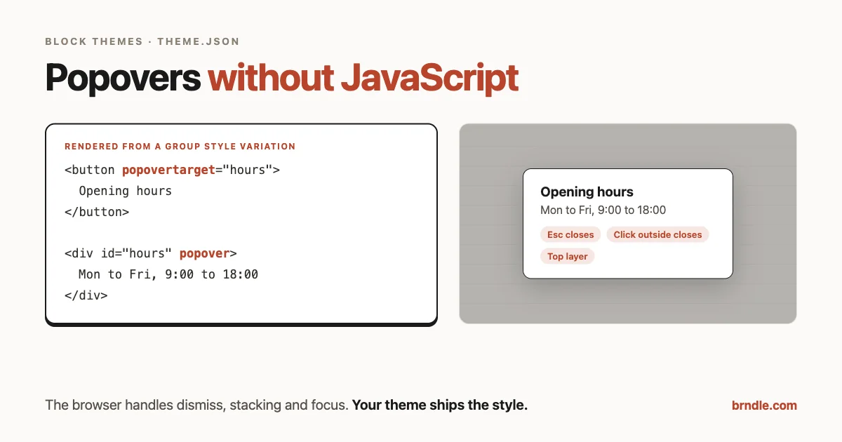
The smallest working popover is two elements and no script:
<button type="button" popovertarget="opening-hours">Opening hours</button>

<div id="opening-hours" popover>
	<p>Mon to Fri, 9:00 to 18:00</p>
</div>
Here is what the browser handles for you, taken from MDN’s Using the Popover API guide:
- Toggling. The button opens the popover and clicking it again closes it.
popovertargetactioncan restrict a button toshoworhide. - Light dismiss. The popover can be “light dismissed,” which MDN defines as hiding it “by clicking outside it.” It can also be closed “using browser-specific mechanisms such as pressing the Esc key.”
- One at a time. “Usually, only one
autopopover can be shown at a time,” with an exception for nested popovers. Your cart panel closes the language switcher without you writing the rule. - Stacking. Open popovers render in the top layer, above everything else on the page. No
z-indexnegotiation with the sticky header. - Focus order. “When the popover is shown, the keyboard focus navigation order is updated so that the popover is next in the sequence,” so the next Tab after the button moves into the popover’s content, wherever that content sits in the DOM.
- Relationships for assistive technology. MDN notes that “an implicit
aria-detailsandaria-expandedrelationship is set up” between the button and the popover.
We tested that exact markup, rendered through WordPress, in Chromium 153: clicking the button matched :popover-open, focus stayed on the button, Escape closed it, and a real click on text outside the popover closed it. One detail worth knowing if you write automated tests: dispatching synthetic pointer events from a script did not light dismiss the popover. Only a real user click did, which is the behaviour you want.
There is also popover="manual". In that state, MDN says the popover “cannot be ‘light dismissed’, although declarative show/hide/toggle buttons (as seen earlier) will still work,” and several can be open at once. Use it for things like toasts that should stay until closed on purpose.
Browser support, honestly
The numbers below come from the web-features dataset that powers Baseline (version 3.38.0 at the time of writing).
| Feature | Baseline status | First versions with support |
|---|---|---|
popover attribute | Newly available since 27 January 2025 | Chrome and Edge 116, Firefox 125, Safari 17, Safari on iOS 18.3 |
Invoker commands (command, commandfor) | Newly available since 12 December 2025 | Chrome and Edge 135, Firefox 144, Safari 26.2 |
@starting-style and transition-behavior | Newly available since 6 August 2024 | Chrome 117, Firefox 129, Safari 17.4 and 17.5 |
<dialog closedby> | Not Baseline | Chrome 134, Firefox 141, no Safari yet |
popover="hint" | Not Baseline | Chrome 151, Firefox 153, no Safari yet |
| CSS anchor positioning | Not Baseline | Not supported in all major engines |
“Newly available” means it works in the current version of every major browser, not that every visitor has updated. Two practical consequences for a theme:
- Design the fallback. A browser that does not understand
popoverignores the attribute. The content shows in the normal page flow and the button does nothing. For an opening-hours note or a size guide, that is an acceptable fallback. For a panel that should really be hidden until asked for, it may not be, so check your analytics for old Safari versions before relying on it for anything critical. - Treat the “not Baseline” rows as enhancements. Use them in a way that still works when they are ignored, which is covered in the sections below.
What WordPress lets you put in content
A popover is only useful to a block theme if its markup survives WordPress’s HTML filtering. For users without the unfiltered_html capability, such as authors and editors on most sites and everyone on a multisite network except super admins, post content passes through wp_kses_post(), which strips any attribute not on its allowlist.
That allowlist changed twice recently. The first change, which shipped in WordPress 6.9, is described in its commit message as adding “popovertarget, popovertargetaction and aria-haspopup to button; popover to div, ul, and adds dialog with the attributes open, closedby, and popover.” The second added command and commandfor to buttons, and is in the 7.1 branch but not 7.0. WordPress 7.1 also allows autofocus on dialog.
We compared kses.php on the 6.9, 7.0 and 7.1 branches to confirm this, then ran a quick check on 7.1:
echo wp_kses_post(
	'<button type="button" popovertarget="x" commandfor="d" command="show-modal">Go</button>' .
	'<div id="x" popover>Hi</div>' .
	'<section popover>no</section>' .
	'<dialog id="d" closedby="any">D</dialog>'
);

// <button type="button" popovertarget="x" commandfor="d" command="show-modal">Go</button>
// <div id="x" popover>Hi</div>
// <section>no</section>
// <dialog id="d" closedby="any">D</dialog>
Note the third line. The popover attribute was removed from section, because only div, ul and dialog are on the list. That catches people out: a Group block set to render as <section> or <aside> will lose the attribute if an author saves it as raw HTML. It is one more reason to add popover behaviour at render time from the theme, as shown next, rather than asking editors to type attributes.
Popovers as a block style variation
Editors should not have to know what popovertarget is. The block editor already has everything needed to express “this group is a popover, and this button opens it”:
- A block style variation called Popover on the Group block, so editors pick it from the Styles panel.
- The Group block’s HTML anchor field, which becomes its
id. - The Button block’s Additional CSS class field, holding a class like
opens-opening-hoursthat names the anchor to open.
The theme then turns those into real attributes at render time. This is the complete PHP, for a theme’s functions.php or an included file:
add_action( 'init', 'brndle_register_popover_style' );
function brndle_register_popover_style() {
	register_block_style(
		'core/group',
		array(
			'name'  => 'popover',
			'label' => __( 'Popover', 'brndle' ),
		)
	);
}

add_filter( 'render_block_core/group', 'brndle_group_popover', 10, 2 );
function brndle_group_popover( $html, $block ) {
	$classes = $block['attrs']['className'] ?? '';
	if ( ! preg_match( '/(^|\s)is-style-popover(\s|$)/', $classes ) ) {
		return $html;
	}
	$tags = new WP_HTML_Tag_Processor( $html );
	if ( $tags->next_tag() && $tags->get_attribute( 'id' ) ) {
		$tags->set_attribute( 'popover', 'auto' );
	}
	return $tags->get_updated_html();
}

add_filter( 'render_block_core/button', 'brndle_button_popover_target', 10, 2 );
function brndle_button_popover_target( $html, $block ) {
	$classes = $block['attrs']['className'] ?? '';
	if ( ! preg_match( '/(?:^|\s)opens-([A-Za-z][\w-]*)/', $classes, $match ) ) {
		return $html;
	}
	$tags = new WP_HTML_Tag_Processor( $html );
	if ( $tags->next_tag( 'button' ) ) {
		$tags->set_attribute( 'popovertarget', $match[1] );
	}
	return $tags->get_updated_html();
}
A few decisions in there are deliberate:
WP_HTML_Tag_Processor, not regular expressions on HTML. It is core’s HTML API. It finds the first tag safely and escapes attribute values for you.- No anchor, no popover. A popover nobody can open is just hidden content, so the group filter only adds the attribute when the block has an
id. - Only real buttons.
popovertargetworks on<button>, not on links. The button filter looks specifically for abuttontag and does nothing to a Button block that renders as<a>. - Editor stays editable. The attributes are added only on the front end, so in the editor the popover content is visible in place and can be edited like any other group.
Making the Button block render a button
The Button block renders a link by default. Its block.json defines a tagName attribute with the values a and button, defaulting to a. The simplest way to hand editors a working trigger is a block pattern with tagName already set. This is the markup we rendered through do_blocks() on WordPress 7.1:
<!-- wp:buttons -->
<div class="wp-block-buttons"><!-- wp:button {"tagName":"button","className":"opens-opening-hours"} -->
<div class="wp-block-button opens-opening-hours"><button type="button" class="wp-block-button__link wp-element-button">Opening hours</button></div>
<!-- /wp:button --></div>
<!-- /wp:buttons -->

<!-- wp:group {"anchor":"opening-hours","className":"is-style-popover","layout":{"type":"constrained"}} -->
<div id="opening-hours" class="wp-block-group is-style-popover"><!-- wp:paragraph -->
<p>Mon to Fri, 9:00 to 18:00</p>
<!-- /wp:paragraph --></div>
<!-- /wp:group -->
With the filters active, the front end output was:
<div class="wp-block-button opens-opening-hours"><button popovertarget="opening-hours" type="button" class="wp-block-button__link wp-element-button">Opening hours</button></div>

<div popover="auto" id="opening-hours" class="wp-block-group is-style-popover is-layout-constrained wp-block-group-is-layout-constrained">
<p class="wp-block-paragraph">Mon to Fri, 9:00 to 18:00</p>
</div>
Save that markup as a pattern in your theme’s patterns folder and editors get a ready-made popover they can rename, restyle and duplicate. Each copy needs its own anchor and a matching opens- class, which is worth saying in the pattern’s description.
For more on building variations like this one into a consistent system, see our guide to custom block styles for a WordPress design system.
Styling it from theme.json
Browsers ship a default popover look: MDN quotes the user agent stylesheet as position: fixed; inset: 0; width: fit-content; height: fit-content; margin: auto; border: solid; padding: 0.25em; plus system colours. That centers the popover in the viewport with a plain border. Your design system should replace the look and keep the positioning.
Because Popover is now a registered block style variation, it can be styled in theme.json under the Group block’s variations, using your presets instead of hard-coded values:
{
	"version": 3,
	"styles": {
		"blocks": {
			"core/group": {
				"variations": {
					"popover": {
						"color": {
							"background": "var(--wp--preset--color--base)"
						},
						"border": {
							"radius": "12px",
							"width": "1px",
							"style": "solid",
							"color": "var(--wp--preset--color--contrast)"
						},
						"spacing": {
							"padding": {
								"top": "1.5rem",
								"right": "1.5rem",
								"bottom": "1.5rem",
								"left": "1.5rem"
							}
						},
						"css": "&::backdrop{background:rgb(0 0 0 / 0.4)}&:popover-open{box-shadow:0 12px 40px rgb(0 0 0 / 0.2)}"
					}
				}
			}
		}
	}
}
We passed that object to WP_Theme_JSON on 7.1 with the variation registered, and it generated:
:root :where(.wp-block-group.is-style-popover){background-color: var(--wp--preset--color--base);border-radius: 12px;border-color: var(--wp--preset--color--contrast);border-width: 1px;border-style: solid;padding-top: 1.5rem;padding-right: 1.5rem;padding-bottom: 1.5rem;padding-left: 1.5rem;}
:root :where(.wp-block-group.is-style-popover)::backdrop{background:rgb(0 0 0 / 0.4)}
:root :where(.wp-block-group.is-style-popover:popover-open){box-shadow:0 12px 40px rgb(0 0 0 / 0.2)}
Three things to notice in that output:
- The
&nesting works for both pseudo-elements and pseudo-classes. Core’s custom CSS processor moves::backdropoutside the:where()so it stays valid, and keeps:popover-openinside it. - Everything is wrapped in
:where(), so it has zero specificity and editors can still override it with block-level controls. It still beats the browser’s default popover styles, because author styles always win over the user agent stylesheet regardless of specificity. - The design tokens carry through. Change
baseorcontrastin your palette and every popover on the site follows. Our guide to design tokens in theme.json goes deeper on structuring those presets.
Opening and closing animations
Popovers switch between display: none and shown, which normal CSS transitions cannot animate. Two newer features fix that, and both are Baseline newly available: @starting-style defines where an entry transition starts from, and transition-behavior: allow-discrete lets display take part in a transition.
Core’s theme.json CSS processor splits on & and does not handle nested at-rules like @starting-style, so this part belongs in your theme’s stylesheet:
.wp-block-group.is-style-popover {
	transition:
		opacity 0.2s,
		display 0.2s allow-discrete,
		overlay 0.2s allow-discrete;
}

.wp-block-group.is-style-popover:not(:popover-open) {
	opacity: 0;
}

@starting-style {
	.wp-block-group.is-style-popover:popover-open {
		opacity: 0;
	}
}

@media (prefers-reduced-motion: reduce) {
	.wp-block-group.is-style-popover {
		transition: none;
	}
}
The overlay property is not Baseline and is only supported in Chromium browsers. Including it keeps the popover in the top layer while it fades out in those browsers. Elsewhere it is ignored and the popover simply disappears at the end of the fade, which is fine.
If you want this CSS to load only on pages that contain a Group block, wp_enqueue_block_style() (available since WordPress 5.9) attaches a stylesheet to a specific block type. For a block as common as Group, the saving is small, so a line in your main stylesheet is just as reasonable.
Modals: dialog plus invoker commands
A popover is not a modal. It does not make the rest of the page inert, and clicking outside closes it. For a newsletter signup, a confirmation or anything that should hold the user’s attention until they act, use <dialog>.
Until recently, opening a modal dialog required one line of JavaScript: dialog.showModal(). Invoker commands remove it:
<button type="button" commandfor="newsletter" command="show-modal">Subscribe</button>

<dialog id="newsletter" closedby="any">
	<p>Join the list</p>
	<button type="button" commandfor="newsletter" command="close">Close</button>
</dialog>
In our browser test, clicking Subscribe opened the dialog as a true modal (it matched :modal) and moved focus to the Close button inside it. Clicking Close shut the dialog and returned focus to Subscribe. No script was involved at any point.
Two cautions from the support table apply here:
- Always include a close button.
closedby="any"lets users dismiss the dialog by clicking the backdrop, but Safari does not support it yet. Escape still closes a modal dialog, but a visible Close button is what makes it usable for everyone. - Check your WordPress version before editors use it.
commandandcommandforsurvivewp_kses_post()on 7.1, not on 7.0. On older sites, render these attributes from the theme the same way as the popover filters above.
Where you still need JavaScript
Native popovers remove the generic open and close script. They do not remove every reason a theme ships JavaScript.
Positioning next to the trigger
By default a popover is centered in the viewport. Dropdown menus and tooltips need to appear next to the button that opened them. CSS anchor positioning is designed for exactly that, but it is not Baseline yet. You can use it as an enhancement, with the centered default as the fallback, or keep a small positioning script for menus where placement is essential.
Hover and focus tooltips
popover="hint" and interest invokers are meant for tooltip-style popovers that open on hover or focus, and neither is Baseline. For now, a tooltip that must work in Safari still needs a script, or better, a redesign where the information is visible or one click away.
State shared with other parts of the page
If opening a panel needs to update a cart count, load content from the REST API or sync with another component, that is application state, and the Interactivity API is the right tool. A popover can still be the container. The Interactivity API can call showPopover() and hidePopover() on it instead of reimplementing dismiss behaviour.
Site navigation
The core Navigation block already manages its responsive overlay menu. Do not replace it with a popover group. If you are customizing navigation, our guide to advanced menus with the Navigation block covers the block’s own options first.
Accessibility checks before you ship
The platform handles the mechanics. The content decisions are still yours:
- Use a real button with a clear label. “Opening hours” tells a screen reader user what will appear. “More” does not.
- Keep popover content short and non-essential, or put the same information somewhere permanent too. Content that only exists inside a popover is easy to miss.
- Start long popovers with a heading so users who Tab into them know where they are.
- Keep the focus outline visible on the trigger and on controls inside the popover. Theme resets that remove outlines hurt most in overlay content.
- Use a modal dialog, not a popover, when the user must respond before continuing.
- Respect reduced motion in any open and close animation, as in the stylesheet above.
For the related pattern of styling open states on accordions and dialogs with CSS alone, see our sister site’s piece on the :open pseudo-class.
Common questions
Does this work in a classic theme?
Yes. The popover attributes are plain HTML, so a classic theme can print them directly in its templates, such as footer.php, without any filters. The render filters in this guide exist only to translate block editor settings into attributes. The content filtering rules are the same for both kinds of theme, because they apply to post content, not templates.
Why is the popover content visible in the editor?
Because the render_block filters run when WordPress renders blocks on the front end, the editor canvas never receives the popover attribute. That is intentional: editors can see and change what is inside the group. If you want a visual hint in the editor, give the Popover variation a dashed border in an editor stylesheet.
Can I still open a popover from JavaScript?
Yes. Every element with a popover attribute gets showPopover(), hidePopover() and togglePopover() methods. Use them when an existing script needs to open a panel after something else happens, and you keep the native dismiss, stacking and focus behaviour instead of rebuilding it.
A migration checklist for your theme
- Search the theme’s JavaScript for click-outside listeners, Escape key handlers and
is-openstyle toggles. Each one is a candidate. - Sort them: plain show and hide panels (replace), modals (replace with
dialog), positioned dropdowns and tooltips (keep or enhance), stateful components (keep, possibly with a popover as the container). - Register the Popover block style variation on Group and add the two render filters.
- Style the variation in theme.json with your presets, and add the animation CSS with a reduced-motion override.
- Ship a block pattern with a Button block set to
tagName: buttonand a matching Group, so editors never type attributes. - Test in current Chrome, Firefox and Safari, including keyboard only: Tab to the trigger, Enter to open, Tab into the content, Escape to close, focus back on the trigger.
- Test the fallback by viewing the page with the
popoverattribute removed, and decide whether the inline content is acceptable. - Delete the old script, then check the page weight and your console for errors.
The interesting part is not the kilobytes saved. It is that behaviour every theme used to reimplement slightly differently, and slightly wrong in different ways, is now the same everywhere, handled by the browser and exposed to editors through the same block style and theme.json tools as everything else in your design system.