Screen-Reader Testing the Pricing Table Block: What VoiceOver and NVDA Announce
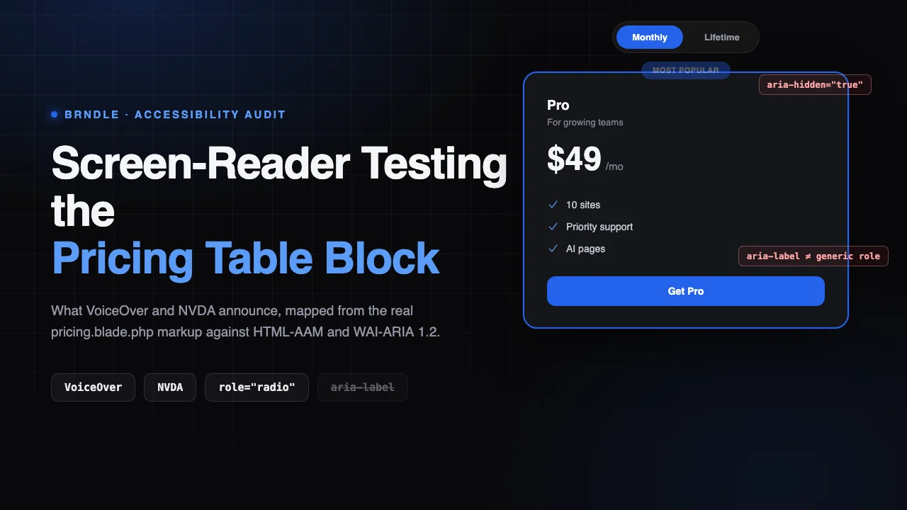
Most pricing comparisons on the web fail screen reader users before a single line of custom JavaScript gets involved, because the comparison itself is built out of div soup: three or four visually aligned boxes with no row/column relationship exposed to anything but a sighted eye tracking across the page. A table would carry that relationship for free, <th scope="col"> giving every cell its plan name, <th scope="row"> giving every row its feature name, both announced automatically on every cell a screen reader lands on. A grid of cards carries none of that unless something else does the work. We already drove Brndle’s FAQ accordion with a real keyboard in a previous audit and scored it against the WAI-ARIA Accordion and Disclosure patterns. This post does the pricing block, brndle/pricing, with a different method suited to a different kind of question: not “can you reach and operate it with a keyboard,” but “what would a screen reader actually say when it lands on each part of it.”
We can’t run a literal VoiceOver or NVDA session as a text-based audit and claim it as a live transcript, and we’re not going to pretend otherwise. What we can do, and what this post actually is, is pull the real markup from brndle-themes/brndle, read on 12 November 2026, and run it through the documented HTML-to-accessibility-tree mapping rules that both screen readers are built on: the W3C’s ARIA in HTML specification (the living successor to HTML-AAM) and the WAI-ARIA 1.2 core spec it depends on. That mapping is not a guess, browsers implement it, and both NVDA and VoiceOver consume the accessibility tree the browser builds from it. Tracing the real markup through the real spec tells you, with citable precision, what a screen reader is supposed to announce. It does not tell you what your specific screen reader version actually said out loud today, on your OS, with your settings, a claim only a live session can make, and we say exactly where that line falls throughout this post.
Table of contents
- The real implementation: what’s actually in pricing.blade.php
- Table, card grid, or something else? Settling it against the source
- Mapping the real markup to the accessibility tree, element by element
- What VoiceOver and NVDA are documented to announce
- Four real gaps, found by tracing the spec against the markup
- The fix for each gap
- How to verify this yourself with a real screen reader
- FAQ
- The takeaway
The real implementation: what’s actually in pricing.blade.php
blocks/pricing/block.json describes the block as “Pricing table with 2-3 plans, featured plan highlight, and feature lists,” and lists table among its keywords alongside pricing and plans. That is a specific, checkable word choice, the same way the FAQ block’s “CSS-only accordion” line in its own block.json was a checkable claim rather than marketing copy, and we checked it the same way: by opening the render template and reading what actually ships.
resources/views/blocks/pricing.blade.php is 162 lines. The section wrapper and heading look like this, unedited from the file as read on 12 November 2026:
<section class="py-24 md:py-32 {{ $isDark ? 'brndle-section-dark' : 'bg-surface-secondary' }}"@if($anchor !== '') id="{{ $anchor }}"@endif>
  <div class="max-w-7xl mx-auto px-6">
    <div class="max-w-3xl mx-auto text-center mb-16 reveal">
      @if($a['eyebrow'])
        <p class="text-sm font-semibold text-accent uppercase tracking-[0.15em] mb-3">{{ $a['eyebrow'] }}</p>
      @endif
      @if($a['title'])
        <h2 class="text-4xl sm:text-5xl font-bold tracking-tight">{!! wp_kses_post($a['title']) !!}</h2>
      @endif
      ...
The billing-period toggle, present only when two billing_group values exist across the plans, is a real, interactive <button> group, not a styled <div> pretending to be one:
<div class="mt-8 inline-flex items-center gap-3 p-1 rounded-full ..." role="radiogroup" aria-label="{{ __('Billing period', 'brndle') }}">
  @foreach($groupKeys as $i => $group)
    <button
      type="button"
      role="radio"
      aria-checked="{{ $i === 0 ? 'true' : 'false' }}"
      data-toggle="{{ $toggleId }}"
      data-group="{{ esc_attr($group) }}"
      class="brndle-billing-btn px-6 py-2 text-sm font-semibold rounded-full transition-all duration-200 {{ $i === 0 ? 'brndle-section-accent bg-accent text-on-accent shadow-sm' : ($isDark ? 'text-white/60 hover:text-white/80' : 'text-text-secondary hover:text-text-primary') }}"
    >
      {{ ucfirst($group) }}
      @if($group === 'lifetime')
        <span class="ml-1 text-xs {{ $i === 0 ? 'text-on-accent/70' : 'text-accent' }}">{{ __('Save more', 'brndle') }}</span>
      @endif
    </button>
  @endforeach
</div>
<div class="sr-only" aria-live="polite" data-billing-announce="{{ $toggleId }}"></div>
Each plan then renders as one <div> inside a CSS grid, not a row inside anything resembling a table:
<div
  class="p-8 rounded-2xl reveal transition-all duration-300 hover:shadow-lg {{ $featured ? 'brndle-section-dark border-2 border-accent relative' : 'bg-surface-primary border border-surface-tertiary hover:border-text-tertiary' }} {{ $isHidden ? 'hidden' : '' }}"
  {!! $featured ? 'aria-label="' . esc_attr($plan['badge'] ?? __('Most Popular', 'brndle')) . ' plan"' : '' !!}
  @if($billingGroup) data-billing-group="{{ esc_attr($billingGroup) }}" @endif
>
  @if($featured)
    <div class="absolute -top-3.5 left-1/2 -translate-x-1/2 px-4 py-1 rounded-full brndle-section-accent bg-accent text-on-accent text-xs font-bold" aria-hidden="true">{{ $plan['badge'] ?? __('Most Popular', 'brndle') }}</div>
  @endif

  <h3 class="text-lg font-bold">{{ $plan['name'] ?? '' }}</h3>
  ...

  <div class="mt-6 mb-8">
    @if(!empty($plan['original_price']))
      <span class="text-xl ... line-through mr-1">{{ $plan['original_price'] }}</span>
    @endif
    <span class="text-5xl font-bold">{{ $plan['price'] ?? '' }}</span>
    @if(isset($plan['period']))
      <span class="... ml-1">{{ $plan['period'] }}</span>
    @endif
  </div>

  @if(isset($plan['features']) && is_array($plan['features']))
    <ul class="space-y-3 mb-8">
      @foreach($plan['features'] as $feature)
        <li class="flex items-center gap-3 text-sm ...">
          <svg class="w-5 h-5 text-accent shrink-0" fill="currentColor" viewBox="0 0 20 20"><path fill-rule="evenodd" d="M16.704 4.153..."/></svg>
          {{ $feature }}
        </li>
      @endforeach
    </ul>
  @endif

  <a href="{{ $plan['cta_url'] ?? '#' }}" ... class="block w-full text-center px-6 py-3 ...">
    {{ $plan['cta_text'] ?? __('Get Started', 'brndle') }}
  </a>
</div>
Behind the toggle sits a 40-line inline <script> block that handles switching between billing groups: it listens for click on each toggle button, flips aria-checked, swaps the active button’s classes, shows or hides the matching plan cards by toggling Tailwind’s hidden class, recalculates the grid’s column count, and writes a sentence into the aria-live region. We’ll come back to exactly what it does, and does not, bind a listener to.
Table, card grid, or something else? Settling it against the source
There is no <table>, <thead>, <th>, or scope attribute anywhere in pricing.blade.php. The entire thing is a <div class="grid"> containing one <div> per plan. “Table” in the block’s own keywords is metadata, not an architectural description, the same gap between a label and the real markup we flagged for the FAQ block’s “accordion” naming, where the actual behavior turned out to be a stack of independent disclosures rather than a true single-open accordion.
That is worth defending on its own terms before calling it a finding, because a table isn’t automatically the correct choice here. A true data table earns its semantics when there is a shared axis, the same feature row repeating across every column, so a cell’s meaning depends on both its row header and its column header at once. Brndle’s plans attribute doesn’t model that: each plan carries its own independent features array, of its own length, in its own order, with no guarantee any two plans even describe the same underlying capability on the same line. A Starter plan with two features and a Pro plan with five don’t align into rows at all. Forcing that into a <table> would mean either padding every plan’s feature list to a fake common length or building <td> cells that are empty for most plans, both worse than what a card actually is: a self-contained, independently-ordered list, which is exactly what <ul>/<li> models. The real problem isn’t that this block uses cards instead of a table. It’s that two of the ARIA roles that would make the card-grid version accessible, on the toggle and on the “Most Popular” signal, are either incomplete or spec-prohibited, which is what the rest of this post is actually about.
Mapping the real markup to the accessibility tree, element by element
Every mapping below comes from the W3C’s ARIA in HTML specification and the WAI-ARIA 1.2 role characteristics tables, both read on 12 November 2026, applied directly to the markup quoted above. This is the documented rule a conforming browser follows to build its accessibility tree, the same tree both VoiceOver and NVDA read from; it is not our own interpretation of what “should” happen.
- The
<section>wrapper. ARIA in HTML’s rule is explicit and conditional: “role=region if the section element has an accessible name. Otherwise, role=generic.” Brndle’s pricing section carries noaria-label, noaria-labelledby, and notitleattribute, only a plainidused as a scroll anchor. It has no accessible name, so the second branch applies: the element maps togeneric, notregion. - The billing-toggle container. An explicit
role="radiogroup"witharia-label="Billing period"maps directly to the ARIAradiogrouprole, named “Billing period.” - Each toggle
<button>.<button>‘s implicit role isbutton, but ARIA in HTML’s permitted-roles list for<button>explicitly includesradioamong the roles an author may apply, sorole="radio"here is a valid override, not a hack. Each button’s accessible name comes from its own text content (“Monthly,” “Lifetime”), and its state comes from the explicitaria-checkedattribute the template sets. - The
aria-liveannouncer.aria-liveis a global ARIA property, not a role, and it applies regardless of the element’s own role; a plain<div class="sr-only">witharia-live="polite"works exactly the way it would on any other container. It is present and empty on first render, then populated by the toggle script, which is the configuration both screen readers are built to pick up and speak without moving focus. - Each plan’s outer
<div>. With no explicitroleattribute, a<div>‘s implicit role isgeneric. WAI-ARIA 1.2’s role characteristics table listsgenericunder the roles where “Name from author” is prohibited: “the element does not support name from author. Authors MUST NOT use the aria-label or aria-labelledby attributes to name the element.” The featured plan’s wrapper carries exactly that attribute,aria-label="[badge] plan", on exactly that role. - The “Most Popular” badge.
aria-hidden="true"is unconditional: it removes the element and everything inside it from the accessibility tree, regardless of role. The badge’s own text never reaches any screen reader through this path. - Each plan’s
<h3>. Heading elements map to theheadingrole witharia-levelset from the numeral in the tag name, a long-standing, uncontroversial mapping. Nested one level under the section’s own<h2>title, this is correct heading hierarchy. - The price, period, and original-price
<span>elements. Plain inline text with no role of their own; they’re read as a sequence of text runs in document order, which is exactly adequate for a single number and its unit, no row/column relationship is being claimed or needed here. - The feature
<ul>/<li>list.<ul>maps tolist; a child<li>of an element exposed as a list maps tolistitem. Both map correctly here with no attributes required. - The inline checkmark
<svg>. It carries norole, noaria-hidden, and no<title>. SVG accessibility mapping is genuinely browser-dependent at the edges: without an accessible name or an explicit role, most current browsers prune an unlabeled, non-interactive<svg>from the tree, but the behavior is not as uniformly specified as the HTML elements above, which is exactly why leaving it unmarked rather than explicitlyaria-hidden="true"is a gap worth closing rather than a confirmed defect. - The CTA
<a>. Maps tolink, named from its own text content (“Start free,” “Get Pro”). No gap here.
What VoiceOver and NVDA are documented to announce
Translating the mapping above into words, this is what the documented behavior predicts for a sighted-free pass through the block, phrased the way each screen reader’s own announcement conventions typically render a role and state. We are stating this as the spec-level expectation implied by the markup, consistent with how both screen readers describe these same roles elsewhere on the web, not as a transcript of a session we ran.
| Element | Documented role / state | Expected announcement pattern |
|---|---|---|
| Section wrapper | generic (no accessible name) | Not read as anything on entry; does not appear in a landmarks/regions list |
| Section title | heading, level 2 | “Simple, transparent pricing, heading level 2” (NVDA) / “heading level 2, Simple, transparent pricing” (VO) |
| Billing toggle container | radiogroup, named “Billing period” | “Billing period, radio group” on entry |
| Active toggle button | radio, checked | “Monthly, radio button, checked, 1 of 2” (NVDA) / “Monthly, selected, radio button, 1 of 2” (VO) |
| Billing-change live region | aria-live="polite" | Interrupts nothing; speaks “Showing lifetime plans” shortly after the toggle is activated, focus unmoved |
Featured plan’s wrapper <div> | generic; aria-label present but prohibited for this role | No reliable announcement of the label; behavior is spec-undefined, not spec-guaranteed |
| “Most Popular” badge | aria-hidden="true" | Never announced, by design, regardless of browser or AT |
| Plan name | heading, level 3 | “Pro, heading level 3” |
| Price block | plain text runs | “$49, slash mo” (or similar, read in document order) |
| Feature list | list / listitem x N | “List, 3 items” on entry, then each item read, e.g. “Priority support” |
Checkmark <svg> | unspecified (no role, no name, no aria-hidden) | Most likely silent/pruned; not guaranteed across every browser/AT pairing |
| CTA link | link, named from content | “Get Pro, link” |
Four real gaps, found by tracing the spec against the markup
Gap 1: the “Most Popular” signal never reaches a screen reader, by two separate mistakes that cancel each other out
This is the headline finding, because it isn’t a single slip, it’s two independent, reasonable-looking decisions that happen to add up to total silence. The visible “Most Popular” badge is deliberately removed from the accessibility tree with aria-hidden="true", a defensible choice on its own if something else were carrying the same meaning to assistive technology. Something else was clearly meant to: the plan’s outer wrapper carries aria-label="[badge] plan", written specifically to compensate. But that wrapper is a bare <div> with no explicit role, which means its implicit role is generic, and WAI-ARIA 1.2 places generic in the list of roles where naming from aria-label is prohibited, not merely unsupported, prohibited. Per spec, a conforming screen reader has no obligation to expose that label at all. The one path that would have worked (the badge’s own visible text) is intentionally hidden, and the one path that was built to replace it is built on a role that isn’t allowed to carry a name. A screen reader user comparing plans gets no equivalent of the “this one’s recommended” signal a sighted visitor sees immediately.
Gap 2: the radio-group pattern is half-built: it has the roles and states, not the keyboard model
Declaring role="radiogroup" and role="radio" is a commitment to a specific interaction contract, the WAI-ARIA Radio Group Pattern, not just a visual label. That pattern specifies arrow keys (Left/Right or Up/Down) to move focus and selection between options, wrapping at the ends, and a roving tabindex so only the currently-checked radio sits in the page’s own Tab order, meaning Tab and Shift+Tab move focus into and out of the whole group in one stop, not one stop per button. This is directly checkable from the markup alone, with no live session required: neither <button> in Brndle’s toggle carries a tabindex attribute at all, and the inline <script> attaches exactly one listener type, click, to each button, with no keydown handler anywhere in the file. Two consequences follow directly from that absence, independent of browser or AT: every toggle button is its own default Tab stop (two stops through the toggle, not the roving single stop the pattern specifies), and the arrow keys a keyboard or screen-reader user would reasonably try after hearing “radio group” do nothing at all. Tab+Space or Tab+Enter still works on either button individually, because they’re real, focusable <button> elements, so the toggle is operable, just not through the exact keyboard model its own ARIA roles promise.
Gap 3: the whole pricing section is invisible to landmark navigation
<section> is one of HTML’s sectioning elements, and a screen reader user who navigates by regions (NVDA’s “next/previous landmark” command, VoiceOver’s Landmarks rotor category) relies on exactly the rule quoted above: a <section> only becomes a region landmark when it has an accessible name. Brndle’s pricing block never sets one, no aria-label, no aria-labelledby pointing at its own <h2> title, so per spec it maps to generic and sits outside the landmarks list entirely, even though the section is visually obvious, heading-led, and clearly delineated for a sighted visitor scanning the page.
Gap 4: the feature checkmark icon has no explicit accessibility treatment
The smallest gap, and the one we’re most careful to frame as a risk rather than a confirmed failure. The inline <svg> next to each feature has no role, no aria-hidden, and no <title>. Most current browsers prune an unlabeled, non-interactive SVG with no accessible name from the accessibility tree on their own, which is likely why nobody noticed anything wrong in casual testing, but that pruning behavior is an implementation detail browsers have converged on, not a mapping guaranteed by the same specs the other ten items in this post rest on. Marking it explicitly decorative removes the ambiguity instead of depending on convergent behavior holding forever.
The fix for each gap
Gap 1, the Most Popular signal. Stop relying on aria-label on a generic <div>, and stop hiding the only text that said it out loud. Either give the wrapper a role that is actually permitted to carry a name, role="group" is a correct, lightweight choice for “a set of UI elements that aren’t intended to be included in a page summary or table of contents,” which fits a single plan card well, or drop aria-hidden="true" from the badge itself so its own text reaches the tree directly:
<div
  role="group"
  aria-label="{{ esc_attr($plan['badge'] ?? __('Most Popular', 'brndle')) }} plan"
  class="..."
>
  @if($featured)
    <div class="absolute -top-3.5 left-1/2 -translate-x-1/2 ..." aria-hidden="true">{{ $plan['badge'] ?? __('Most Popular', 'brndle') }}</div>
  @endif
role="group" is in WAI-ARIA 1.2’s “Name from author: supported” category, unlike generic, so the same aria-label the template already writes now has somewhere valid to land, with no change to the visual output.
Gap 2, the radio group’s keyboard model. Add the roving tabindex and the arrow-key handler the pattern specifies, in the same inline script that already owns click handling:
btns.forEach(function(btn, idx){
  btn.setAttribute('tabindex', idx === activeIndex ? '0' : '-1');
});
btns.forEach(function(btn, idx){
  btn.addEventListener('keydown', function(e){
    if (e.key !== 'ArrowRight' && e.key !== 'ArrowLeft' && e.key !== 'ArrowDown' && e.key !== 'ArrowUp') return;
    e.preventDefault();
    var dir = (e.key === 'ArrowRight' || e.key === 'ArrowDown') ? 1 : -1;
    var next = (idx + dir + btns.length) % btns.length;
    btns[next].setAttribute('tabindex', '0');
    btn.setAttribute('tabindex', '-1');
    btns[next].focus();
    btns[next].click(); // reuse the existing click handler to change selection
  });
});
This closes both parts of the gap at once: only one button is ever a Tab stop, and the arrow keys a user familiar with the Radio Group pattern will reach for actually work.
Gap 3, the missing landmark. Point the section at its own title instead of inventing new copy, which costs one id and one attribute:
@php $titleId = 'pricing-title-' . wp_unique_id(); @endphp
<section class="..." @if($a['title']) aria-labelledby="{{ $titleId }}" @endif ...>
  ...
  <h2 class="..." id="{{ $titleId }}">{!! wp_kses_post($a['title']) !!}</h2>
Conditioning it on $a['title'] being set matters: labeling a region with an id that doesn’t exist on the page is worse than no label, so only add the attribute when the heading it points to is actually rendered.
Gap 4, the checkmark icon. One attribute, no visual change:
<svg class="w-5 h-5 text-accent shrink-0" aria-hidden="true" fill="currentColor" viewBox="0 0 20 20"><path fill-rule="evenodd" d="M16.704 4.153..."/></svg>How to verify this yourself with a real screen reader
Everything above is a documented mapping applied to real source, not a session transcript, and we’d rather hand you the exact steps to confirm it than ask you to take it on faith.
NVDA (Windows, free): load a page with the pricing block. Press Insert+F7 to open the Elements List, switch to the Landmarks tab, and confirm the pricing section is absent (Gap 3) until you add aria-labelledby. Tab to the billing toggle and listen for “Billing period, radio group,” then try the Left/Right arrow keys before clicking anything, if nothing happens and you must keep pressing Tab to reach the second option, you’ve reproduced Gap 2 directly. Use Insert+F7‘s Headings tab to confirm each plan name reads as a level-3 heading.
VoiceOver (macOS, built-in, Cmd+F5): open the Rotor with VO+U, switch to Landmarks, and check for the same absence. Tab to the toggle, confirm “radio button” and “selected” are announced, then try VO+Right Arrow versus the plain arrow keys the Radio Group pattern specifies, the plain arrows are what should move selection and currently don’t. Navigate the featured plan card with VO+Right Arrow item by item and listen for whether anything communicates “most popular” before you reach the plan name, under the current markup, nothing will.
Reference docs, read on 12 November 2026: the ARIA in HTML specification and the WAI-ARIA Radio Group Pattern are both short enough to check against yourself in under fifteen minutes, which is the whole point of citing them rather than asking you to trust our reading of them.
FAQ
Does the Brndle pricing block use a real HTML <table>?
No. pricing.blade.php has no <table>, <th>, or scope attribute anywhere. It’s a CSS grid of independent <div> cards, one per plan, which is also the architecturally correct choice here because each plan’s features array is its own length and order, there’s no shared feature-row axis across plans for a table’s row/column semantics to describe.
Did you actually run VoiceOver or NVDA for this post?
Not as a live, transcribed session. We mapped the real markup from the theme’s GitHub repository against the documented HTML-to-accessibility-tree rules in the W3C’s ARIA in HTML specification and WAI-ARIA 1.2, the same rules both screen readers are built to honor, which is a spec-level prediction, not a recording. We say exactly which claims in this post are markup-level facts (verifiable from the source alone, like the absent tabindex attributes) versus documented-behavior predictions, and we give the exact NVDA and VoiceOver steps to confirm either kind yourself.
Is the billing toggle a real control, or a styled div pretending to be one?
Real. Each option is an actual <button type="button"> with role="radio" and a live aria-checked attribute the inline script updates on click, inside a container with role="radiogroup" and a proper aria-label. role="radio" on a <button> is an explicitly permitted override per the ARIA in HTML spec’s own permitted-roles list for that element, not an invalid combination.
What is the single biggest accessibility gap you found?
The “Most Popular” badge never reaches a screen reader. Its visible text is wrapped in aria-hidden="true", and the aria-label meant to replace it sits on a plain <div>, whose implicit generic role is explicitly listed in WAI-ARIA 1.2 as prohibited from taking a name via aria-label. Two individually defensible decisions add up to total silence on the one signal most likely to influence which plan someone picks.
Can you really know the radiogroup’s keyboard behavior is broken without pressing any keys?
For this specific gap, yes, with unusual confidence. The WAI-ARIA Radio Group Pattern requires a roving tabindex and arrow-key handling to move selection. Reading the source directly shows neither <button> in the toggle carries a tabindex attribute, and the inline <script> binds exactly one event type, click, with no keydown listener anywhere in the file. A keyboard behavior that depends on code which doesn’t exist in the file can’t be present at runtime; that’s a markup-level fact, not a predicted one. We still recommend pressing the arrow keys yourself, because confirming it firsthand is faster than taking our word for it.
Does the pricing section show up in a screen reader’s landmarks list?
No, and this follows directly from a documented, conditional rule: the W3C’s ARIA in HTML specification maps <section> to the region role only when it has an accessible name, and to generic otherwise. Brndle’s pricing section sets no aria-label or aria-labelledby, so it falls into the second branch and doesn’t appear in a landmarks/regions navigation list, despite being a clearly delineated, heading-led section visually.
Are the price and feature list announced in a useful order?
Yes. The price, its unit, and any struck-through original price are plain inline <span> elements read in document order, which is adequate for a single figure with no row/column relationship to express. The feature list uses a real <ul>/<li> structure, which maps to the list/listitem roles, so a screen reader announces “list, N items” on entry and reads each feature as its own list item, exactly the behavior a feature list should have.
Is the checkmark icon next to each feature a real accessibility problem?
It’s the smallest and least certain of the four gaps we found. The inline <svg> has no role, no aria-hidden, and no accessible name. Most current browsers prune an unlabeled, non-interactive SVG like this from the accessibility tree on their own, so it’s likely silent in practice, but that’s a browser convergence behavior, not a guarantee from the same specs the rest of this audit cites. Adding aria-hidden="true" removes the ambiguity for a one-attribute cost.
If I’m auditing a different theme’s pricing table, what should I check first?
Open the rendered HTML and check three things in order: whether it’s a real <table> with scope attributes (rare for pricing, and only actually correct if every plan shares the same feature rows) or a card grid with real <ul>/<li> feature lists (far more common, and fine on its own); whether any billing-period toggle that uses role="radio" or role="tab" also implements that pattern’s full keyboard model, arrow keys and roving tabindex, not just click handling; and whether any “featured” or “most popular” visual signal has a path to assistive technology that doesn’t depend on aria-label landing on a plain, unroled <div>.
Does this block set aria-expanded or anything else that could get the plan cards confused with an accordion?
No. There’s no collapsing or expanding state anywhere in this block, every plan card that matches the active billing group is simply visible or hidden via a plain CSS class, with no corresponding ARIA state attribute needed for that binary show/hide, since a hidden (display:none) element is already removed from the accessibility tree entirely.
The takeaway
Brndle’s pricing block isn’t a table dressed up as cards, and it shouldn’t be, its own data shape (independent, variable-length feature lists per plan) is a worse fit for table semantics than for the <ul>/<li> structure it actually ships. Mapped against the real HTML-to-accessibility-tree rules in the W3C’s ARIA in HTML and WAI-ARIA 1.2 specifications, most of the markup does exactly what it should: a genuine role="radio"/radiogroup toggle with live aria-checked state, a correctly-wired aria-live announcer, real heading and list semantics throughout. Four gaps survive that mapping, and they range from the smallest, an unmarked decorative icon, to the one worth fixing first: the “Most Popular” signal is built twice, once as hidden visual text and once as an aria-label on a role that the ARIA 1.2 spec explicitly forbids from carrying a name, and the net result is that the signal most likely to influence a purchase decision reaches zero screen reader users. None of these four gaps required a live screen reader session to find, they were visible in the source the moment we checked each element’s role against what the spec says that role is allowed to do, which is the same method worth applying to any other theme’s pricing table before trusting its own “accessible” claim.
Sources, read on 12 November 2026
- brndle-themes/brndle, specifically
blocks/pricing/block.jsonandresources/views/blocks/pricing.blade.php - W3C: ARIA in HTML, the
<section>,<button>,<ul>, and<li>role mappings - W3C: WAI-ARIA 1.2, the
genericandgrouprole characteristics and the “Name from author” support table - W3C ARIA Authoring Practices Guide: Radio Group Pattern
- Keyboard-Testing the FAQ Block’s Accordion: Focus Order, aria-expanded, Escape
- Is Your Block Theme Really Accessible? A WCAG 2.2 Checklist for Theme Authors