6 Footer Styles Compared: Big vs Minimal vs Stacked for Different Content Depths
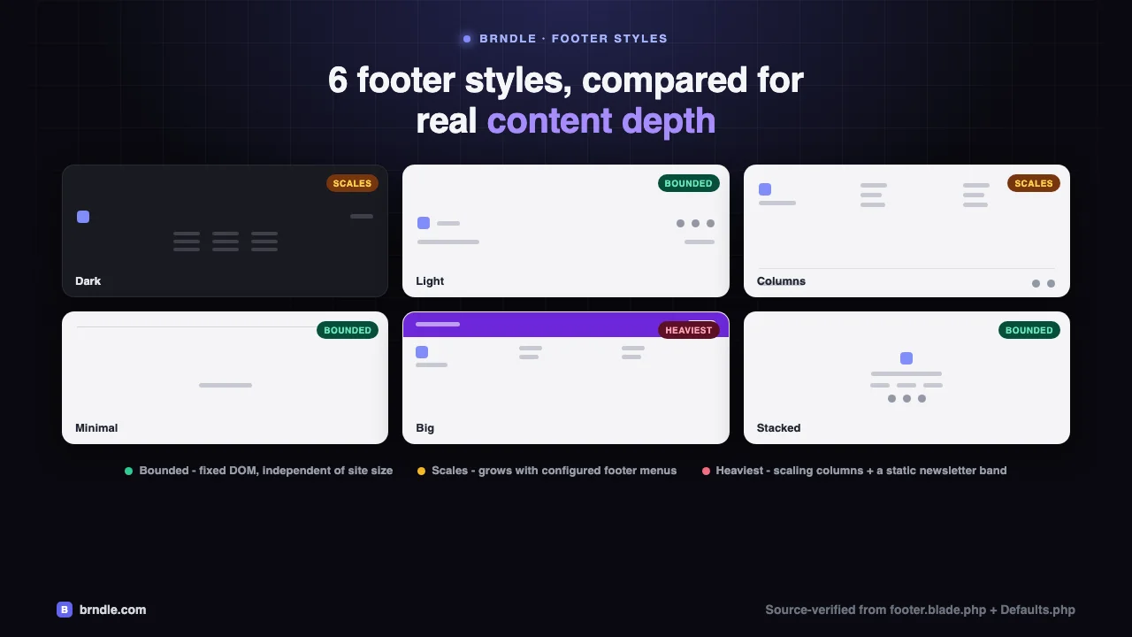
Footer style tends to get picked the way header style does: scroll the dropdown, click whichever looks closest to the mood board, move on to launch day. For a header that’s at least defensible, a header sits above the fold and does real work on first paint. A footer doesn’t. It renders after everything else, below the fold, often never scrolled to at all on a bounce. So it’s tempting to treat the six footer styles Brndle ships as pure decoration, no mechanics worth reading.
That’s half right. A footer genuinely doesn’t touch Largest Contentful Paint the way a backdrop-filter-heavy header can, and anyone telling you Minimal is “faster” than Big because of LCP is reasoning about the wrong metric. But a footer still has real, verifiable mechanics: how many DOM nodes it ships, whether that count is fixed or scales with how much navigation a site owner actually configures, whether it needs a WordPress widget area or just a nav menu, and whether a “big” footer with a newsletter band and three menu columns is honest about the content behind it or just padding out empty space. Those are architecture questions, not aesthetic ones, and they’re the ones this post answers by reading Brndle’s own source, resources/views/sections/footer.blade.php, the settings schema in app/Settings/Defaults.php, and the view composer in app/View/Composers/Theme.php, the same way our companion piece on the eight header styles read header.blade.php. It’s a companion for a reason: same rigor, different set of tradeoffs, because a footer’s real cost structure isn’t a header’s.
In this comparison
- Why footer style is a content-architecture decision, not just a look
- The real 6 footer styles in Brndle’s source
- Grouping the 6 by DOM weight: bounded, scales, heaviest
- The performance notes that actually apply to a footer
- Content-depth decision guide: when Big is honest, when Minimal is
- Questions about Brndle’s footer styles
- What should you do next?
Why footer style is a content-architecture decision, not just a look
Every footer style in Brndle resolves to the same three ingredients, and how much of each a given style reaches for is what actually separates them, not how dark the background is:
- Nav menu locations. Brndle registers exactly four footer-related
wp_nav_menulocations inapp/setup.php:footer_col_1,footer_col_2,footer_col_3, andfooter_navigation. Every column, every legal-links row, every “stacked” nav you see in any of the six styles is one of these four, rendered withhas_nav_menu()guards so a location nobody assigned a menu to renders nothing rather than an empty heading. - Settings fields, not widgets. Copyright text, the optional closing CTA, and the social icon set all come from plain option fields read through
Settings::get(), resolved once per request in theThemeview composer and handed to every Blade view as$footerCopyright,$footerCtaLabel,$socialLinks, and so on. - A fixed sprite of four social icons. X/Twitter, GitHub, LinkedIn, Instagram, each an inline SVG with one
<path>, each conditionally rendered only if that platform’s URL is set insocial_links. No icon font, no external request, no extra HTTP round trip for the icon set itself.
What that means structurally: a footer’s real “weight” in Brndle isn’t a property of the style you pick from the dropdown, it’s a property of how many menu items the site owner actually assigned to those four locations. Minimal is light because it doesn’t call any of the four menu locations except, optionally, the legal row. Big and Columns are heavier because they call three of the four, each wrapped in a loop that renders one <li> per configured menu item. Pick Big for a site with three real menus and it’s doing exactly the job it’s built for. Pick Big for a site with no footer menus configured at all, and you get a newsletter band sitting over three empty grid cells, which is a real, previously-shipped bug we’ll get to.
We pulled every detail below directly from the Blade template, the settings schema, and the theme’s own changelog in its GitHub repository, with version numbers cited so you can verify any of it against footer.blade.php yourself.
The real 6 footer styles in Brndle’s source
The settings schema registers the option plainly: 'footer_style' => ['section' => 'footer', 'label' => 'Footer style', 'control' => 'select', 'options' => ['dark' => 'Dark', 'light' => 'Light', 'columns' => 'Columns', 'minimal' => 'Minimal', 'big' => 'Big', 'stacked' => 'Stacked']], matching the readme’s own count: “8 header styles, 6 footer styles.” That’s the canonical set, in the order the admin dropdown presents them, and like header style it’s a per-page override too, via _brndle_footer_style post meta read in the Theme composer ($pageMeta('_brndle_footer_style', Settings::get('footer_style', 'dark'))), alongside a separate _brndle_hide_footer meta key that drops the footer section entirely on a given page regardless of which style is configured sitewide.
1. Dark (the default)
Markup: <footer class="brndle-section-dark bg-surface-inverse text-white border-t border-surface-tertiary/50">, sharing its entire branch in the Blade template with Columns (@elseif($style === 'columns' || $style === 'dark')), distinguished only by a ternary on the surface classes. It’s the heaviest style structurally: a brand column, up to three nav-menu columns (footer_col_1/2/3), an optional closing CTA, and a bottom bar with copyright, legal links, and social icons, all on a dark surface regardless of the page’s active light/dark theme. That last detail is deliberate and has its own code comment: “A dark-surfaced footer is dark in BOTH colour schemes, so the usual dark:hidden pair is the wrong test… pick by the footer’s own surface instead.” Practically, it means Dark renders exactly one logo <img> (the dark-variant logo, unconditionally), where every other style except Glass’s header counterpart renders two, light and dark, gated by dark:hidden / hidden dark:block. One fewer image request, for the same reason Glass’s header style only requests one logo file: the surface it sits on never changes, so there’s nothing for a light/dark toggle to switch.
2. Light
Markup: <footer class="bg-surface-secondary text-text-primary"> wrapping a single flex row: brand mark, copyright, the legal-links partial, and social icons, all in one line that wraps to a stacked column under the sm: breakpoint. No nav-menu columns at all, which makes it structurally the same shape as the dead @else fallback branch covered below, just reached deliberately instead of by accident. This is the standalone single-row style: lighter than Columns or Dark, heavier than Minimal only by the width of a logo mark and a social-icon row.
3. Columns
Same branch as Dark, same markup, light surface instead: bg-surface-secondary text-text-primary. Grid: grid grid-cols-1 sm:grid-cols-2 {{ $colsClass }} gap-10 pb-12 border-b, where $colsClass comes from a match() on the footer_columns setting (range control, 1 to 4, default 3): 2 => 'lg:grid-cols-2', 3 => 'lg:grid-cols-3', default => 'lg:grid-cols-4'. The detail worth being precise about: footer_columns doesn’t add or remove menu locations. There are always exactly three possible menu columns (footer_col_1/2/3) plus the brand column, fixed by register_nav_menus() in app/setup.php. The setting only changes how many of those fit per row on large screens before wrapping, a pure CSS layout control, not a content-depth control. Set it to 2 on a site using all three menu locations and you get two columns on row one, one on row two, not three menus becoming two.
4. Minimal
Markup: <footer class="border-t border-surface-tertiary/50"> wrapping one centered paragraph of copyright text and, if a menu is assigned to footer_navigation, the shared legal-links partial beneath it. That’s the entire style. No brand mark, no social icons, no columns. It’s the one footer style that can render with a single <p> and nothing else if the site owner hasn’t wired up a legal menu, which makes it the honest choice described below for a site with no real footer navigation to show.
5. Big
The “enterprise mega footer”: a newsletter band (<div class="bg-accent">) sitting above the identical column grid Columns and Dark use, then a bottom bar with a “Back to top” link added on top of the usual copyright, legal links, and social icons. The newsletter form itself is worth being exact about, because it’s easy to assume it does something: <form ... onsubmit="return false;">. That’s it. No fetch, no AJAX handler, no enqueued script, no server-side endpoint. It’s a visual placeholder an agency is expected to wire to their own ESP (Mailchimp, ConvertKit, whatever the client uses) via a child-theme override, and until someone does, submitting it does nothing and costs nothing: zero extra network requests, zero extra JavaScript bytes, because there’s no JavaScript backing it at all. The two added elements over Columns/Dark, the newsletter band and the “Back to top” anchor, are both static markup. The only genuinely scripted part is the smooth-scroll invoked inline via onclick="window.scrollTo({top:0,behavior:'smooth'})", a one-line browser API call, not a listener that runs continuously.
6. Stacked
Markup: <footer class="bg-surface-primary border-t border-surface-tertiary/50"> wrapping a centered column: logo, site description, a single nav row (footer_navigation, rendered directly, styled as the primary nav rather than a legal row), social icons, copyright. It’s the one style that doesn’t @include('partials.footer-legal'), and that’s not an oversight, it’s because Stacked already renders the footer_navigation location itself as its centered nav row; including the legal partial on top would render the exact same WordPress menu twice on the same page.
Grouping the 6 by DOM weight: bounded, scales, heaviest
Reading each style’s branch is the honest way to get here, but the useful summary is how much DOM each one ships and whether that amount is fixed or grows with what the site owner configures.
| Class | Styles | Why |
|---|---|---|
| Bounded (fixed DOM) | Minimal, Light, Stacked | None of the three call more than one nav-menu location. Minimal calls at most one (footer_navigation, optional). Light calls none. Stacked calls exactly one, rendered as its own nav row. DOM size for these three barely moves whether the site has 3 pages or 3,000, because nothing in the branch loops over content, only over however many items are in a single configured menu, if any. |
| Scales with configured menus | Columns, Dark | Both call has_nav_menu() up to three times (footer_col_1/2/3) plus the legal row, and each populated location renders one <li> per menu item via wp_nav_menu(). DOM size here is a direct, linear function of how many links the site owner put in those three menus, not of the style itself. A site with three 8-item menus ships roughly 24 extra anchor elements; a site with the locations registered but empty ships the brand column and nothing else. |
| Heaviest baseline | Big | Everything Columns/Dark ships, plus a static newsletter band (one heading, one paragraph, one input, one button: four extra nodes, fixed) and a “Back to top” anchor. The added baseline is small and constant; the variable cost is identical to Columns, because Big’s column grid is the same markup, same has_nav_menu() guards, same loop. |
Worth being precise about what this table is not saying: it’s not a performance-impact ranking the way the header post’s Low/Medium/High table was, because none of this changes how the page renders or scrolls. A heavier footer is a few more kilobytes of server-rendered HTML sent in the same response, parsed once, with no layout recalculation, no paint cost beyond the initial one, and nothing re-evaluated on scroll or interaction. The table above is about how much markup ships and what makes that number move, which matters for page weight and for honesty about content, not for Core Web Vitals.
The performance notes that actually apply to a footer
A header’s performance story is about paint and scroll, because it’s visible from the first frame and often stays visible while a reader interacts with the page. A footer’s story is different: it loads once, in the initial response, below everything a reader sees first, and in Brndle’s case never again after that, because there’s no lazy-loading, no client-side hydration, and no asynchronous widget content anywhere in the footer template. Here’s what that actually buys and costs, read from the source rather than assumed.
- No widgets, so no widget-stack cost at all, in any style. Brndle’s
app/setup.phpdoes register a sidebar:register_sidebar(['name' => 'Footer', 'id' => 'sidebar-footer']). We cloned the theme’s repository and grepped every PHP and Blade file in it fordynamic_sidebar: it’s called exactly twice, both insideapp/Navigation/MegaMenuWalker.php, both for the mega-menu’s per-item widget areas (brndle-mega-{menu_item_id}).sidebar-footeritself is never passed todynamic_sidebar()anywhere in the theme. It shows up in Appearance → Widgets, a site owner can drop widgets into it, and nothing will render them, in any of the six footer styles. That means none of Brndle’s footer styles, including Big, carry the classic widgetized-footer risk of a plugin shipping a slow or shortcode-heavy widget into the footer stack: there’s no footer widget stack to put one in. - Query count is flat, not a function of footer_columns. The
has_nav_menu()checks and thewp_nav_menu()calls for a style’s menu columns run the same fixed number of times regardless of whetherfooter_columnsis set to 2, 3, or 4, because that setting only changes$colsClass, a CSS grid utility. The query cost of a Columns, Dark, or Big footer is set by how many of the three menu locations are actually assigned a menu, which is usually 0 to 3, not by the column-count slider. - No CLS from async loading, in any style, because nothing in the footer loads asynchronously. Every byte of every footer style is in the server-rendered HTML the browser receives on first response. There’s no widget plugin injecting a shortcode after the fact, no oEmbed resolving late, no client-rendered newsletter form swapping in a confirmation state. If a footer-adjacent layout shift happens on a Brndle site, the theme’s own changelog shows it came from something positioned near the footer rather than from the footer’s own content: 2.3.1 fixed the floating dark-mode toggle, fixed to a bottom corner, covering the last 64px of the viewport and sitting on top of the final legal link’s tap target once a reader scrolled to the end of the page. The footer now reserves that band on sites running a floating toggle. That’s a genuine footer-adjacent UI bug with a real fix, but it’s a positioning conflict between two fixed-position elements, not a content-loading CLS issue the footer style itself introduces.
- The social icon set costs the same four inline SVGs in every style that shows it. Each icon is one
<svg>with a single<path>, inline in the HTML, no separate HTTP request, no icon font download. Whether a style shows 0 or 4 of them (gated per-platform by whether that URL is set insocial_links), the cost is a few hundred bytes of inline markup, not a network round trip.
Content-depth decision guide: when Big is honest, when Minimal is
The real variable isn’t which of the six styles looks most “enterprise,” it’s whether the site actually has three menus’ worth of footer navigation to show. The theme’s own changelog is unusually candid about what happens when that’s not true: a 2.3.7 release note describes the brand column in the columns and dark styles as having “held a logo and a tagline above a column-height of empty space,” which is exactly what Columns, Dark, or Big look like on a site that hasn’t assigned anything to footer_col_1/2/3: a brand block, then a wide stretch of nothing where two or three menu columns were supposed to sit.
- Pick Minimal or Light when there’s no real footer navigation yet. A new site, a single-page product, a site still being built out, anything where
footer_col_1/2/3are unassigned. Minimal renders a single centered line and, optionally, a legal row; it never has an empty-column problem because it never reaches for columns in the first place. This is the honest choice, not a placeholder choice: it ships exactly as much footer as there’s content to put in one. - Pick Columns or Dark once you have two or three real menus to show. Sitemap-style links, product categories, company pages, resources, whatever your site’s information architecture actually has three natural groupings of.
footer_columns(1 to 4) is then genuinely useful, it controls how those columns wrap on large screens, not whether there’s content worth showing. - Pick Big only when you also have a working newsletter integration. The signup form is inert by default (
onsubmit="return false;"), so Big is only as “enterprise” as the child-theme work you put into wiring the form to a real email provider. Shipping Big with the stock placeholder form is cosmetic, not functional, a visitor who submits it gets silently nothing. If you don’t have an ESP integration planned, Columns gives you the same column grid without implying a subscribe flow that doesn’t exist. - Pick Stacked for a single, centered navigation story. It’s the right shape when a site has one coherent footer menu (not three separate groupings) and wants it presented as a calm, centered list rather than a left-right split row. Because it renders
footer_navigationdirectly rather than through the shared legal partial, it’s also the one style where that menu is doing double duty as both primary footer nav and legal links, so keep it to a single menu location rather than trying to wedge a second one in. - Set
footer_cta_labelandfooter_cta_urldeliberately, not by default. The optional closing CTA in Columns/Dark’s brand column, added in 2.3.7, renders only when both the label and URL are set; leaving either blank keeps the column exactly as it was before that release. It’s the right lever for “get in touch” or “start a trial” on a Columns/Dark footer that otherwise ends on a logo and a sentence of description with nothing to do next.
Questions about Brndle’s footer styles
Does footer style affect Largest Contentful Paint or Lighthouse performance score?
No, not in any mechanism we found in the source. LCP is decided by whichever element paints the largest content block first, almost always something above the fold, and the footer renders last, below everything else, in the same server response as the rest of the page. None of the six styles use position: fixed, backdrop-filter, or a scroll listener, the three things that actually cost something in Brndle’s header styles. The closest thing to a footer performance lever is total page weight: a Big or Columns footer with three populated menus adds more HTML bytes than Minimal does, but that’s a payload-size difference, not a rendering-cost one.
Which footer style is safest if I don’t want to think about this again?
Light or Minimal. Both are in the “bounded” group: fixed DOM regardless of how the site grows, no empty-column risk because neither reaches for the three menu columns, and both work correctly with zero footer navigation configured. Columns is the next safe step up once you actually have menus to put in it.
Why does the Dark style only request one logo image while Light requests two?
Because Dark’s surface is dark in both the site’s light and dark color schemes, there’s no scheme-dependent swap to make, so the template skips the usual dark:hidden / hidden dark:block image pair and picks the dark-variant logo file unconditionally. Light’s surface does change between schemes, so it needs both logo variants in the markup for the browser to show the right one; both get requested regardless of which is actually displayed, since hiding an <img> with a CSS class doesn’t stop the browser from fetching its src.
Does the footer_columns setting change how much content is in my footer?
No. It only changes $colsClass, a Tailwind grid-column utility that controls how many of the (always up to three) configured menu columns sit side by side on a large screen before wrapping to the next row. The content itself, how many menus are assigned and how many items are in each, comes entirely from what’s registered under Appearance → Menus to the footer_col_1, footer_col_2, and footer_col_3 locations, independent of this setting.
Can I drop a widget into the footer, since Brndle registers a Footer sidebar?
You can add one in Appearance → Widgets, since register_sidebar(['id' => 'sidebar-footer']) does make the sidebar exist and selectable. It won’t render anywhere, though: no footer style, and no other template in the theme, calls dynamic_sidebar('sidebar-footer'). The only two dynamic_sidebar() calls in the entire codebase are inside the mega-menu walker, for an unrelated per-menu-item widget area. If you need widget-driven footer content, the supported path is a child-theme override of sections/footer.blade.php that adds the dynamic_sidebar() call yourself, not the existing registered-but-unused sidebar.
Is the newsletter form in the Big footer style actually functional?
No, not out of the box. The <form> element carries onsubmit="return false;" and has no JavaScript handler, no fetch call, and no server-side endpoint behind it anywhere in the theme. It’s a visual placeholder for an agency or site owner to connect to a real email service provider via a child-theme override. Shipping it unmodified means a visitor who enters their email and clicks subscribe gets no error and no confirmation, just nothing, which is worth fixing before launch on any site actually using the Big style for its newsletter signup.
Why doesn’t the Stacked style show the legal links partial other styles use?
Because Stacked already renders the footer_navigation menu location directly, as its own centered nav row, rather than deferring to the shared partials/footer-legal.blade.php include the other five styles use for that same location. Including the legal partial on top would render the identical WordPress menu twice on one page. If you’re using Stacked and want a visually distinct legal row separate from your main footer nav, that requires a template override, since the theme’s registered menu locations don’t give you a second slot for it.
Did every footer style always render the legal menu, or is that a newer fix?
It’s a fix, documented plainly in the 2.3.1 changelog entry: “The footer_navigation menu location rendered in the stacked footer style only. Every other style, including the default dark, silently dropped whatever menu was assigned to it.” Versions before 2.3.1 shipped a real, user-facing bug: a site with privacy, terms, or refund links wired to a real menu location lost them entirely on any style except Stacked, with nothing in the admin flagging the loss. The current source confirms the fix: partials/footer-legal.blade.php is now included from the bottom bar of every style except Stacked, which doesn’t need it for the reason above.
Did the Dark style used to be broken, or has it always rendered the columned footer?
It used to be broken, and it’s a genuinely interesting piece of the theme’s own history. The 2.3.0 changelog: “The default footer style, dark, had no branch in the footer template. The chain covered minimal, columns, light, big and stacked, so every site left on the default fell through to a bare brand-and-copyright row with no columns and no menus.” That fallthrough branch is still in the source today as the template’s final @else, commented “DARK (default)” even though dark no longer reaches it, routed instead into the shared Columns/Dark branch by an explicit || $style === 'dark' check added as part of that fix. The @else branch is dead code under the current schema, since dark, light, columns, minimal, big, stacked are the only valid values and five of them have their own explicit branch, with dark now caught earlier, a small piece of code archaeology from a real historical bug, left in place as a defensive fallback rather than cleaned up.
Does a heavier footer like Big or Columns hurt accessibility compared to Minimal?
Not inherently, and the theme’s changelog shows the fixes went the other direction: 2.3.0 corrected footer column headings from h4 directly after page content ending in h2, a skipped heading level on every site using a columned footer, now rendered as h2 with the smaller visual size kept through classes rather than a lighter heading tag. The same release fixed footer column links rendering at roughly 20px tall, under accessible tap-target size, because an earlier fix scoped to footer nav li > a missed footer columns entirely, since they render inside a <div> rather than a <nav>. Both are now correct across all six styles; more columns means more links to navigate, not worse accessibility per link.
What should you do next?
Open your own site’s Footer settings tab, and before picking a style on looks, check what’s actually assigned to footer_col_1, footer_col_2, footer_col_3, and footer_navigation under Appearance → Menus. If two or three of those are empty, Columns, Dark, and Big will show it, a brand block followed by dead space, exactly as the 2.3.7 changelog described before that release added the optional CTA to give the space something to do. If you want to verify any of the mechanics above yourself, the full source is in Brndle’s repository on GitHub, in resources/views/sections/footer.blade.php and app/Settings/Defaults.php. For the header half of this comparison, read our piece on the eight header styles, which walks the same source-verified approach through backdrop-filter cost and scroll listeners instead of DOM weight and menu depth. And if you’re extending either template beyond what the settings screen exposes, our guide to extending Brndle’s native blocks covers the same filter-and-override pattern that would let you wire the Big footer’s newsletter form to a real provider, or finally call dynamic_sidebar('sidebar-footer') from a child theme if you actually want that registered sidebar to do something.