Logical Properties: Block Theme CSS That Survives RTL
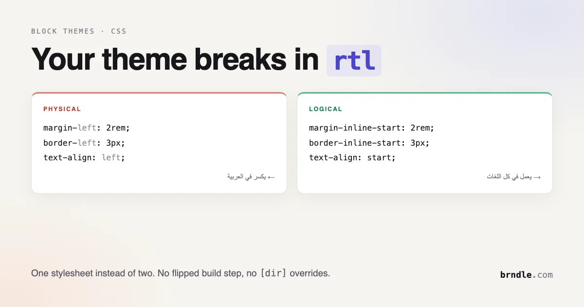
Switch a block theme to Arabic and watch what happens. The text flips to right-to-left because the browser handles that. Your layout does not. Sidebars stay pinned to the wrong edge, card icons sit on the wrong side of their labels, and every carefully tuned margin-left now points into the middle of the page instead of away from it.
The fix is not a stylesheet full of [dir="rtl"] overrides. It is writing CSS that never committed to a direction in the first place. Logical properties do that, and they have been widely supported for years. Most block themes still do not use them, and there is a specific reason for that which is worth understanding before you convert anything.
Two axes, not four sides
Physical CSS thinks in terms of top, right, bottom and left. Those are properties of your screen. Logical CSS thinks in terms of two axes that follow the content:
- Inline axis: the direction text flows within a single line.
- Block axis: the direction lines and blocks stack.
In English, inline runs left to right and block runs top to bottom. In Arabic or Hebrew, inline runs right to left while block still runs top to bottom. In traditional Japanese vertical text, the axes swap entirely: inline runs top to bottom and block runs right to left.
Write margin-left: 2rem and you have said “two rem from the left edge of the screen” in every language on earth. Write margin-inline-start: 2rem and you have said “two rem before the text starts”, which resolves to the left in English and the right in Arabic without you doing anything.
That is the whole idea. Everything below is consequences.
What writing-mode actually does
The writing-mode property sets whether lines of text lay out horizontally or vertically, and the direction blocks and lines progress. It takes five values.
The distinction between the vertical and sideways values matters if you are actually typesetting CJK. The vertical-* values keep upright characters upright and rotate only what should rotate, which is what Chinese, Japanese and Korean readers expect. The sideways-* values rotate every glyph, which is what you want for a decorative rotated label in a Latin script and not what you want for real vertical text.
The property is defined in CSS Writing Modes Level 4 and is widely available across modern browsers. It is not the risky part of this article.
What makes writing-mode worth understanding even if you will never ship vertical text is that it proves the axes are real. Set it on a container and watch flex-direction: row start running vertically, inline-size start controlling height, and align-items start working on the axis you did not expect. Those behaviours were always defined in terms of the inline and block axes. Horizontal English just made the abstraction invisible.
The mapping
Nearly every physical property has a logical counterpart. The ones worth memorising:
| Physical | Logical |
|---|---|
margin-left / margin-right | margin-inline-start / margin-inline-end |
margin-top / margin-bottom | margin-block-start / margin-block-end |
padding-left and padding-right | padding-inline |
border-left | border-inline-start |
width and height | inline-size and block-size |
max-width | max-inline-size |
top: 0; left: 0 | inset-block-start: 0; inset-inline-start: 0 |
text-align: left | text-align: start |
float: left | float: inline-start |
border-radius corners | border-start-start-radius and friends |
The shorthands are the ones you will reach for most. margin-inline: auto centres a block. padding-block: 2rem pads top and bottom. inset: 0 replaces all four offsets at once.
Nine declarations become six, and the second version works in every locale. That accent border moving to the correct edge in Arabic is the entire payoff, and you got it by writing less CSS rather than more.
Why block themes drifted
Here is the part that explains why this has not already happened across the theme ecosystem.
WordPress solved RTL a long time ago, at a different layer. Themes ship a generated rtl.css, produced by running the stylesheet through RTLCSS, which mechanically flips left to right and back. Register it and WordPress loads the flipped file whenever is_rtl() returns true.
If you build with @wordpress/scripts, those -rtl.css files are generated for you at build time. The system works, it is well established, and it is the reason a generation of theme authors never had to learn logical properties.
It has three costs. You ship and maintain two stylesheets instead of one. Mechanical flipping is not always correct, because the flipper cannot tell the difference between a chevron that should mirror and a logo that should not. And it does nothing for inline styles, which is exactly what the block editor generates.
That last point is the one that matters now. A block theme’s styling is not one stylesheet you control. It is theme.json output, block supports, pattern markup and user-set values from the editor, and RTLCSS cannot reach most of it.
The theme.json wrinkle
Know this before you plan a migration, because it limits what you can achieve.
theme.json’s spacing model is physical. Padding and margin take top, right, bottom and left keys, and WordPress emits the corresponding physical CSS properties.
You cannot write inline-start there. Core keeps extending what style data can express, as the responsive prefix syntax shows, but direction-relative spacing is not part of it today. So the honest scope of this work is: theme.json gives you physical spacing whether you want it or not, and everything else is yours. Your own stylesheet, your pattern markup, your block style variations, and any custom CSS in the site editor are where logical properties apply.
In practice that is still most of the CSS that breaks in RTL, because symmetric padding survives flipping perfectly well. It is the asymmetric things that break: a border on one side, an icon offset, a pull quote indent, a badge nudged away from a title. Those live in your CSS, not in theme.json spacing.
Finding the drift
Start by measuring how much physical CSS you actually have. Most themes have less than authors fear.
Block-axis properties like margin-top are lower priority. They only differ from logical in vertical writing modes, which you are probably not shipping. Convert them for consistency if you like, but the inline axis is where the actual bugs live.
What should not flip
Converting everything is a mistake, and this is where mechanical flipping earns its bad reputation. Some things are physical on purpose.
A media player’s progress bar runs left to right in every locale, because that is a timeline and time does not mirror. Logos are not mirrored. A checkmark stays a checkmark. Code blocks stay left-aligned regardless of the surrounding locale, because code is left-to-right even inside an Arabic paragraph. Numbers do not reverse.
The test to apply: would a native right-to-left reader expect this to be on the other side? If yes, make it logical. If it is a physical fact about the world, a timeline, a brand mark, a piece of code, leave it physical and leave a comment saying why. The comment is what stops someone converting it back in six months.
Directional icons need explicit work
Arrows and chevrons are the one category logical properties cannot solve, because the glyph itself has a direction. A “next” chevron pointing right in English must point left in Arabic, and no amount of correct margin handling rotates an SVG.
This is a legitimate use of a direction selector. Keep the list explicit rather than mirroring every icon in the theme, because a mirrored magnifying glass or a mirrored play button looks wrong to everyone.
Testing it properly
Reading the CSS does not tell you whether the layout holds. Switch the site language and look at it.
WordPress adds an rtl class to the body and sets a direction attribute on the html element, so you can also spot-check a single component without switching the whole site by wrapping it in an element with dir="rtl".
Walk the templates that matter: the header, the post template, archive cards, comments, and pagination. Pagination deserves extra attention, since previous and next are meaningful directions and they are the thing most often left unflipped.
The second test costs nothing and catches a different class of bug. Set a vertical writing mode on a container temporarily and see what falls apart:
You are not shipping this. It is a stress test. Components built on logical properties will rotate coherently. Components with a hardcoded height or a top offset will collapse, and those are exactly the places where an assumption about the screen leaked into code that should have been about the content.
Where vertical text is genuinely useful
Two cases justify shipping writing-mode rather than just testing with it.
The first is real CJK typesetting, where vertical text is a normal reading mode rather than a design flourish. Use vertical-rl with text-orientation if you need finer control over individual glyph rotation.
The second is decorative: a rotated label down the side of a section, a vertical byline, a spine-style heading. This is where sideways-lr earns its place, because it rotates cleanly without the upright-character handling you do not want in a Latin script.
Note inline-size rather than width in that rule. Once the element is in a vertical writing mode, width constrains the wrong axis and the label will not size the way you expect. This is the moment logical properties stop being an accessibility nicety and start being the only way to express what you mean.
Keep decorative vertical text out of anything a screen reader needs to read in order, and never use it for a heading that carries real meaning. Rotated text is harder to read for everyone and considerably harder for anyone with low vision.
Patterns leak physical styles
Your stylesheet is the obvious place to look. Pattern markup is the one people forget, and it is worse, because a pattern is copied into the user’s content on insert. Fix the pattern next month and every page built from it last month keeps the old markup.
The common offender is a style attribute written by hand in a pattern file:
The second form is better for a reason beyond direction. Moving the styling into a class means you can change it later for content that already exists. Inline styles in patterns are a decision you cannot revise, which is a good argument for keeping pattern markup structural and letting a block style variation carry the appearance.
Audit your pattern directory the same way you audited the stylesheet:
If you use Tailwind
Plenty of block themes now pull Tailwind in for the parts theme.json does not reach. Tailwind has logical utilities, and they are underused because the physical ones came first and muscle memory is strong.
| Physical utility | Logical utility |
|---|---|
ml-4 / mr-4 | ms-4 / me-4 |
pl-6 / pr-6 | ps-6 / pe-6 |
border-l / border-r | border-s / border-e |
text-left / text-right | text-start / text-end |
rounded-l-lg | rounded-s-lg |
The s and e suffixes stand for start and end. Swapping ml- for ms- across a template is a mechanical change with no visual difference in English and a correct layout in Arabic, which makes it about the cheapest internationalisation work available.
Worth noting the axis shorthands too: mx-4 and px-4 already map to the inline axis, so horizontal shorthands were never the problem. It is the single-sided utilities that need attention.
Container queries want logical sizing
Logical properties pair naturally with container queries, and if you have already adopted the newer layout features covered in the Baseline CSS features worth using in block themes, this is the piece that makes them behave consistently across locales.
A container query asks about the size of a container, and inline-size containment is the common case. That name is not incidental. Containment is defined on the same axes, so a container queried on its inline size keeps working when the writing mode changes.
Every dimension in that rule is content-relative. The card puts its image before the text and its gap after, in whichever direction before and after happen to mean. Write the same rule with float: left and margin-right and you have a card that inverts itself in Arabic while the container query keeps working perfectly, which is a confusing bug to read because the responsive behaviour is correct and the layout is not.
Do you need a fallback?
Short answer: no, and writing one will cost you more than it saves.
Logical properties have been supported across current browsers for years, and so has writing-mode. The browsers that lack them are the same ones that lack the rest of what a modern block theme depends on, including container queries and custom property fallbacks, so a site that needs to support them has bigger problems than margin direction.
If you inherited a codebase with paired declarations, delete the physical one rather than keeping both:
That pattern is worse than either property alone. Cascade order decides which applies, the physical one usually lands last, and you get identical broken behaviour in RTL plus a rule that looks like it was handled. If you see paired declarations in a theme, treat them as a bug rather than a safety net.
A migration that will not stall
Do not convert the whole theme in one pass. It is a large diff that nobody can review and it makes every regression hard to attribute.
Start with new code. Every rule you write from today uses logical properties. This costs nothing and stops the problem growing.
Then convert by component, in order of how visible the breakage is. Navigation and pagination first, since directional bugs there are immediately obvious to a reader. Then cards and archive items, which usually carry the asymmetric borders and icon offsets. Then long-form content styles, which are mostly symmetric and therefore mostly fine. Then everything else, whenever you happen to be editing it.
Once a component is fully logical, you can drop its rules from the flipped stylesheet. When the whole theme is converted, the generated rtl.css stops earning its place and you can remove the build step entirely. That is the real prize: one stylesheet, no flipping, no second file drifting out of sync with the first.
The checklist
- Count your physical inline-axis properties first, so you know the size of the job.
- Convert the inline axis before the block axis. Inline is where the bugs are.
- Use the shorthands:
margin-inline,padding-block,inset. - Swap
text-align: leftfortext-align: startandfloat: leftforfloat: inline-start. - Leave timelines, logos, code blocks and numerals physical, with a comment explaining why.
- Mirror directional icons explicitly with a short, deliberate list.
- Accept that theme.json spacing stays physical, and focus on your own CSS.
- Test with a real RTL locale, not just a direction attribute on one element.
- Stress test with
writing-mode: vertical-rlto expose hidden physical assumptions. - Retire
rtl.cssonly when a component is fully converted, component by component.
None of this is new CSS. Logical properties have been shippable for years and writing-mode is widely available. What is new is that block themes made the old workaround insufficient, because a generated flipped stylesheet cannot reach inline styles the editor produces at render time.
The practical version is simple enough to adopt today. Stop describing where things sit on a screen. Start describing where they sit relative to the text. The browser already knows which direction the text runs, and it will do the rest.