Best Software for Digital Art in 2026 Professional Tools for Illustrators, Painters, and Concept Artists
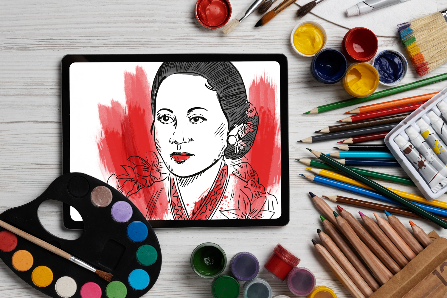
Digital art continues to thrive in 2026 across industries, from concept design and illustration to game development, webcomics, and NFT artwork. Whether you’re painting, drawing, or creating mixed media, these tools deliver professional results. Picking the right one has less to do with which software is objectively “best” and more to do with matching the tool to your specific workflow, hardware, and the kind of art you actually want to make.
Top Digital Art Software in 2026
Best Overall: Clip Studio Paint
Pros: Excellent brush engine, comic and manga tools, 3D pose references, animation features, affordable pricing.
Cons: Subscription model for newer versions, interface can feel dense.
Best for: Illustrators, comic artists, and concept artists.
Clip Studio Paint earns its reputation because it was built by people who actually draw comics and illustrations for a living, and that shows in details competitors often overlook, like perspective rulers that snap correctly during inking, vector layers that stay editable after you’ve committed to a line, and a brush engine that responds to pressure and tilt in a way that feels closer to real ink and pencil than most alternatives. The panel and text tools built specifically for comic and manga pages save enormous time compared to recreating that structure manually in a general-purpose painting app.
Best for Painting: Corel Painter
Pros: Realistic traditional media simulation, extensive brush library, texture synthesis.
Cons: Expensive, resource-intensive, learning curve.
Best for: Digital painters wanting traditional media feel.
Painter’s core strength is brush realism. Its oil, watercolor, and pastel brushes genuinely blend and mix pigment on the virtual canvas rather than just layering opacity, which produces textures that look and behave closer to physical media than most digital-native brush engines attempt to replicate. Traditional painters transitioning to digital work often find Painter’s tools map more intuitively to muscle memory built on real canvases, even if the software itself takes time to learn.
Best for iPad: Procreate
Pros: Intuitive gesture controls, excellent brush engine, one-time purchase, portable workflow.
Cons: iPad-only, no desktop version.
Best for: Artists who prefer tablet-based workflows.
Procreate’s biggest achievement is making a genuinely professional-grade painting tool feel effortless on a touchscreen, with gesture-based undo, layer management, and canvas manipulation that would feel clunky translated onto a mouse and keyboard workflow. The Apple Pencil integration is tight enough that latency, once a real complaint for digital painters, is essentially a non-issue on recent hardware. Its one-time purchase price, rather than a subscription, remains a genuine differentiator against most of its competitors.
Best Free Option: Krita
Pros: Free and open-source, professional brush engine, animation support, active community.
Cons: Performance issues on some systems, fewer advanced features.
Best for: Artists on a budget wanting professional tools.
Krita has closed most of the gap that used to separate free software from paid alternatives. Its brush engine is stable and customizable enough that professional illustrators use it as a primary tool, not just a budget fallback, and the active open-source community means new brush packs, plugins, and tutorials show up regularly without any cost. Performance can lag on older or lower-spec machines, particularly with very large canvases or heavy brush textures, but for most illustration and concept work it holds up well.
Best for Photo-Based Art: Adobe Photoshop
Pros: Industry standard, powerful layer system, extensive filters and effects, AI features.
Cons: Subscription required, can feel bloated for pure illustration.
Best for: Digital artists doing photo manipulation and compositing.
Photoshop remains the default choice specifically for artists whose work blends painting with photography, whether that’s matte painting, photobashing, or heavily composited concept art. Its layer, mask, and blend mode system is deeper than most dedicated painting apps offer, and the AI-assisted selection and generative fill tools have genuinely sped up tedious tasks like background extension and object removal that used to eat hours of manual work.
Other Notable Options
A few more tools are worth knowing depending on your specific niche. Affinity Photo and Affinity Designer offer a one-time purchase alternative to Adobe’s subscription model with surprisingly capable raster and vector tools respectively. ArtRage focuses specifically on traditional media simulation at a more affordable price point than Painter, making it a good entry point for artists curious about that style of brush behavior without the higher cost. Rebelle specializes in realistic watercolor and wet media simulation with fluid dynamics that few other tools attempt to replicate.
Choosing Software Based on Your Art Style
Illustrators and comic artists doing clean line work with flat or cel-shaded coloring generally get the most value from Clip Studio Paint’s specialized tooling. Painters chasing a traditional media look, especially those coming from physical painting backgrounds, tend to gravitate toward Painter or Rebelle for the texture realism. Concept artists working fast, rough, and iteratively often prefer Photoshop or Krita for their speed and flexibility with photo references and quick compositing. And anyone working primarily on a tablet rather than a desktop setup will likely find Procreate’s touch-first design hard to beat regardless of what genre of art they’re making.
Hardware Considerations for Digital Art
Software choice matters less than most beginners assume compared to the input device. A pressure-sensitive tablet, whether a dedicated drawing tablet connected to a desktop or an iPad with Apple Pencil, changes the drawing experience far more dramatically than switching between two comparable software packages. Pressure sensitivity levels, tilt recognition, and palm rejection quality all affect how natural digital drawing feels, and a mismatch between a high-end software package and a budget input device tends to produce more frustration than a modest software choice paired with a solid tablet.
For desktop setups, a tablet with a built-in screen (rather than a separate tablet and monitor) removes the hand-eye coordination gap that trips up a lot of beginners used to drawing on paper, though it comes at a meaningfully higher price point than a standard non-display tablet.
Building an Efficient Brush Library
New digital artists often assume more brushes means better art, but a bloated, disorganized brush library slows down workflow more than it helps. Most professional illustrators work from a tight core set: one or two sketching brushes, an inking brush, a soft blending brush, and a texture brush or two for finishing touches. Building familiarity with a small, well-organized set produces more consistent results than constantly switching between dozens of downloaded brush packs that behave unpredictably differently from each other.
Common Mistakes New Digital Artists Make
Working at too low a resolution is a frequent early mistake; low-resolution files look fine while zoomed in during creation but fall apart when exported for print or larger digital display. Over-reliance on undo, rather than committing to marks and adjusting afterward, can also slow down the development of confident linework, since traditional media never afforded that safety net and developing decisiveness under those constraints tends to translate into stronger digital work too. Finally, skipping value studies and jumping straight to color is a common shortcut that often produces muddy, hard-to-read compositions; working out light and shadow in grayscale first, then adding color, generally produces more readable, professional-looking results.
Setting Up Canvases for Different Purposes
How you set up a new file depends heavily on where the finished art is headed. Work destined purely for social media or web display can get away with a lower resolution, typically enough to look sharp at the display size of the target platform, saving on file size and performance while you’re actively painting. Work intended for print, book covers, merchandise, or large-format display needs considerably higher resolution from the outset, since upscaling a low-resolution piece after the fact rarely produces results that hold up to close inspection. Setting up the correct canvas size and resolution before starting, rather than fixing it in post, avoids a frustrating rework cycle later.
Color mode matters too. Digital screens display in RGB, while most commercial printing uses CMYK, and colors that look vibrant on screen can shift noticeably, usually toward muddier or duller tones, once converted for print. Artists producing work meant for both digital and print use often keep a master RGB file and do a careful CMYK conversion and adjustment pass specifically for print output rather than assuming the RGB file will translate directly.
Color Theory Fundamentals That Transfer Across Any Software
No software substitutes for understanding color relationships, and the fundamentals apply regardless of which program you’re using. Value, the relative lightness or darkness of a color, does more work in making an image read clearly than hue or saturation choices; a painting with strong, well-organized values will often look more polished in grayscale than a poorly planned piece looks in full color. Limited color palettes, deliberately restricting yourself to a handful of colors rather than the full spectrum available, frequently produce more cohesive, professional-looking results than unrestricted color choices, because the constraint forces more intentional decisions about temperature and contrast.
Most professional digital art software includes color harmony tools, wheels, and palette generators that can suggest complementary or analogous color schemes based on a starting hue. These are useful starting points, but treating them as a rulebook rather than a suggestion tends to produce flatter results than developing an eye for what specific colors actually communicate in context.
Moving Into Animation From Static Illustration
A growing number of digital artists eventually branch into simple animation, whether that’s short looping GIFs, animated stickers, or full character animation. Clip Studio Paint and Krita both include built-in frame-by-frame animation tools that let illustrators experiment without learning an entirely separate dedicated animation package first. The learning curve from static illustration to animation is real, since concepts like timing, easing, and consistent character proportions across frames don’t come up in single-image work, but starting with short, simple loops inside familiar illustration software is a gentler entry point than jumping straight into professional animation tools.
File Organization and Backup Habits
Digital art files, especially layered working files with dozens of layers and groups, can become unwieldy fast without some discipline around naming and organization. Grouping layers by function (sketch, line art, base colors, shading, effects) rather than leaving a flat, unlabeled stack makes it dramatically easier to return to a piece after a break or to make client-requested revisions without hunting through dozens of identically named layers.
Backup habits matter more for digital art than most people initially realize, since a corrupted file or a crashed app with no autosave can mean losing hours of work with no physical sketch to fall back on. Most modern software includes autosave and version history, but pairing that with periodic exports to a separate backup location, whether cloud storage or an external drive, protects against the software-specific failures that autosave alone can’t always catch.
Selling and Licensing Digital Art
Artists looking to monetize digital work have more distribution options now than a decade ago, from print-on-demand storefronts to direct commission work to licensing illustrations for commercial use. Each path has different technical requirements worth planning for from the start: print-on-demand needs high-resolution, print-ready files in the correct color mode, commission work often requires delivering both a final flattened image and organized source files depending on client expectations, and licensing deals frequently specify exact resolution and format requirements in the contract itself. Setting up a consistent export workflow, rather than improvising file preparation for every new opportunity, saves significant time once you’re juggling multiple active projects or clients.
Related Creative Tools
Digital art connects to broader creative workflows. Explore Photoshop alternatives for image editing options, check out graphic design alternatives for quick projects, and discover character animation software to bring your art to life.
Frequently Asked Questions
Do I need an expensive tablet to start digital art?
No. Entry-level pressure-sensitive tablets are affordable and capable enough to learn fundamentals and produce polished work. Upgrading to a screen tablet or higher-end model makes sense once you know digital art is something you’ll stick with long-term.
Is Procreate or Photoshop better for beginners?
Procreate’s touch-first interface and gesture controls tend to feel more intuitive to complete beginners, especially those without prior experience in complex desktop software. Photoshop has a steeper learning curve but offers more flexibility if you eventually want to combine painting with photo editing or compositing.
Can free software really compete with paid options?
Krita in particular has closed most of the practical gap for illustration and concept art. The remaining differences show up mostly in specialized features, like Clip Studio Paint’s comic tools or Painter’s traditional media simulation, rather than in core drawing quality, and many working illustrators use Krita as a primary tool without feeling limited by its price tag.
How long does it take to get good at digital art?
This varies enormously by prior art experience and practice frequency, but most people notice a meaningful jump in comfort and control within a few months of regular practice, with continued improvement over years as fundamentals like anatomy, color theory, and composition develop alongside the technical software skills.
Should I learn traditional drawing before switching to digital?
It’s not strictly necessary, since digital tools can teach the same fundamentals of line, form, and value that traditional media teaches. That said, many working artists find that time spent with pencil and paper builds observational skills and confidence in mark-making that transfers well once you move to a screen, without the distraction of infinite undo and layer tricks slowing down that early learning process.
Building a Portfolio That Attracts the Right Work
A common mistake among artists building a portfolio is including every piece they’ve ever made rather than curating for the kind of work they actually want to attract. A portfolio full of varied genres and styles can read as unfocused to potential clients or employers looking for a specific skill set, whether that’s character design, environment art, or editorial illustration. Grouping similar work together and leading with your strongest, most representative pieces tends to communicate expertise more clearly than a chronological dump of everything produced over the years.
Process work, sketches, color studies, and work-in-progress screenshots, can also strengthen a portfolio when included thoughtfully, since it demonstrates problem-solving and gives potential clients confidence in how you approach a piece from start to finish, not just the polished final result.
Working With References Without Losing Originality
Reference use is standard practice among professional artists, not a shortcut to be embarrassed about, but there’s a meaningful difference between using references to understand anatomy, lighting, or perspective and directly copying a reference image wholesale. Combining multiple references, for pose, lighting, and material respectively, rather than relying on a single source photo tends to produce more original, cohesive results and avoids the flat, traced quality that comes from leaning too heavily on one image. Building a personal reference library organized by category, poses, hands, fabric folds, environments, saves considerable time compared to searching from scratch for every new piece, and revisiting that library periodically as your skill grows often reveals new details you missed the first time you studied a given reference.
Digital Art Tips for 2026
Invest in a quality drawing tablet, it transforms the digital art experience. Learn keyboard shortcuts to speed up your workflow. Study traditional art fundamentals; digital tools don’t replace the need for solid foundations. And don’t underestimate the value of finishing pieces rather than abandoning them halfway through once the initial excitement fades; the last twenty percent of a piece, the polish and refinement stage, is often where the most learning actually happens. Whatever software you choose, treat the first few weeks as a period of deliberately learning the tool’s shortcuts and quirks rather than fighting the interface while also trying to solve every artistic problem at once.