How to Implement a Consistent Spacing System in theme.json for Balanced Layouts
Spacing is the silent architect of every layout. It controls how close or far elements sit from each other, how sections breathe, and how the eye moves through a page. In block themes, spacing used to mean writing custom CSS for every edge case. Today, theme.json gives you a single source of truth – a spacing system that every block respects, every editor control references, and every template inherits automatically.
This is Article 3 in the Block Theme Design Systems series. If you missed the earlier pieces on design tokens and typography systems, those lay important groundwork. Here, we go deep on spacing: how to define a scale, how to make it fluid with clamp(), how to wire it up to block gaps and padding, and how to use spacing tokens to keep layouts predictable across every screen size.
Why a Spacing System Matters in Block Themes
Block themes give editors significant control – they can set padding, margin, and gap on almost any block from inside the editor. Without a defined spacing system, that freedom creates chaos. Every editor ends up using arbitrary pixel values, and the result is inconsistent whitespace that looks fine in isolation but falls apart when you view the full page.
A spacing system in theme.json solves this at the design level. Rather than allowing free-form numeric input, you expose a curated set of named spacing values – Small, Medium, Large, and so on. Editors choose from those options using a visual slider. Developers reference them as CSS custom properties. Everyone uses the same vocabulary, and the result is layouts that feel designed rather than assembled.
- Consistency – every block respects the same spacing scale, so gaps and padding always feel related
- Scalability – change a spacing value in one place and it updates everywhere that references it
- Editor alignment – designers and editors speak the same language (Small, Medium, Large) rather than arguing about pixels
- Responsive by default – fluid spacing with
clamp()means your system adapts to any screen without extra media queries - Performance – WordPress generates the CSS custom properties for you, so there is no extra stylesheet to load
Understanding settings.spacing in theme.json
Before writing any spacing values, you need to understand what the settings.spacing object controls. It has three main jobs: enabling spacing controls in the editor, defining the spacing scale, and setting which units are available.
Enabling Spacing Controls
Three boolean flags unlock specific spacing controls in the block editor. Set them to true to enable, or false to lock them down for editors who should not touch those values.
| Setting | What it unlocks | Default |
|---|---|---|
spacing.blockGap |
The gap between blocks inside containers (groups, columns, etc.) | false |
spacing.padding |
Padding on individual blocks | false |
spacing.margin |
Margin on individual blocks | false |
When you set blockGap: true, WordPress shows a spacing control in the editor for any block that supports block gap. When you set spacingSizes, those named presets appear as a slider with labeled stops. This is the core of the spacing system.
Defining a Spacing Scale with spacingSizes
The spacingSizes array is where you define your spacing vocabulary. Each entry has three properties: name (the human-readable label shown in the editor), slug (the identifier used in CSS custom properties and JSON references), and size (the actual CSS value).
WordPress takes each slug and generates a CSS custom property in the format --wp--preset--spacing--{slug}. So a slug of md becomes --wp--preset--spacing--md. You can reference this property anywhere in your theme styles.
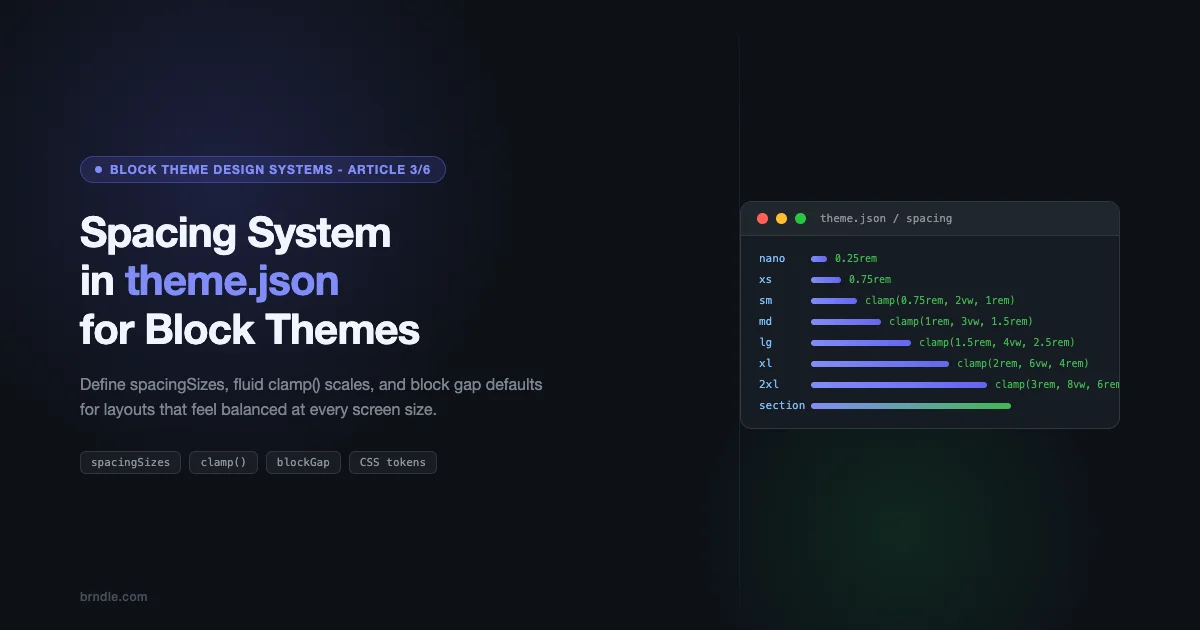
A Basic Eight-Step Scale
A good starting point is an eight-to-nine-step scale that covers everything from tight inline spacing to full-section gaps. The values below use rem units and follow a rough doubling progression – a pattern borrowed from established design systems like Tailwind and Material Design. If you are curious about what good design system thinking looks like in practice, what shadcn/ui gets right that WordPress block themes should copy is worth reading alongside this.
With this in place, WordPress generates the following CSS custom properties automatically:
--wp--preset--spacing--3xs: 0.25rem--wp--preset--spacing--2xs: 0.5rem--wp--preset--spacing--xs: 0.75rem--wp--preset--spacing--sm: 1rem--wp--preset--spacing--md: 1.5rem--wp--preset--spacing--lg: 2rem--wp--preset--spacing--xl: 3rem--wp--preset--spacing--2xl: 4rem--wp--preset--spacing--3xl: 6rem
These properties are injected into the page as a :root block in the generated stylesheet – no extra CSS file needed, no enqueue calls, nothing to maintain manually.
Naming Conventions That Scale
Your naming scheme matters more than the actual values. A few conventions to follow:
- Use semantic names, not numeric ones –
sm,md,lgare easier to reason about thanspacing-2,spacing-4,spacing-8 - Keep slugs short – they appear in CSS custom property names and in saved block attributes, so brevity helps
- Add context-specific slots if needed – a
sectionslug that maps to your biggest spacing value makes it clear where that value is intended to be used - Avoid generic names like “gap-1” – someone will add a “gap-2” next month and suddenly your scale has no internal logic
Fluid Spacing with CSS clamp()
A static spacing scale works, but it does not adapt to screen size. On a wide desktop, 2rem of gap between sections looks comfortable. On a 375px phone, that same 2rem might feel cramped, or alternately, a large section gap might eat up an uncomfortable percentage of the viewport height.
CSS clamp() solves this elegantly. The function takes three arguments: a minimum value, a preferred value (typically a viewport-relative unit), and a maximum value. The browser picks the preferred value as long as it stays between the min and max. The result is spacing that scales smoothly from small to large screens without any media query.
The clamp() Formula for Spacing
The pattern for fluid spacing in spacingSizes looks like this:
clamp(minimum, preferred-viewport-value, maximum)Example:
clamp(1.5rem, 4vw, 2.5rem)
At 4vw, the preferred value equals 1.5rem when the viewport is 375px wide and equals 2.5rem when the viewport is 625px wide. Below 375px, it stays at 1.5rem. Above 625px, it stays at 2.5rem. No breakpoints. No JavaScript. Just math.
A Fluid Spacing Scale
Here is a complete fluid spacing scale. Notice how the viewport percentage in the preferred value grows with each step – this ensures larger spacing steps get proportionally more fluid range.
The progression here is deliberate. The sm step uses 2vw as its preferred value – a gentle flex. The section step uses 10vw – it scales aggressively because section gaps should feel proportional to the page width, not just device size.
Fluid spacing means your layout adapts to any screen without a single media query – spacing just works.
Choosing the Right Viewport Percentage
Getting the vw value right requires a bit of arithmetic. The preferred value should equal your minimum at roughly 375px and equal your maximum at around 1200px to 1440px. Here is a quick formula:
vw% = ((max – min in px) / (max-vp – min-vp)) * 100
For min=1rem (16px), max=2.5rem (40px), min-vp=375px, max-vp=1200px:
vw% = ((40 – 16) / (1200 – 375)) * 100 = 24 / 825 * 100 ≈ 2.9vw
You do not need to be precise to the decimal. A round number like 3vw works fine. The goal is smooth scaling, not mathematical perfection.
Using spacingSizes for Block Gap and Padding
Defining a spacing scale in settings.spacing.spacingSizes is only half the work. The other half is applying those presets as defaults through styles.spacing and styles.blocks. This is where your system gets connected to actual blocks on the page.
Global Block Gap
The most impactful single spacing decision you can make in theme.json is setting the global blockGap. This value applies to every block that supports the block gap feature – which includes groups, columns, query loops, post templates, and more.
Set it under styles.spacing.blockGap using a reference to your spacing preset:
This tells WordPress: by default, every block that supports block gap should use the Medium spacing preset between its children. Editors can still override this per-block in the editor, but the default is consistent across the entire theme.
Per-Block Spacing Defaults
Some blocks need different default spacing. A full-width group used as a hero section needs more padding than a group used as a card. Columns in a feature grid need more gap than columns in a narrow two-column layout. You can specify these defaults in styles.blocks.
The file above shows a complete setup. A few things to note:
- core/group gets XL padding on top and bottom, LG on the sides – this assumes groups are typically used as full-width sections
- core/columns gets LG block gap – column grids need more breathing room than inline content
- core/post-content gets MD block gap – the body of a post should use the base content rhythm
How Preset References Work
When you write "var(--wp--preset--spacing--md)" inside theme.json, WordPress resolves that to the actual value at render time. The pattern is always:
var(--wp--preset--spacing--{slug})
You can also use the shorthand JSON reference format in some contexts, but the CSS custom property format is the most reliable and works everywhere – in theme.json styles, in custom CSS, and in block attributes saved to the database.
Practical Example: A Blog Layout
Here is how a blog post layout benefits from the system. The post template might look like this in the editor:
- Post title (heading block)
- Featured image (image block)
- Post content (post-content block)
- Tags (tags block)
- Author bio (group block)
- Related posts (query loop block)
Without a spacing system, each of these elements would have inconsistent margins. The gap between the title and image might differ from the gap between the image and content. With a global blockGap of Medium, all these elements share a base rhythm. When the author bio needs more visual separation, you assign it Large top margin. When the related posts section needs to feel like a distinct zone, it gets XL or Section gap above it. Every decision references the same scale.
Spacing Tokens for Layout Predictability
Beyond the preset scale, you can extend the spacing system with custom tokens for specific layout purposes. These live in settings.custom and become CSS custom properties with a slightly different naming pattern: --wp--custom--{path}.
Custom spacing tokens are useful for values that do not belong on the generic scale but need to be consistent across the theme – things like the padding of the content area, the gap above footer sections, or the inset of card components.
Defining Custom Spacing Tokens
The custom tokens in this file generate CSS custom properties like:
--wp--custom--spacing--baseline: 0.25rem--wp--custom--spacing--section-gap: clamp(4rem, 8vw, 8rem)--wp--custom--spacing--content-padding-inline: clamp(1rem, 5vw, 2rem)
You can use these in your custom CSS, in block style variations, or in any place that accepts CSS values. They are not available in the editor spacing control slider (only spacingSizes entries appear there), but they are available as named tokens for developers to reference.
When to Use Presets vs Custom Tokens
| Use Case | Use spacingSizes | Use custom tokens |
|---|---|---|
| General block padding/gap | Yes – editors see these in the controls | No |
| Section vertical rhythm | Yes – define a Section slug | Only if it’s a named layout concern |
| Content max-width inset | No | Yes – it’s a layout concern, not a general spacing step |
| Card internal padding | Yes, reference via blocks styles | Only if the card has a distinct padding pattern |
| Footer top gap | Yes | Only if footer spacing is always different from everything else |
The Role of Tokens in Predictability
The value of tokens is not in the values themselves – it is in the constraint they create. When every developer and every template references the same set of named values, you cannot end up with a situation where one section uses 80px of padding, another uses 5rem, and a third uses 120px because someone eyeballed it. Everything traces back to the same declared source.
This matters especially when you start building block style variations and patterns that other people will use. If your hero pattern uses var(--wp--preset--spacing--section) for vertical padding, anyone adding that pattern to any site running your theme gets the right spacing automatically. The section gap scales with screen size because you used clamp(). Nobody has to think about it – it just works.
Consistent Margin and Padding Across Blocks
One of the harder problems in block themes is getting consistent vertical rhythm between blocks of different types. A paragraph followed by a heading followed by another paragraph should not feel like three unrelated elements stacked together. There should be a clear visual hierarchy in the spacing – headings pull slightly away from the preceding content and sit close to what follows them.
Heading Spacing Convention
In print and web typography, the convention is to give headings more space above them than below. This groups them visually with the content they introduce rather than the content they follow. In theme.json:
Set heading margin-top to Large or XL, and margin-bottom to XS or Small. The heading then “belongs” visually to the section below it.
Here is a real example from the full system. Under styles.blocks.core/heading:
"margin": { "top": "var(--wp--preset--spacing--lg)", "bottom": "var(--wp--preset--spacing--xs)" }
With the Large and XS values coming from the spacing scale, this creates a consistent 2.5rem gap above headings and a 0.75rem gap below. The ratio holds as screen size changes because both values are fluid.
Paragraph and List Spacing
Body text blocks – paragraphs and lists – should use a smaller bottom margin to keep the content flow tight. The goal is a rhythm where text feels connected, with headings acting as clear breaks rather than just bigger text.
core/paragraph: margin-bottom of Small (1rem) – keeps paragraphs in a comfortable reading flowcore/list: margin-bottom of Small – lists should end with the same rhythm as paragraphscore/image: margin-top and margin-bottom of Medium – images need a bit more breathing room on both sidescore/separator: margin-top and margin-bottom of XL – separators are visual breaks and need significant space
Avoiding the Double-Margin Problem
One issue that comes up when setting block margins in theme.json is double-margining. If you set a paragraph’s bottom margin to Small and the next heading’s top margin to Large, the space between them is Small + Large. That might be exactly what you want, or it might create an awkward gap.
The safest approach is to set margins on one side only where possible. Use bottom margin on paragraphs and top margin on headings, but do not set both. Let the blockGap handle the default rhythm, and only override margin when a specific block type needs different spacing from its neighbors.
Section-Level Spacing
For full-width sections – groups, covers, and other container blocks – padding is the main tool. The goal is generous vertical padding that creates a clear visual zone, combined with horizontal padding that prevents content from touching the viewport edges on small screens.
A well-designed section block in theme.json looks like this under styles.blocks.core/group:
"padding": { "top": "var(--wp--preset--spacing--xl)", "bottom": "var(--wp--preset--spacing--xl)", "left": "var(--wp--preset--spacing--lg)", "right": "var(--wp--preset--spacing--lg)" }
The asymmetry here is intentional. Vertical padding (XL) is larger than horizontal padding (LG) because sections typically have more visual height than width needs protecting. Horizontal padding is mainly a fallback for narrow viewports – it prevents content overflow rather than creating visual rhythm.
The Full Spacing System: Putting It All Together
All the concepts above combine into a single theme.json file. The full spacing system below includes the complete spacingSizes array with fluid clamp() values, global blockGap, and per-block spacing defaults for the most common blocks.
This file is a complete starting point. You would merge the settings and styles objects into your existing theme.json rather than replacing the whole file – your color, typography, and layout settings stay in place.
Block Coverage in the Full System
- core/paragraph: Small bottom margin for tight body rhythm
- core/heading: Large top margin, XS bottom margin for visual grouping
- core/group: XL vertical padding, LG horizontal padding
- core/columns: LG block gap for column grids
- core/column: SM block gap for content within each column
- core/cover: 2XL vertical padding, XL horizontal padding for hero sections
- core/list: Small bottom margin matching paragraphs
- core/image: Medium margin above and below
- core/separator: XL margin above and below for visual breaks
- core/query: LG block gap between query-related blocks
- core/post-template: XL block gap between post cards in archive layouts
Spacing in the Block Editor: What Editors See
It is worth understanding how your spacing system translates into the editor experience. When a user selects a group block and opens the Spacing panel in the sidebar, they see a visual slider with labeled stops. Each stop corresponds to one of your spacingSizes entries.
The slider goes from your first entry (Nano or XS) to your last (Section or 3XL). The labels you chose for the name field appear as tooltip text when hovering each stop. This is why your naming matters – “Small”, “Medium”, “Large” is immediately understandable. “spacing-2”, “spacing-5”, “spacing-8” is not.
Locking Down Spacing for Non-Technical Editors
If you are building a theme for clients or non-technical editors, you might want to restrict which spacing controls are available. You can do this in two ways:
- Set
spacing.padding: falseandspacing.margin: falsein settings – this removes padding and margin controls from the editor entirely, leaving only block gap available - Set spacing only on specific blocks in
styles.blocks– the controls are still there, but the defaults are so well-considered that editors rarely need to change them
The second approach is usually better. Removing controls frustrates experienced users. Good defaults mean most users never need to change anything anyway.
Spacing and the Site Editor
In the Site Editor (Appearance – Editor), spacing controls are available on template parts and templates as well as individual blocks. Your spacing system applies everywhere. A header template part with a group containing navigation will use your group padding default unless explicitly overridden. This consistency is the goal – every part of the site shares the same spatial language.
Common Mistakes and How to Avoid Them
After working with spacing systems in dozens of block themes, a few patterns come up consistently as sources of problems.
Mistake 1: Too Many Steps in the Scale
A 15-step spacing scale is not more useful than a 9-step scale – it is harder to use. Editors faced with 15 options on a slider struggle to understand the difference between steps 7 and 8. Stick to 8-10 meaningful stops. If you find yourself needing more granularity, that is usually a sign a specific component needs a hard-coded custom token rather than another generic scale step.
Mistake 2: Using rem Without Considering the Base Font Size
rem values are relative to the root font size, which is typically 16px but can be changed by the user’s browser settings. A spacing value of 0.25rem is 4px at default settings. At a user-set base font size of 20px, it becomes 5px. This is actually a feature, not a bug – your spacing scales with the user’s preferences. But it means you should think in ratios to body text rather than absolute pixels when defining your scale.
Mistake 3: Forgetting to Enable blockGap in Settings
You can set a global blockGap in styles.spacing without setting settings.spacing.blockGap: true. The style will apply, but the editor control for block gap will not appear. Users will be confused when they cannot see the spacing they know is there. Always pair the style setting with the feature setting.
Mistake 4: Using Spacing Presets in blockAttributes Only
When a block’s spacing is set via the editor and saved to the database, it stores a reference like var:preset|spacing|md. This is an internal WP format that gets converted to the CSS custom property at render time. Do not confuse this with the CSS variable syntax. In theme.json styles, always use var(--wp--preset--spacing--md).
Mistake 5: Not Testing Fluid Values on Real Devices
Fluid spacing looks great on paper but can behave unexpectedly on actual phones. A 10vw section gap at 375px is 37.5px, which is likely fine. But at 320px (older iPhones) it is 32px – still okay. The issue is usually at the wide end: a 10vw gap at 1600px is 160px, which might feel like a canyon between sections. Always test your fluid values at the extremes of your supported viewport range.
Spacing and Layout Width: Working with contentSize and wideSize
Spacing tokens interact with layout width settings in theme.json. The settings.layout.contentSize and settings.layout.wideSize values define the maximum width of content and wide-aligned blocks. When your horizontal padding references spacing tokens, that padding applies on top of the layout constraint.
A practical pattern for content-width layouts:
- Set
contentSizeto your reading column width – typically 680px to 760px - Set
wideSizeto a wider breakout – typically 1100px to 1200px - Set horizontal padding on the body or post-content block to your
smorxsspacing token - The content width constraint handles the maximum; the padding handles the minimum safe edge on small screens
This means your spacing system needs to account for horizontal padding as a “safe zone” rather than a visual element. The values should be small enough to feel like they belong on a phone screen but consistent with the rest of the scale.
Block Style Variations and Spacing
Block style variations let you create alternate visual presentations for a block. A “Card” variation on a group block might have different padding from the default group. A “Hero” variation on a cover block might have taller padding than a standard cover. These variations reference your spacing tokens just like the main theme styles do.
Register a block style variation with custom spacing in your functions.php or a separate stylesheet, and reference the CSS custom properties directly:
.is-style-card { padding: var(--wp--preset--spacing--md) var(--wp--preset--spacing--sm); }.is-style-hero { padding-block: var(--wp--preset--spacing--section); }
Because these rules use the preset custom properties, updating your spacing scale in theme.json automatically updates the variation styles too. This is the compounding benefit of a token-based system – every downstream reference updates for free.
Testing Your Spacing System
Once your spacing system is in place, test it with a few key scenarios before shipping:
- Mobile at 375px: check that section padding does not eat too much of the viewport height, and that inline content does not feel cramped
- Tablet at 768px: the middle range where fluid values are most active – look for any awkward transitions
- Desktop at 1280px: the target max for most block themes – verify padding feels generous but not excessive
- Ultra-wide at 1600px+: check your maximum clamp values – is the section gap acceptable at 10vw?
- Editor vs frontend: open the Site Editor and check that the spacing you set in theme.json appears correct in edit mode too – sometimes editor styles and frontend styles diverge
Pay special attention to nested layouts. A group inside a columns block inside another group stacks padding in ways that can look fine on desktop but feel over-padded on mobile. Fluid values with well-chosen minimums handle this better than static values, but it is worth verifying with real content.
What Comes Next in the Series
This article covers spacing – the third pillar of a block theme design system. In the next piece, we will look at color systems: how to define palettes in theme.json, how to use duotone and gradient presets, and how to connect color tokens to block style variations so that a site’s color scheme can change with a single variable update.
If you are following the series from the start, the full picture looks like this:
- Article 1: Design tokens and the theme.json architecture
- Article 2: Typography systems with fluid type scales
- Article 3 (this one): Spacing systems with clamp() and spacingSizes
- Article 4: Color systems and palette management
- Article 5: Layout constraints and template structure
- Article 6: Shipping and maintaining a block theme design system
Key Takeaways
- Define your spacing scale in
settings.spacing.spacingSizes– each entry generates a CSS custom property automatically - Use
clamp(minimum, viewport-value, maximum)for fluid spacing that adapts to any screen size without media queries - Set a global
blockGapinstyles.spacingas your base content rhythm, then override per block type instyles.blocks - Give headings more space above than below to create visual grouping with the content they introduce
- Use custom tokens in
settings.custom.spacingfor layout-specific values that are not part of the generic scale - Block style variations can reference spacing preset custom properties directly, so scale updates propagate automatically
- Test fluid spacing at real device sizes, especially the wide and narrow extremes of your supported range
Build Block Themes with Brndle
Looking to build production-ready block themes with a proper design system? Browse our guides on theme.json for block themes, explore block theme development, and check out the rest of the Block Theme Design Systems series to build themes that are consistent, scalable, and editor-friendly.