Five New CSS Properties Just Landed in WebKit
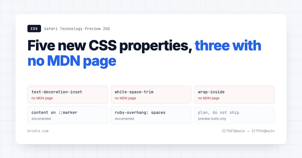
Safari Technology Preview 250 shipped yesterday, and it carries five CSS properties that most of us have never written a line of. Three of them do not have an MDN page yet. That is not a criticism of MDN. It is a useful signal about how early this is.
So this is not a list of things to start using. It is a look at what the text layer of CSS is about to gain, why each one exists, and which of the workarounds currently sitting in your stylesheet each one is meant to delete.
The five: text-decoration-inset, white-space-trim, wrap-inside, the content property on ::marker, and the spaces value for ruby-overhang.
Read the status before the syntax
Safari Technology Preview is a preview build. Features arrive there to be tested, and some of them change shape or leave again. This particular release covers WebKit changes between 317507 and 317934, which is a fortnight of work, not a shipping announcement.
When I checked each property against MDN, ruby-overhang had a page. text-decoration-inset, white-space-trim and wrap-inside returned a 404. All three are real, specified properties in CSS Text Level 4 and CSS Text Decoration Level 4, so they exist as far as the working group is concerned. They just have no browser support worth documenting yet.
A property with no MDN page is a property with no users. Plan around it, do not ship on it.
That is the frame for everything below. Read this as a preview of where the text layer is heading over the next couple of years, and check the support tables yourself before any of it reaches a production stylesheet.
text-decoration-inset
Of the five, this is the one a design system will want first, because it fixes something people currently fake.
Name: text-decoration-inset
Value: <length-percentage>{1,2} | auto
Initial: 0
Applies to: all elements
Inherited: no
It adjusts where a decoration line starts and stops. Positive values move an endpoint inward and trim the line. Negative values move it outward and extend it. Give it two values and the first applies to the start, the second to the end.
/* Pull the underline in by a quarter of the font size at each end. */
a {
  text-decoration-line: underline;
  text-decoration-inset: 0.25em;
}

/* Trim only the start, leave the end alone. */
a {
  text-decoration-inset: 0.25em 0;
}
The spec is specific about scope in a way that matters: it controls the decoration lines drawn by this decorating box, and not lines drawn by its ancestors. If a parent element is underlining a run of text, an inset on a child inside that run does not shorten the parent’s line.
What it replaces
Every design system that wants an underline shorter than its text currently reaches for a background gradient:
/* The workaround we have all shipped. */
a {
  text-decoration: none;
  background-image: linear-gradient(currentColor, currentColor);
  background-size: calc(100% - 0.5em) 1px;
  background-position: 0.25em 100%;
  background-repeat: no-repeat;
}
That works and it is miserable. It throws away the real underline, so text-decoration-skip-ink stops applying and descenders get sliced. It does not wrap correctly across lines. It fights with any other background on the element. And it needs recalculating whenever the type scale changes, because the offsets are hard numbers pretending to be typography.
One declaration replaces all of that, keeps the real decoration line, and inherits the skip-ink behaviour that makes underlines readable in the first place.
The auto value and the percentage rule
Two details in the definition repay a second read.
The value grammar allows auto alongside lengths and percentages. That leaves room for a browser to make a typographically sensible choice rather than forcing every author to pick a number, which is the same idea behind text-underline-offset: auto. What a given engine decides auto means is up to it, so treat it as a reasonable default rather than a predictable measurement.
Percentages are stranger, and the spec spells out why. A percentage resolves against the inline size of the decorating box, or against each individual box fragment, depending on the value of box-decoration-break. That matters for any inline element that wraps across lines. With fragments, a percentage inset is recalculated per fragment, so a link broken over two lines gets its inset applied to each piece rather than to the notional whole.
If that sounds like a source of surprises, it is, which is a decent argument for using em here and keeping the result tied to the type size rather than to the width of whatever box the text happens to land in.
white-space-trim
This one solves a problem that only exists because HTML is written by people and rendered by machines.
Name: white-space-trim
Value: none | discard-before || discard-after || discard-inner
Initial: none
Applies to: inline boxes and block containers
Inherited: no
The three values do what they say. discard-before collapses whitespace immediately before the start of the element. discard-after collapses it immediately after the end. discard-inner discards whitespace at the beginning and end of the element’s own content, up to the first segment break in each direction.
Note that they combine with || in the value grammar, so you can specify more than one.
.badge {
  white-space-trim: discard-inner;
}
Why anyone needs it
Consider a badge component whose markup is formatted for humans:
<span class="badge">
  New
</span>
That badge does not contain “New”. It contains a newline, two spaces, “New”, a newline. Those collapse to a single space at each end, and because the element has a background and padding, you can see them. The badge is wider than its text on both sides by a space you never asked for.
The current fixes are all bad in the same way: they push a layout concern into the markup. You write the tag on one line and hope nobody’s editor reformats it. You add HTML comments to eat the whitespace. You set font-size: 0 on the parent and restore it on the child. You strip the whitespace in a template filter. Every one of those makes the rendered result depend on how the source is typed.
For anyone building components that other people fill with content, that is the interesting part. A component should not care how its markup was indented.
wrap-inside
Name: wrap-inside
Value: auto | avoid
Initial: auto
Applies to: inline boxes
Inherited: no
With avoid, line breaking is suppressed inside the box. The browser may still break there, but only if the line offers no other valid break point. It is a preference with a fallback, not a prohibition, which is exactly the right shape for typography.
The nesting rule is the clever bit. If boxes marked avoid are nested inside each other and the browser has to break somewhere, it must use a break in an outer box before it uses one in an inner box. That gives you a priority order for breakpoints rather than a single on-off switch.
The spec’s own example is a conference footer:
footer { wrap-inside: avoid; }
venue  { wrap-inside: avoid; }
date   { wrap-inside: avoid; }
place  { wrap-inside: avoid; }
Each part stays whole if it can. When the line runs out of room, the break lands between the parts rather than inside the venue name.
What it replaces
Today this is white-space: nowrap, which is a blunt instrument, because it means never break, even when never breaking pushes text out of its container. The usual result is a card whose title overflows on a narrow viewport, discovered by a customer rather than by us.
It is also the non-breaking space, which does the same job while being invisible in the source and impossible to grep for. Anyone who has inherited a codebase held together by knows the feeling.
Prices, dates, product names, units of measurement, a first name and surname that should not split across lines: all of that is wrap-inside: avoid, expressed as a preference the layout can overrule when it has to.
Where it sits in the wrapping family
wrap-inside is not a lone addition. CSS Text Level 4 organises line wrapping into a small set of properties that divide the job cleanly, and it helps to see the whole shape before deciding which one you actually want.
text-wrap-modedecides whether wrapping happens at all. This is where the oldwhite-space: nowrapbehaviour now properly lives.wrap-insidecontrols breaks within a box.wrap-beforeandwrap-aftercontrol breaks between boxes.text-wrap-styleselects how to wrap, which is wherebalanceandprettylive.text-wrapis the shorthand tying mode and style together.
Seen that way, the split is between whether, where and how. text-wrap-style: balance already ships in several engines and gets used for headings, and it answers a different question from wrap-inside. Balance distributes text evenly across the lines it ends up using. wrap-inside: avoid says which runs of text should not be split when the browser decides where those lines fall.
They compose. A card heading can ask to be balanced overall while a product name inside it asks not to be split, and the browser reconciles the two. Today the only way to express the second half is to make it unbreakable and accept the overflow risk.
content on ::marker
List markers have been partly stylable for a while. ::marker accepts colour and font properties, and list-style-type accepts a string. What this adds is the content property on the pseudo-element itself, which is a different and more useful lever.
li::marker {
  content: "\2713\00a0";
  color: var(--wp--preset--color--primary);
}
The reason it matters more than it looks: the alternative most people use is list-style: none plus a ::before, and that combination has an accessibility cost. Removing the list marker can stop some screen readers announcing the element as a list at all, which turns a list into a run of unrelated lines for the people who most need the structure.
Styling the real marker keeps the list a list. That is the whole argument.
STP 250 also fixed a marker rendering bug in passing, where a list-style-position: inside marker was painted one device pixel away from the equivalent inline text. If you have ever nudged a marker by a hair and wondered whether you were imagining the misalignment, you were not.
ruby-overhang: spaces
The narrowest of the five, and worth knowing exists rather than studying.
Ruby annotations are the small pronunciation guides set above or beside text, used heavily in Japanese and Chinese typesetting. An annotation is often wider than the character it annotates, so the question is whether it may overhang the text next to it.
The new spaces value limits overhang to adjacent spaces and punctuation, and none now acts as an alias for it. So the annotation can lean into the gaps but not over neighbouring characters.
If you never set CJK text, file this one away. If you do, it is a real improvement over choosing between full overhang and none at all.
What this means for a design system
Three of these five are token-shaped, and that is worth planning for now rather than when they ship.
A decoration inset is a typographic constant. It belongs beside your line height and letter spacing, not scattered across component files. Same for the whitespace trimming rule on a badge or chip, and the no-break preference on a price or a date.
:root {
  --text-decoration-inset: 0.25em;
}

@supports (text-decoration-inset: 0.25em) {
  a {
    text-decoration-line: underline;
    text-decoration-inset: var(--text-decoration-inset);
    background-image: none; /* retire the gradient hack */
  }
}
An @supports block is the right container for all of this today. The hack stays as the base, the real property takes over where it exists, and the day support arrives you delete one branch rather than rewriting a component.
For block themes there is a second timeline to watch. A property is usable in a stylesheet long before it is expressible in theme.json, because Global Styles has to grow a key for it and the editor has to grow a control. We wrote recently about how WordPress now maintains two separate token systems, and this is the gap that story keeps producing: the CSS lands, the design tool catches up later, and in between the token lives in a stylesheet where no editor UI can reach it.
Which means the practical answer for a block theme is a custom property now, declared once, referenced everywhere, and swapped for a real theme.json key when one exists. That is the same shape as the advice for any property that arrives before the tooling does, including the logical properties we covered in the piece on block theme CSS surviving RTL.
The pattern across all five
Line these up and they are not five unrelated additions. Every one takes something we currently express by damaging the markup or faking the rendering, and moves it into a property that says what we meant.
| Property | What we do today | What it costs |
|---|---|---|
text-decoration-inset | Background gradient faking an underline | Loses skip-ink, breaks on wrap, fights other backgrounds |
white-space-trim | Reformat the HTML, comment out whitespace, font-size zero | Rendering depends on how the source was typed |
wrap-inside | white-space: nowrap or a non-breaking space | Overflow on narrow screens, invisible characters in source |
content on ::marker | list-style: none plus ::before | Can stop a list being announced as a list |
ruby-overhang: spaces | All overhang or none | Poor CJK typesetting either way |
Two of those costs are accessibility costs, which is the part worth sitting with. The marker workaround can remove list semantics. The gradient underline defeats skip-ink, which exists because underlines that cut through descenders are harder to read. Both are cases where a visual preference was expensive to express correctly, so people expressed it incorrectly and the people who paid were the ones using assistive technology or simply reading carefully.
That is a decent argument for why small text-layer properties deserve attention out of proportion to their size. They are not sugar. They are the difference between a design intent expressed as itself and the same intent expressed as damage to something else.
There is a second pattern worth naming, which is where each of these problems currently gets solved. Look at the middle column of that table again and notice how much of it is not CSS at all. Reformatting HTML so a badge does not gain a stray space is a markup fix for a rendering problem. A non-breaking space is a content fix for a layout problem. Stripping whitespace in a template filter is a build-step fix for a presentation problem.
Every one of those puts the decision somewhere it cannot be seen by the person who later has to change it. A designer adjusting a component will find the padding and the type scale. They will not find the HTML comment eating a newline, or the template filter trimming the string, and when the layout misbehaves they will have no idea why.
Moving these decisions into CSS is not only tidier. It puts them where the people who own them are already looking, which is most of what a design system is for.
How to actually try them
Reading a property definition tells you what it should do. Watching it render tells you what it does, and those diverge often enough in preview builds to be worth ten minutes.
Safari Technology Preview installs alongside regular Safari rather than replacing it, which matters if Safari is also where you verify releases. Keep them separate and never treat a preview build as your compatibility baseline.
The fastest check is feature detection rather than a version number. CSS can answer for itself:
@supports (white-space-trim: discard-inner) {
  /* only applies where the property is understood */
}
And from a console, when you want a yes or no across a set of properties at once:
[
  ['text-decoration-inset', '0.25em'],
  ['white-space-trim', 'discard-inner'],
  ['wrap-inside', 'avoid'],
  ['ruby-overhang', 'spaces'],
].forEach(([prop, val]) => {
  console.log(prop, CSS.supports(prop, val));
});
Run that in whatever browser you are curious about. It is the same check @supports performs, and it answers the question honestly in a way that reading a blog post from six months ago does not.
One caveat on feature detection generally: a browser reporting support for a property is telling you it parses the value, not that it implements the behaviour perfectly. Early implementations pass CSS.supports() and still get edge cases wrong. Detection tells you whether to bother testing, not whether to trust the result.
What to do this week
- Nothing in production. One preview build in one engine is not a support story. Three of these do not have an MDN page.
- Grep for the workarounds. Search your stylesheets for
background-size: calcnear a link rule, forwhite-space: nowrap, for in templates, and forlist-style: nonefollowed by a::before. That list is your future diff. - Name the tokens now. If a decoration inset is going to be a design decision, it can be a custom property today and a real property later without touching components twice.
- Install Safari Technology Preview if you want to see them, and keep it separate from the browser you test releases in.
- Check MDN and caniuse before you believe any of this, including this article. Support tables move and posts do not.
The realistic timeline for a property that appears in a preview build with no cross-browser documentation is measured in years, not months. Some arrive, some are reshaped by the working group, and a few quietly stop being mentioned.
Worth knowing about anyway. The hacks in your stylesheet are not permanent, and it helps to know which ones have a replacement coming.
There is also a quieter benefit to reading release notes for a browser you may not develop in first. Preview builds are where the working group’s decisions become visible before they become your problem. A property landing in one engine is the earliest reliable signal that a hack you rely on has a shelf life, and knowing that six months before you have to act on it is the difference between a planned cleanup and an emergency one.