Reading Purple: What Woo’s Block Theme Teaches Theme Authors
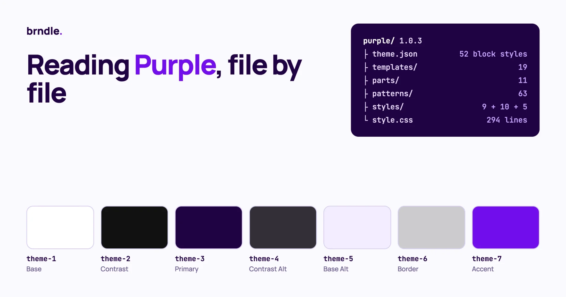
Purple is WooCommerce’s own starter block theme, in beta since September 2026. Its most useful lessons for a theme author are in four places: a palette named by role number, a spacing scale built from one custom value, section styles that restyle everything inside a group, and store templates that are almost empty because the layout lives in patterns. This post reads the files and says what to copy and what to think twice about.
A note on method. We read the theme’s source at version 1.0.3 in the woocommerce/woo-themes repository (latest commit 9 October 2026) and looked at WooCommerce’s public demo store. We did not install it on a store taking orders. It is a beta, and WooCommerce’s announcement says templates, patterns and styling will keep changing. Treat file names and values here as a snapshot.
In this teardown:
- What is in the box
- The palette: seven slots named by number
- Spacing: one custom value drives the whole scale
- Typography: one variable font, ten pairings as style variations
- Section styles: restyle a group and everything inside it
- Store templates: thin files, hidden patterns
- Responsive values written into block markup
- How it handles WooCommerce version drift
- What to copy, and what to think twice about
- Questions theme authors ask
If you want the store owner’s view (should you use Purple, a block theme or a custom build), our sister site covers that in Purple, a Block Theme or a Custom WooCommerce Build?. This post is for people who build themes.
What is in the box?
Purple 1.0.3 declares Requires at least: 7.1, Requires PHP: 7.4 and WC requires at least: 11.1 in its style.css header. Here is the file count, which tells you where the work went.
| Folder or file | Count | What it holds |
|---|---|---|
theme.json | 1 file, about 19 KB | Version 3, settings, 12 element styles, 52 block styles |
templates/ | 19 | Blog, pages, shop, product, cart, checkout, order confirmation, search, coming soon |
parts/ | 11 | Two headers, two footers, a checkout header, navigation overlays, four add-to-cart parts |
patterns/ | 63 | Page layouts, sections, product collections, and 10 hidden patterns used by templates |
styles/colors/ | 9 | Alternative palettes (ten with the default) |
styles/typography/ | 10 | Font pairings |
styles/block/ | 5 | Three section styles, a contrast button, a post terms badge |
style.css | 294 lines | Form and WooCommerce component fixes that theme.json cannot express |
functions.php | about 5 KB | Enqueues, one pattern category, one template filter |
The ratio is the first lesson. Sixty-three patterns and nineteen style files against under 300 lines of CSS and a small functions.php. For a store theme, where plugin markup usually forces a lot of CSS, that is a strong result. The cost is a large theme.json: 52 entries under styles.blocks, 27 of them for woocommerce/* blocks.
Why are the palette slots named by number?
Because a slug such as primary or purple stops making sense the moment a style variation changes the colour. Purple’s palette has seven slots with slugs theme-1 to theme-7. The human names (Base, Contrast, Primary, Contrast Alt, Base Alt, Border, Accent) are labels only.
"palette": [
  { "slug": "theme-1", "name": "Base",         "color": "#FFFFFF" },
  { "slug": "theme-2", "name": "Contrast",     "color": "#111111" },
  { "slug": "theme-3", "name": "Primary",      "color": "#1f0342" },
  { "slug": "theme-4", "name": "Contrast Alt", "color": "#322f37" },
  { "slug": "theme-5", "name": "Base Alt",     "color": "#f2edff" },
  { "slug": "theme-6", "name": "Border",       "color": "rgba(17, 17, 17, 0.2)" },
  { "slug": "theme-7", "name": "Accent",       "color": "#720eec" }
]
Each file in styles/colors/ redefines the same seven slugs. The Autumn variation, for example, sets theme-1 to a dark brown and theme-2 to a light grey, so base and contrast swap and the theme goes dark with no other change. Every block style in theme.json refers to a slot, never to a hex value, so all ten palettes work with all 63 patterns.
What to copy
- Keep the slot count small. Seven is enough for a full store.
- Give the border its own slot. Purple’s border is the contrast colour at 20 percent opacity, and the variations change it together with the contrast colour.
- Derive hover colours instead of adding slots. The button hover is
color-mix(in srgb, var(--wp--preset--color--theme-3) 90%, #FFF), written once.
What to think twice about
Numbered slugs are hard to read in markup. has-theme-5-background-color tells a reviewer nothing. If you copy the idea, keep a table of what each number means in your theme’s readme. Also note the fixed #FFF in that hover mix: on a dark palette, mixing toward white lightens a button that is already light. A mix toward the base slot would follow the palette.
How does one custom value drive the whole spacing scale?
Purple defines three values under settings.custom and builds every spacing step from two of them.
"custom": {
  "outline-button-color": "var(--wp--preset--color--theme-2)",
  "spacing-unit": "10",
  "wide-size": "1340"
}
Each step in settings.spacing.spacingSizes is a clamp() with the same shape. This is step 50:
clamp(
  20px,
  calc(var(--wp--custom--spacing-unit) * 5 * 100vw / var(--wp--custom--wide-size)),
  calc(var(--wp--custom--spacing-unit) * 5 * 1px)
)
Read it as: at the wide layout width (1340 pixels) the step equals 5 units, which is 50 pixels. Below that it shrinks in proportion to the viewport, and it never goes under 20 pixels. The seven steps are 10, 20, 30, 50, 70, 90 and 140, and the slug is the pixel value at full width. So var:preset|spacing|70 means 70 pixels on a wide screen.
What to copy
- Slugs that state the size. A designer reading
spacing|70knows what to expect, which is not true ofspacing|60in a scale where 60 means “the sixth step”. - One knob. A child theme or a style variation can set
spacing-unitto 8 and tighten the whole site. - Scaling tied to the layout width, so spacing and content width shrink together.
What to think twice about
The unit and the wide size are stored as bare numbers so they can be used in calc(). That means wide-size exists twice: as "1340" in custom and as "1340px" in settings.layout.wideSize. Change one and forget the other and the scale drifts from the layout. If you copy this, add a comment in your readme or a build check that compares the two. The content width, for reference, is 645 pixels, narrow by store theme standards and good for reading.
How are ten font pairings delivered without ten stylesheets?
The base theme registers one family, Inter, as a single variable font file with weights 100 to 900. Each of the ten files in styles/typography/ registers its own families and overrides a few styles. The Fraunces and Crimson Pro pairing adds both families and sets styles.elements.heading.typography.fontFamily to the Fraunces preset. Nine font folders ship in assets/fonts/, and a site only loads the ones its chosen pairing declares.
The detail worth copying is in the button element. Its font family is not a preset. It is a reference:
"button": {
  "typography": {
    "fontFamily": { "ref": "styles.elements.heading.typography.fontFamily" },
    "fontSize": "var(--wp--preset--font-size--medium)",
    "fontWeight": "400"
  }
}
A ref points at another value in the same theme.json tree. When a typography variation changes the heading family, buttons follow, and the variation file does not have to mention buttons. Use ref wherever two things should always match. It removes a whole class of “the variation forgot one element” bugs.
Font sizes are five presets from small (0.875rem) to xx-large (2.125rem), fluid except medium, which is fixed at 1rem. Keeping body text out of fluid scaling is a sound choice: body copy that shrinks on phones is harder to read, and headings are where fluid sizing earns its keep.
How do section styles restyle a group and everything inside it?
This is the part of Purple most worth studying. The three files section-1.json, section-2.json and section-3.json in styles/block/ are block style variations registered for core/group, core/columns and core/column. Each sets a background and text colour, then restyles the elements and blocks inside it.
{
  "version": 3,
  "slug": "section-1",
  "title": "Style 1",
  "blockTypes": [ "core/group", "core/columns", "core/column" ],
  "styles": {
    "color": {
      "background": "var(--wp--preset--color--theme-2)",
      "text": "var(--wp--preset--color--theme-5)"
    },
    "css": "--wp--custom--outline-button-color: currentColor;",
    "elements": {
      "button":  { "color": { "background": "var(--wp--preset--color--theme-1)", "text": "var(--wp--preset--color--theme-2)" } },
      "heading": { "color": { "text": "var(--wp--preset--color--theme-5)" } },
      "link":    { "color": { "text": "var(--wp--preset--color--theme-5)" } }
    }
  }
}
Pick “Style 1” on a group and the group turns dark, its headings and links turn light, and its buttons invert, in one click. Because the values are palette slots, the same section style works in all ten palettes.
The custom property trick
Look at the css line. It does not write a rule. It sets a custom property, --wp--custom--outline-button-color, to currentColor on the section. The outline button style reads that property for its text colour. So an outline button inside a dark section picks up the section’s text colour with no extra selector. This is a clean way to pass context down to a nested block style, and it avoids the specificity fights you get from .is-style-section-1 .is-style-outline rules in a stylesheet.
What to copy
- Offer two or three section styles and build your patterns from them. Patterns then carry no colour attributes of their own, which keeps them valid in every palette.
- Use a custom property set in a variation’s
cssto pass context to child blocks. - Style separators with
color-mix(in srgb, currentColor 25%, transparent)so they follow the text colour of whatever section they sit in.
Why are the store templates nearly empty?
Because the layout lives in patterns marked as hidden, and the template only places the pattern. The whole single product template is a header part, a main group and one pattern reference:
<!-- wp:template-part {"slug":"header"} /-->

<!-- wp:group {"tagName":"main","layout":{"type":"constrained"}} -->
<main class="wp-block-group">
  <!-- wp:pattern {"slug":"purple/hidden-single-product"} /-->
</main>
<!-- /wp:group -->

<!-- wp:template-part {"slug":"footer"} /-->
(We trimmed the spacing attributes from the group for readability.) Ten patterns carry a hidden- prefix: the single product layout, product details, the 404 page, the blog heading, four search layouts, the cart page title and the order confirmation. A PHP pattern file can translate its strings and build asset URLs with get_template_directory_uri(), which an HTML template cannot. That is the reason to do it this way, and it is the same reason core’s own default themes do.
Checkout gets its own header and its own width
The checkout template does not use the normal header. It loads a checkout-header part, wraps the page in woocommerce/page-content-wrapper with "page":"checkout", sets a 1000 pixel content width on the main group and outputs woocommerce/store-notices before the post content. There is no footer part at all. Fewer links on the checkout page is a long-standing conversion practice, and here it is built into the template instead of being left to the store owner.
The cart template keeps the normal header and footer, uses a 1060 pixel width, and places an upsell products pattern after the cart. So the three widths in play are 645 for reading, 1000 to 1060 for cart and checkout, and 1340 for wide layouts.
Add-to-cart is four template parts
Simple, variable, grouped and external products each have their own part, such as variable-product-add-to-cart-with-options.html, registered in theme.json under templateParts with the area uncategorized. A store owner can restyle the variable product form without touching the simple one.
Keeping store templates out of the page template picker
Core treats any template file without a postTypes declaration as available to every post type. So a theme that ships page-cart.html or single-product.html will offer “Single Product” as a page template in the editor, which makes no sense. Purple filters them out:
add_filter( 'get_block_templates', 'purple_hide_store_templates_from_template_picker', 20, 3 );

function purple_hide_store_templates_from_template_picker( array $templates, array $query, string $template_type ): array {
	if ( 'wp_template' !== $template_type || empty( $query['post_type'] ) ) {
		return $templates;
	}
	$hidden = array( 'archive-product', 'coming-soon', 'order-confirmation', 'page-cart',
		'page-checkout', 'product-search-results', 'single-product', 'taxonomy-product_attribute' );

	return array_values( array_filter(
		$templates,
		static fn( $template ) => ! in_array( $template->slug, $hidden, true )
	) );
}
(Condensed from the theme’s functions.php.) The check on $query['post_type'] is the clever part. Only the picker passes a post type, so the Site Editor still lists the templates and they stay editable. If your theme ships templates for any plugin’s routes, copy this.
What are the @tablet and @mobile keys in the block markup?
They are responsive values stored on the block. The cart and single product templates carry them on the main group:
"style": {
  "spacing": { "padding": { "top": "var:preset|spacing|70", "bottom": "var:preset|spacing|30" } },
  "@tablet": { "spacing": { "padding": { "top": "var:preset|spacing|10" } } },
  "@mobile": { "spacing": { "padding": { "top": "var:preset|spacing|10" } } }
}
This is why the theme requires WordPress 7.1. Per-viewport styles on blocks are recent, and WordPress trunk has had a run of fixes to them since: responsive styles kept in style variation partials, flex-direction output when a viewport override switches a stack to a row, and preset variable names generated consistently for responsive styles. We list those in What to Test in Your Block Theme for WordPress 7.2.
Our advice: use viewport keys sparingly in a theme you sell. They work, but they are the newest part of the styles engine, and a theme that leans on them inherits every fix and regression in that area. Purple can require 7.1 because it is a starter theme for new stores. A commercial theme with customers on older versions cannot.
How does Purple handle WooCommerce changing under it?
With version-gated stylesheets that remove themselves. functions.php maps a “fixed in” WooCommerce version to a small CSS file and loads the file only while the installed version is older.
$stylesheets = array(
	'11.2.0' => 'assets/css/woocommerce-11.1.css',
	'11.3.0' => 'assets/css/woocommerce-11.2.css',
);

foreach ( $stylesheets as $version => $relative_path ) {
	if ( version_compare( WC_VERSION, $version, '<' ) ) {
		$applicable[ $version ] = $relative_path;
	}
}
The files are short, 19 and 24 lines, and each rule has a comment linking the upstream pull request that fixes the problem in WooCommerce itself. When the store updates past the fixed version, the override stops loading. Nobody has to remember to delete it.
This is the best maintenance idea in the theme. Every theme that supports a plugin collects “temporary” overrides that outlive the bug. Tie each one to the version that fixes it, and they expire on their own. The same list is passed to add_editor_style(), so the editor and the front end stay in step.
Two smaller touches in the same area: an admin notice on the Themes screen when WooCommerce is missing, inactive or older than 11.1, dismissible per user; and wp_get_theme( get_template() ) for the version string, so cache busting still works when a child theme is active.
The CSS that would not fit in theme.json
The 294 lines of style.css are mostly forms. The opening comment explains why. WooCommerce’s classic form fields read CSS custom properties that WooCommerce defines on :root, while the cart and checkout block components hardcode their values. Purple sets the tokens on body, not :root, so its values win regardless of stylesheet order, and then overrides the block components selector by selector. If you style WooCommerce forms, expect to do the same until those components read tokens. In theme.json itself the only form styling is a border colour on the textInput element. We covered what that element can do in Form Styling Is Moving Into theme.json.
What should you copy, and what should you think twice about?
| Idea | Verdict | Why |
|---|---|---|
| Palette slots by role number | Copy, with a readme table | Variations can swap light and dark without renaming anything |
| Spacing scale from one custom unit | Copy | One value tightens or loosens the whole theme |
| Wide size stored twice | Guard it | The number and the pixel value can drift apart |
ref for values that must match | Copy | Variations stay short and cannot forget an element |
| Section styles with a custom property for context | Copy | Patterns need no colour attributes |
| Thin templates, hidden patterns | Copy | Translatable strings and asset URLs |
| Filtering store templates from the page picker | Copy | Stops owners assigning a product template to a page |
| Version-gated compatibility CSS | Copy | Overrides expire when the plugin fixes the bug |
| Viewport keys in template markup | Use sparingly | Newest part of the styles engine, raises your minimum version |
52 block entries in one theme.json | Think twice | Hard to review. Consider splitting by moving block styles into styles/block/ partials where they are true variations |
| Requiring the newest WordPress and WooCommerce | Not for a sold theme | Fine for a starter, a support burden for a product |
For the general choice between a pattern, a template part and a style variation, see Patterns, Template Parts or Style Variations? How to Choose. Purple is a worked example of all three used for the jobs they suit.
Questions theme authors ask
Can you base a commercial theme on Purple?
The header says GPL version 2 or later, so the licence allows it. Whether you should is a different matter while it is in beta: three tagged releases (1.0.1 to 1.0.3) followed quickly on each other, and file names may still move. Borrow the ideas now and wait for a stable release before you depend on the files.
Does Purple work with the classic shortcode cart and checkout?
Its templates are built around WooCommerce’s blocks, and its style.css also carries rules for classic form markup. We have not tested a store using the shortcode checkout with it, so check on staging before you assume.
Are there known problems?
On 12 October 2026 the repository had three open issues. One reports that a product cannot be added to the cart when a one-page checkout extension is active, one concerns a description showing in two places, and one is a design question. Read the issue tracker before a client build.
Why is the checkout header a separate template part?
So the checkout page can drop the main navigation and the footer without the store owner editing anything. The part is registered with the header area, so it appears alongside the normal header in the Site Editor.
Is 19 KB of theme.json too much?
It is a lot to review, and most of it is per-block styling for WooCommerce blocks. The alternative is the same rules in a stylesheet, which the Site Editor cannot show or let an owner change. For a store theme, we would take the larger theme.json.
What is the single best idea to take away?
Tie every compatibility override to the plugin version that makes it unnecessary. It costs ten lines of PHP and it stops your stylesheet filling up with fixes for bugs that no longer exist.
Brndle takes a similar path for non-store sites: a small role-based palette, named colour schemes and patterns that carry no colours of their own. If you are planning a block theme and want a starting point with those decisions already made, see the theme at brndle.com.